Download
1 / 42
420 likes | 558 Views
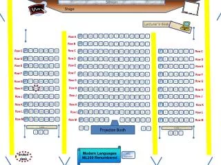
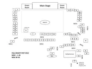
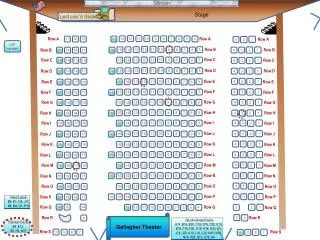
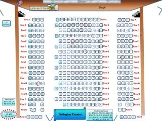
Stage. Screen. Lecturer’s desk. 11. 10. 9. 8. 7. 6. 5. 2. 14. 13. 12. 4. 3. 1. Row A. 14. 13. 12. 11. 10. 9. 6. 8. 7. 5. 4. 3. 2. 1. Row B. 28. 27. 26. 23. 25. 24. 22. Row C. 7. 6. 5. Row C. 2. 4. 3. 1. 21. 20. 19. 18. 17. 16. 13. Row C. 15.

E N D
Stage Screen Lecturer’s desk 11 10 9 8 7 6 5 2 14 13 12 4 3 1 Row A 14 13 12 11 10 9 6 8 7 5 4 3 2 1 Row B 28 27 26 23 25 24 22 Row C 7 6 5 Row C 2 4 3 1 21 20 19 18 17 16 13 Row C 15 14 12 11 10 9 8 22 27 28 26 25 24 23 Row D 1 Row D 6 21 20 19 18 17 16 13 7 5 4 3 2 15 14 12 11 10 9 8 Row D Row E 28 27 26 22 Row E 23 25 24 7 6 5 1 2 4 3 Row E 21 20 19 18 17 16 13 15 14 12 11 10 9 8 Row F 28 27 26 23 25 24 22 Row F 1 6 21 20 19 18 17 16 13 7 5 4 3 2 15 14 12 11 10 9 8 Row F Row G 22 27 28 26 25 24 23 7 6 5 1 Row G 2 4 3 Row G 21 20 19 18 17 16 13 15 14 12 11 10 9 8 Row H 28 27 26 22 23 25 24 Row H 6 21 20 19 18 17 16 13 7 5 4 3 2 1 15 14 12 11 10 9 8 Row H Row J 28 27 26 23 25 24 22 7 6 5 Row J 2 4 3 1 Row J 21 20 19 18 17 16 13 15 14 12 11 10 9 8 22 27 28 26 25 24 23 6 21 20 19 18 17 16 13 7 5 4 3 2 1 15 14 12 11 10 9 8 Row K Row K Row K 28 27 26 22 23 Row L 25 24 21 20 19 18 17 16 13 6 15 14 12 11 10 9 8 Row L 7 5 4 3 2 1 Row L 28 27 26 22 23 Row M 25 24 21 20 19 18 17 16 13 6 12 11 10 9 8 Row M 7 5 4 3 2 1 Row M table • Projection Booth 14 13 2 1 table 3 2 1 3 2 1 Modern Languages ML350 Renumbered R/L handed broken desk
Please click in My last name starts with a letter somewhere between A. A – D B. E – L C. M – R D. S – Z
Use this as your study guide By the end of lecture today1/31/12. Questionnaire design and evaluation Correlational methodology Dot Plots Frequency Distributions - Frequency Histograms Frequency, cumulative frequency Relative frequency, cumulative relative frequency Guidelines for constructing frequency distributions
Schedule of readings Before next exam: Please read chapters 1 - 4 & Appendix D & E in Lind Please read Chapters 1, 5, 6 and 13 in Plous Chapter 1: Selective Perception Chapter 5: Plasticity Chapter 6: Effects of Question Wording and Framing Chapter 13: Anchoring and Adjustment
MGMT 276: Statistical Inference in ManagementRoom 350 Modern LanguagesSpring, 2012 Welcome Remember to hold onto homework until we have a chance to cover it http://www.youtube.com/watch?v=Ahg6qcgoay4&watch_response
Homework due - (February 2nd) On class website: please print and complete homework worksheet #4 Please double check – Allcell phones other electronic devices are turned off and stowed away
Review of Homework Worksheet Must be complete and must be stapled
Peer review Please exchange questionnaires with someone (who has same TA as you) and complete the peer review handed out in class You have 10 minutes Peer review is an important skill in nearly all areas of business and science. Please strive to provide productive, useful and kind feedback as you complete your peer review
Review of Homework Worksheet Hand in the peer review with the questionnaire *Hand them in together*
Descriptive vs inferential statistics Descriptive statistics - organizing and summarizing data Inferential statistics - generalizing beyond actual observations making “inferences” based on data collected
Descriptive or inferential? Descriptive statistics - organizing and summarizing data Inferential statistics - generalizing beyond actual observations making “inferences” based on data collected What is the average height of the basketball team? Measured all of the players and reported the average height Measured only a sample of the players and reported the average height for team In this class, percentage of students who support the death penalty? Measured all of the students in class and reported percentage who said “yes” Measured only a sample of the students in class and reported percentage who said “yes” Based on the data collected from the students in this class we can conclude that 60% of the students at this university support the death penalty Measured all of the students in class and reported percentage who said “yes”
Descriptive or inferential? Descriptive statistics - organizing and summarizing data Inferential statistics - generalizing beyond actual observations making “inferences” based on data collected Men are in general taller than women Measured all of the citizens of Arizona and reported heights Shoe size is not a good predictor of intelligence Measured all of the shoe sizes and IQ of students of 20 universities Blondes have more fun Asked 500 actresses to complete a happiness survey The average age of students at the U of A is 21 Asked all students in the fraternities and sororities their age
Descriptive vs inferential statistics Descriptive statistics - organizing and summarizing data Inferential statistics - generalizing beyond actual observations making “inferences” based on data collected To determine this we have to consider the methodologies used in collecting the data
Time series versus cross-sectional comparisons: Trends over time versus a snapshot comparison Time series design: Each observation represents a measurement at some point in time. Repeated measurements allow us to see trends. This is similar to longitudinal design. Cross-sectional design: Each observation represents a measurement at some point in time. Comparing across groups allows us to see differences. Traffic accidents Please note: Any one piece of data can often (not always) be used in either a time series comparison or a cross-sectional comparison. It depends how you set up your question. Does Tucson or Albuquerque have more traffic accidents (they have similar population sizes)? Does Tucson have more traffic accidents as the year ends and winter approaches?
Time series versus cross-sectional comparisons: Trends over time versus a snapshot comparison Time series design: Each observation represents a measurement at some point in time. Repeated measurements allow us to see trends. Cross-sectional design: Each observation represents a measurement at some point in time. Comparing across groups allows us to see differences. Unemployment rate Is there an increase in workers calling in sick as the summer months approach? Do more young workers call in sick than older workers? Grade point average (GPA) Does GPA tend to go up or down as students move from freshman to sophomores to juniors to seniors? Does GPA tend to go up or down when you compare Mr. Chen’s class with Mr. Frank’s Freshman English classes?
Of these republican candidates “Who is your favorite candidate?” A - Rick Perry B - Mitt Romney C - Ron Paul D - Michelle Bachman E - Herman Cain F - Newt Gingrich G - No preference
Simple Frequency Table – Qualitative Data We asked 100 Republicans “Who is your favorite candidate?” • Number expected to vote • 6,380,000 • 3,740,000 • 2,860,000 • 2,200,000 • 880,000 • 880,000 • 5,060,000 Who is your favorite candidate Candidate Frequency Rick Perry 29 Mitt Romney 17 Ron Paul 13 Michelle Bachman 10 Herman Cain 4 Newt Gingrich 4 No preference 23 Relative Frequency .2900 .1700 .1300 .1000 .0400 .0400 .2300 • Percent • 29% • 17% • 13% • 10% • 4% • 4% • 23% If 22 million Republicans voted today how many would vote for each candidate? Just divide each frequency by total number Just multiply each relative frequency by 22 million Just multiply each relative frequency by 100 Please note: 29 /100 = .2900 17 /100 = .1700 13 /100 = .1300 4 /100 = .0400 Please note: .2900 x 22m = 6,667k .1700 x 22m = 3,740k .1300 x 22m = 2,860k .0400 x 22m= 880k Please note: .2900 x 100 = 29% .1700 x 100 = 17% .1300 x 100 = 13% .0400 x 100 = 4% Data based on Gallup poll on 8/24/11
Describing Data Visually Lists of numbers too hard to see patterns 14 17 20 25 21 29 16 25 27 18 16 13 11 21 19 24 20 11 20 28 16 13 17 14 14 16 8 17 17 11 11 14 17 19 24 8 16 12 25 9 20 17 11 14 16 18 22 14 18 23 12 15 10 13 15 11 11 8 11 14 17 19 24 8 12 14 17 20 25 9 12 15 17 20 25 10 13 15 17 20 25 11 13 16 17 20 27 11 13 16 17 21 28 11 14 16 18 21 29 11 14 16 18 22 11 14 16 18 23 11 14 16 19 24 Organizing numbers helps Graphical representation even more clear This is a dot plot
Describing Data Visually 8 12 14 17 19 24 8 12 14 17 20 25 9 13 15 17 20 25 10 13 15 17 20 25 11 13 16 17 20 27 11 13 16 17 21 28 11 14 16 18 21 29 11 14 16 18 22 11 14 16 18 23 11 14 16 19 24 Measuring the “frequency of occurrence” Then figure “frequency of occurrence” for the bins We’ve got to put these data into groups (“bins”)
Frequency distributions Frequency distributions an organized list of observations and their frequency of occurrence How many kids are in your family? What is the most common family size?
Another example: How many kids in your family? Number of kids in family 1 3 1 4 2 4 2 8 2 14 14 4 2 1 4 2 3 2 1 8
Frequency distributions Number of kids in family 1 3 1 4 2 4 2 8 2 14 How many kids are in your family? What is the most common family size? Crucial guidelines for constructing frequency distributions: 1. Classes should be mutually exclusive: Each observation should be represented only once (no overlap between classes) Wrong 0 - 5 5 - 10 10 - 15 Correct 0 - 4 5 - 9 10 - 14 Correct 0 - under 5 5 - under 10 10 - under 15 2. Set of classes should be exhaustive: Should include all possible data values (no data points should fall outside range) Correct 0 - 3 4 - 7 8 - 11 12 - 15 Wrong 0 - 3 4 - 7 8 - 11 No place for our family of 14!
Frequency distributions Number of kids in family 1 3 1 4 2 4 2 8 2 14 How many kids are in your family? What is the most common family size? Crucial guidelines for constructing frequency distributions: 3. All classes should have equal intervals (even if the frequency for that class is zero) Correct 0 - 4 5 - 9 10 - 14 Wrong 0 - 4 8 - 12 14 - 19 Correct 0 - under 5 5 - under 10 10 - under 15 missing space for families of 5, 6, or 7
8 12 14 17 19 24 8 12 14 17 20 25 9 13 15 17 20 25 10 13 15 17 20 25 11 13 16 17 20 27 11 13 16 17 21 28 11 14 16 18 21 29 11 14 16 18 22 11 14 16 18 23 11 14 16 19 24 4. Selecting number of classes is subjective Generally 5 -15 will often work How about 6 classes? (“bins”) How about 16 classes? (“bins”) How about 8 classes? (“bins”)
8 12 14 17 19 24 8 12 14 17 20 25 9 13 15 17 20 25 10 13 15 17 20 25 11 13 16 17 20 27 11 13 16 17 21 28 11 14 16 18 21 29 11 14 16 18 22 11 14 16 18 23 11 14 16 19 24 5. Class width should be round (easy) numbers Lower boundary can be multiple of interval size Remember: This is all about helping readers understand quickly and clearly. Clear & Easy 8 - 11 12 - 15 16 - 19 20 - 23 24 - 27 28 - 31 Round numbers: 5, 10, 15, 20 etc or 3, 6, 9, 12 etc • 6. Try to avoid open ended classes • For example • 10 and above • Greater than 100 • Less than 50
Let’s do one Scores on an exam 82 58 64 80 75 72 87 73 88 94 84 78 93 69 70 60 53 84 76 87 84 61 89 95 87 91 75 99 53 58 60 61 64 69 70 72 73 75 75 76 78 80 82 84 84 84 87 87 87 88 89 91 93 94 95 99 Step 1: List scores Step 2: List scores in order Step 3: Decide whether grouped or ungrouped If less than 10 groups, “ungrouped” is fine If more than 10 groups, “grouped” might be better How to figure how many values Largest number - smallest number + 1 99 - 53 + 1 = 47 Step 4: Generate number and size of intervals (or size of bins) If we have 6 bins – we’d have intervals of 8 Sample size (n) 10 – 16 17 – 32 33 – 64 65 – 128 129 - 255 256 – 511 512 – 1,024 Number of classes 5 6 7 8 9 10 11 Let’s just try it and see which we prefer… Whaddya think? Would intervals of 5 be easier to read?
Scores on an exam 82 58 64 80 75 72 87 73 88 94 84 78 93 69 70 60 53 84 76 87 84 61 89 95 87 91 75 99 Scores on an exam Score Frequency 93 - 100 4 85 - 92 6 77- 84 6 69 - 76 7 61- 68 2 53 - 60 3 Scores on an exam Score Frequency 95 - 99 2 90 - 94 3 85 - 89 5 80 – 84 5 75 - 79 4 70 - 74 3 65 - 69 1 60 - 64 3 55 - 59 1 50 - 54 1 53 58 60 61 64 69 70 72 73 75 75 76 78 80 82 84 84 84 87 87 87 88 89 91 93 94 95 99 Let’s just try it and see which we prefer… 6 bins Interval of 8 10 bins Interval of 5 Scores on an exam Score Frequency 95 - 99 2 90 - 94 3 85 - 89 5 80 – 84 5 75 - 79 4 70 - 74 3 65 - 69 1 60 - 64 3 55 - 59 1 50 - 54 1 Remember: This is all about helping readers understand quickly and clearly.
Scores on an exam 82 58 64 80 75 72 87 73 88 94 84 78 93 69 70 60 53 84 76 87 84 61 89 95 87 91 75 99 Scores on an exam Score Frequency 95 - 99 2 90 - 94 3 85 - 89 5 80 – 84 5 75 - 79 4 70 - 74 3 65 - 69 1 60 - 64 3 55 - 59 1 50 - 54 1 Let’s make a frequency histogram using 10 bins and bin width of 5!!
Scores on an exam 82 58 64 80 75 72 87 73 88 94 84 78 93 69 70 60 53 84 76 87 84 61 89 95 87 91 75 99 Step 6: Complete the Frequency Table Scores on an exam Score Frequency 95 - 99 2 90 - 94 3 85 - 89 5 80 – 84 5 75 - 79 4 70 - 74 3 65 - 69 1 60 - 64 3 55 - 59 1 50 - 54 1 RelativeCumulative Frequency 1.0000 .9285 .8214 .6428 .4642 .3213 .2142 .1785 .0714 .0357 Relative Frequency .0715 .1071 .1786 .1786 .1429 .1071 .0357 .1071 .0357 .0357 Cumulative Frequency 28 26 23 18 13 9 6 5 2 1 Just adding up the relative frequency data from the smallest to largest numbers Please note: Also just dividing cumulative frequency by total number 1/28 = .0357 2/28 = .0714 5/28 = .1786 6 bins Interval of 8 Just adding up the frequency data from the smallest to largest numbers Just dividing each frequency by total number to get a ratio (like a percent) Please note: 1 /28 = .0357 3/ 28 = .1071 4/28 = .1429
Scores on an exam 82 58 64 80 75 72 87 73 88 94 84 78 93 69 70 60 53 84 76 87 84 61 89 95 87 91 75 99 Where are we? Scores on an exam Score Frequency 95 - 99 2 90 - 94 3 85 - 89 5 80 – 84 5 75 - 79 4 70 - 74 3 65 - 69 1 60 - 64 3 55 - 59 1 50 - 54 1 Relative Frequency .0715 .1071 .1786 .1786 .1429 .1071 .0357 .1071 .0357 .0357 Cumulative Rel. Freq. 1.0000 .9285 .8214 .6428 .4642 .3213 .2142 .1785 .0714 .0357 Cumulative Frequency 28 26 23 18 13 9 6 5 2 1 Cumulative Frequency Data Cumulative Frequency Histogram
55 - 59 75 - 79 50 - 54 60 - 64 80 - 84 95 - 99 70 - 74 85 - 89 65 - 69 90 - 94 Score on exam Scores on an exam 82 58 64 80 75 72 87 73 88 94 84 78 93 69 70 60 53 84 76 87 84 61 89 95 87 91 75 99 Step 1: List scores Step 2: List scores in order Step 3: Decide grouped Step 4: Decide 10 for # bins (classes) 5 for bin width (interval size) Step 5: Generate frequency histogram Scores on an exam Score Frequency 95 - 99 2 90 - 94 3 85 - 89 5 80 – 84 5 75 - 79 4 70 - 74 3 65 - 69 1 60 - 64 3 55 - 59 1 50 - 54 1 6 5 4 3 2 1
55 - 59 75 - 79 50 - 54 60 - 64 80 - 84 95 - 99 70 - 74 85 - 89 65 - 69 90 - 94 Score on exam Scores on an exam 82 58 64 80 75 72 87 73 88 94 84 78 93 69 70 60 53 84 76 87 84 61 89 95 87 91 75 99 Generate frequency polygon Plot midpoint of histogram intervals Connect the midpoints Scores on an exam Score Frequency 95 - 99 2 90 - 94 3 85 - 89 5 80 – 84 5 75 - 79 4 70 - 74 3 65 - 69 1 60 - 64 3 55 - 59 1 50 - 54 1 6 5 4 3 2 1
55 - 59 75 - 79 50 - 54 60 - 64 80 - 84 95 - 99 70 - 74 85 - 89 65 - 69 90 - 94 Score on exam Scores on an exam 82 58 64 80 75 72 87 73 88 94 84 78 93 69 70 60 53 84 76 87 84 61 89 95 87 91 75 99 Generate frequency ogive (“oh-jive”) Frequency ogive is used for cumulative data Plot midpoint of histogram intervals Connect the midpoints Scores on an exam Score 95 – 99 90 - 94 85 - 89 80 – 84 75 - 79 70 - 74 65 - 69 60 - 64 55 - 59 50 - 54 30 Cumulative Frequency 28 26 23 18 13 9 6 5 2 1 25 20 15 10 5
Pareto Chart: Categories are displayed in descending order of frequency
Stacked Bar Chart: Bar Height is the sum of several subtotals
Simple Line Charts: Often used for time series data (continuous data)(the space between data points implies a continuous flow) Note: For multiple variables lines can be better than bar graph Note: Fewer grid lines can be more effective Note: Can use a two-scale chart with caution
Pie Charts: General idea of data that must sum to a total(these are problematic and overly used – use with much caution) Exploded 3-D pie charts look cool but a simple 2-D chart may be more clear Exploded 3-D pie charts look cool but a simple 2-D chart may be more clear Bar Charts can often be more effective
Thank you! See you next time!!