Download
1 / 3
30 likes | 190 Views
Masthead: The masthead is a font that looks as though it has been shattered relating to the genre of rock. The font is in white which is quite a contrast from the theme as white is associated with angelic behaviour whereas rock is seen as the opposite.

E N D
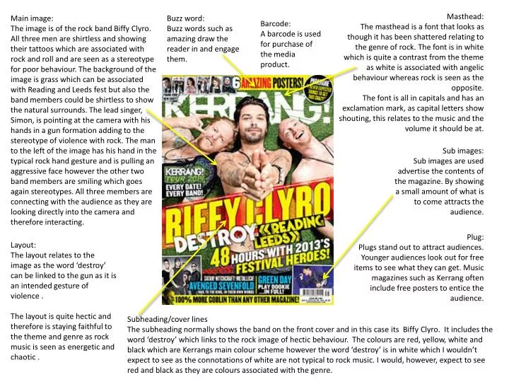
Masthead: The masthead is a font that looks as though it has been shattered relating to the genre of rock. The font is in white which is quite a contrast from the theme as white is associated with angelic behaviour whereas rock is seen as the opposite. The font is all in capitals and has an exclamation mark, as capital letters show shouting, this relates to the music and the volume it should be at. Main image: The image is of the rock band Biffy Clyro. All three men are shirtless and showing their tattoos which are associated with rock and roll and are seen as a stereotype for poor behaviour. The background of the image is grass which can be associated with Reading and Leeds fest but also the band members could be shirtless to show the natural surrounds. The lead singer, Simon, is pointing at the camera with his hands in a gun formation adding to the stereotype of violence with rock. The man to the left of the image has his hand in the typical rock hand gesture and is pulling an aggressive face however the other two band members are smiling which goes again stereotypes. All three members are connecting with the audience as they are looking directly into the camera and therefore interacting. Buzz word: Buzz words such as amazing draw the reader in and engage them. Barcode: A barcode is used for purchase of the media product. Sub images: Sub images are used advertise the contents of the magazine. By showing a small amount of what is to come attracts the audience. Plug: Plugs stand out to attract audiences. Younger audiences look out for free items to see what they can get. Music magazines such as Kerrang often include free posters to entice the audience. Layout: The layout relates to the image as the word ‘destroy’ can be linked to the gun as it is an intended gesture of violence . The layout is quite hectic and therefore is staying faithful to the theme and genre as rock music is seen as energetic and chaotic . Subheading/cover lines The subheading normally shows the band on the front cover and in this case its Biffy Clyro. It includes the word ‘destroy’ which links to the rock image of hectic behaviour. The colours are red, yellow, white and black which are Kerrangsmain colour scheme however the word ‘destroy’ is in white which I wouldn’t expect to see as the connotations of white are not typical to rock music. I would, however, expect to see red and black as they are colours associated with the genre.
The largest text on this page is the word ‘contents’ to show the reader which page they are on. This is also the opposite way round than the other titles on this page as the background is black and the font is in yellow, this shows a difference and therefore the reader is drawn to this. Below this in capitals there is a heading that reads ‘this week’ this sums up what will be in this issue of Kerrang and the page numbers are clearly included for convince for the reader. On this page, there is a quote from a band member of the popular rock band Metallica, this interests the reader and incises them to want to know more. There are many images but one larger image so the reader can see that will be the largest article and it is shown on which page to find this. A clear colour scheme has been established; white, black and yellow. The black and yellow theme is throughout the magazine to create a relationship between the pages. Black and yellow are often associated with danger which is faithful to the genre of magazine as rock can be seen as quite threatening. In the top left hand corner of the page there is a image of the front cover included to insure the reader knows which issue they are reading. To go along with the images of bands/band members, the names of these people are in bold, capital letters to make it clear who the are. It is also made extremely clear of the page the article is as the number is in black lettering with a yellow background insuring it is easy to read.
The image takes up about 75% of the page with only a small part of the right page actually being a written article this is to indicate the importance of the signer, he is the front man of the band and by the other members not being included shows he is possibly the most valued member. The image itself is a contrast as the singer, Simon, is looking into a mirror with a rather expressionless face however his reflection is a shouting face which can be linked to the heading ‘demons be gone.’ The point of view of the image is interesting as the reader looks at him, who is looking at himself in the mirror however the reflection is looking back at the reader creating a third eye effect and a connection with the reader. In the image, Simon is shirtless which shows his tattoos. This fits with the theme as tattoos are seen as a rock and roll stereotype however being shirtless can also mean a connection on more of a personal level. The contrast in this image is interesting because the message is quite dark as the word ‘demon’ is used however the image is light as lighter colours are used. The colours featured on this page are white, black and red. The read and black fit with the overall theme of the magazine however the white is to contrast the darker colours. The red can be linked to the word ‘demons’ as they are associated with the colour red or possibly Hell which also has connotations of red. The red could also be a contrast with the white as white is seen as an angelic and pure colour whereas red is seen as the opposite. The font of this page is interesting as the headline and the name of the band are the same font to create a connection. The text uses drop caps with the letter ‘I’ to create a personal link this is also for the audience as this is a technique that has been seen throughout life in books such as fairytales and therefore is familiar.