Download
1 / 2
40 likes | 585 Views
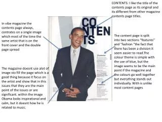
CONTENTS: I like the title of the contents page as its original and its different from other magazine contents page titles. In vibe magazine the contents page always, contrates on a single image which most of the time the same artist that is on the front cover and the double page spread.

E N D
CONTENTS: I like the title of the contents page as its original and its different from other magazine contents page titles. In vibe magazine the contents page always, contrates on a single image which most of the time the same artist that is on the front cover and the double page spread The content page is split into two sections “features” and “fashion “the fact that there has been a division it seem easier to read.Thecolour theme is simple with the use of blue, but the image seems to be the main point if the magazine and the colours go well together but everything stands out individually. With is unlike most content pages The magazine doesnt use alot of image sto fill the page which is a good thing because it focus on the artist and show that in this issues that they are the main point of the issues or are significant. within the image Obama looks inspirational and calm, but it doesnt how he is related to music.
The image show Lupe fiasco in a more home element and shows a more relaxed side to him making the reader feel more friendly towards him the image effectively takes up a whole page The style of text and colour scheme of the article is throughout the article. The gold could portrait that Fiasco is successful along with his gold watch to show that his that has come from a poor background is now a great role model and inspirer people from his demographic. his glasses could represent intelligence and that his used his mind to make himself a great aspect in the music industry The use of language in the article steps away from conventions of hip-hop by avoiding use of slang and jargon The target audience for this article will be aspiring young 16+ boys as Lupe fiasco is known to live the ghetto life style but is portraying the lifestyle of a gangster rapper from a low demographic in society making him in a way a role model for young boys to look up to. The use of different sizes of fonts makes it easy to make the article stand out as the font size used for it is smaller than the rest. The is an even layout creates a balance allowing the audience to have text to read without loading large amounts and subsequently losing images to flick over . The black background he tracksuit top could illustrate that his hasn’t forgotten his tough and rough time from his neighbourhood, and is a way celebrating that a guy from his area of life can make it in and become something great in music even though he has had a dark past. The article takes on an autobiographical tone explaining the history of the artist and his future ambitions. This doesn’t allow the reader to reach out as a close friend it still allows the content of the article to be given across this suggests that the reader is addressed more as a fan than a friend keeping with the formality of the article.