Download
1 / 32
320 likes | 518 Views
Principles of Design. Richard Knowlton Michigan Avenue Academy. What is Design?. Because our yearbook needs to be visually appealing, we need good design. Essentially, design refers to the overall aesthetic of a page (The way a page looks to the viewer.)

E N D
Principles of Design Richard Knowlton Michigan Avenue Academy
What is Design? • Because our yearbook needs to be visually appealing, we need good design. • Essentially, design refers to the overall aesthetic of a page (The way a page looks to the viewer.) • This includes things like where items are placed on a page, spacing of pictures, font choices, etc. • All of these together make our layout design.
From Journalism to Yearbook… Good design helps us go from this… To this… This is the text of a yearbook page, it is boring and non-descript. This is the text of a yearbook page, it is boring and non-descript. We the People of the United States, in Order to form a more perfect Union, establish Justice, insure domestic Tranquility, provide for the common defence, promote the general Welfare, and secure the Blessings of Liberty to ourselves and our Posterity, do ordain and establish this Constitution for the United States of America. This is the text of a yearbook page, it is boring and non-descript. This is the text of a yearbook page, it is boring and non-descript. We the People of the United States, in Order to form a more perfect Union, establish Justice, insure domestic Tranquility, provide for the common defence, promote the general Welfare, and secure the Blessings of Liberty to ourselves and our Posterity, do ordain and establish this Constitution for the United States of America. Defending Freedom By Richard Knowlton T his is the text of a yearbook page, it is awesome and tot- ally cool because of its des- Ign. We the People of the United states in Order to form a more perfect Union, establish Justice, insure domestic Tranquility, provide for the common defence, promote the gen- eralWelfare, and secure the Blessingsof Liberty to ourselves and our Posterity, do ordain and estab- lishthis Const-itutionfor the United States of We the People of the United States, in Order to form a more perfect Union, establish Justice, insure domestic Tranquility, provide for the common defence, promote the general Welfare, and secure the Blessings of Liberty to ourselves and our… 1 But it is more than just adding pictures to a page…
The Beginning…What is good Design? • There are many ideas about what makes a good design. Before we begin we need to ask: • What makes something look interesting?
Reasons… • Is it the color? • Is it the shape? • Is it the size?
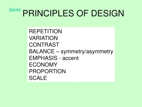
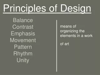
The Four Basic Elements We begin by looking at the four basic elements of design. When we design, paint, sculpt, create, etc., anything, we use these four elements of design. • Balance • Rhythm • Proportion • Dominance
A Note on Composition • Composition is the layout of a particular piece of art. It focuses on how and where things are placed on the canvas. For instance, this Kandinsky.
What is the focal point of this photograph? (Where does your eye go first?)
Balance • Balance is the arrangement of the objects in a given design as it relates to their visual weight (how much space they take up) within a composition. Balance usually comes in two forms: symmetrical and asymmetrical.
Symmetrical • Symmetrical balance occurs when the elements of a piece of art are evenly placed on the canvas. Normally, both sides are exactly equal. • Symmetrical balance is also known as formal balance.
Asymmetrical • Asymmetrical balance occurs elements are NOT evenly placed on the canvas. It involves the arranging objects of different sizes so that they balance one another with their respective visual weights (or size). • Often there is one large object that is offset by many smaller ones. In general, asymmetrical compositions tend to have a greater sense of visual tension. • Asymmetrical balance is also known as informal balance.
Rhythm • Rhythmis the repetition of elements, often with even spaces between them. • Rhythm can create a sense of movement, and can establish pattern and texture. There are many different kinds of rhythm, often defined by the feeling you get when you look at it. • · Regular: A regular rhythm occurs when the spaces between the elements, and often the elements themselves, are similar in size or length. • · Flowing: A flowing rhythm gives a sense of movement • · Progressive: A progressive rhythm shows a sequence of forms through a progression of steps. Like a shape that gets bigger as it moves across the page.
Proportion • Proportion is the comparison of size and number of items on the canvas. • It is the relationship in scale between one element and another, or between a whole object and one of its parts. • Different proportions can relate to different kinds of balance or symmetry, and can help establish visual weight and depth. • In the next examples, notice how the smaller elements seem to recede into the background while the larger elements come to the front.
Dominance/Emphasis • Dominance and emphasis shows us what items stand out in a design. Often what makes a design so amazing is what elements stand out, and what items don’t. • Dominance determines the visual weight of a piece, it establishes space and perspective, and often tells us where the eye goes first when looking at a design. • There are three stages of dominance, each relating to the weight of a particular object within a composition. • Dominant: The object given the most visual weight, the element of primary emphasis that advances to the foreground in the composition. • Sub-dominant: The element of secondary emphasis, the elements in the middle ground of the composition. • · Subordinate: The object given the least visual weight, the element of tertiary emphasis that recedes to the background of the composition. • In this example, the trees act as the dominant element, the house and hills as the secondary element, and the mountains as the third element.
In the End… • What will our yearbook pages look like? • What will we chose to make stand out? • What theme will we choose, and how will our design reflect that theme? • Who will want the job of layout and design editor this year? What creative designs will make this our best yearbook yet? • We’ve only just begun…