Download
1 / 1
10 likes | 116 Views
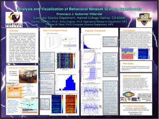
Disaster Likelihood. Payoff (Max=100). Evacuation Button. Red Zone is possible disaster strike range. Analysis and Visualization of Behavioral Network Science Experiments. Francisco J. Gutierrez-Villarreal Computer Science Department, Hartnell College , Salinas, CA 93908

E N D
Disaster Likelihood Payoff (Max=100) Evacuation Button Red Zone is possible disaster strike range Analysis and Visualization of Behavioral Network Science Experiments Francisco J. Gutierrez-VillarrealComputer Science Department, Hartnell College, Salinas, CA 93908 David L. Alderson, Ph.D, Emily Craparo, Ph.D, Operations Research Department, NPS Thomas W. Otani, Ph.D, Computer Science Department, NPS Conclusions Data Processing & Analysis Overview This project involved analyzing the results of a series of behavioral experiments conducted by researchers at the Naval Postgraduate School (NPS) and at the University of California, Santa Barbara (UCSB). The experiment involved individuals within a community deciding if and when to evacuate from a pending natural disaster. The primary objective of this project was to understand the way in which individual decision makers use and share information, and how this information leads to collective action of the group as a whole. Raw data was processed using the Python computer language in order to obtain information about the influence of personal networks on individual and group behavior. Matplotlib, a Python library, was used to graphically represent subject behaviors and experiment outcomes. • Analysis (Continued) Most players disregarded the social network tab and instead focused on the disaster probability tab. This can be seen in the following graphs. The graph on the left shows the payoff distributions for all possible number of neighbor counts for all games. There is no clear correlation between neighbor counts and performance. The graph on the right shows the clicking activity for each player for each game and lists players by their performance (highest rank first). As the graph shows, there were players who did well and were not very active, and others who were active that did poorly. Since clicking activity is strongly associated with neighbor node clicks, the graphs indicate that group behavior did not heavily influence individual decision makers. Log Files, 1 per game (all players) 21 TAB_SWITCH Social Information 0 21 NODE_PRESS 28 113 21 NODE_RELEASE 28 185 21 TAB_SWITCH Disaster Information 1669 18 NODE_PRESS 43 1747 18 NODE_RELEASE 43 1842 14 TAB_SWITCH Social Information 1877 17 TAB_SWITCH Social Information 2197 18 NODE_PRESS 43 2201 03 TAB_SWITCH Social Information 2324 18 NODE_RELEASE 43 2505 48 TAB_SWITCH Social Information 2536 38 TAB_SWITCH Social Information 2598 09 TAB_SWITCH Social Information 2734 32 TAB_SWITCH Social Information 2768 14 NODE_PRESS 25 2846 14 NODE_RELEASE 25 2950 43 TAB_SWITCH Social Information 2998 39 TAB_SWITCH Social Information 3004 35 TAB_SWITCH Social Information 3005 18 NODE_PRESS 29 3074 06 TAB_SWITCH Social Information 3147 23 TAB_SWITCH Social Information 3168 18 NODE_RELEASE 29 3242 22 TAB_SWITCH Social Information 3441 14 NODE_PRESS 02 3442 27 TAB_SWITCH Social Information 3447 33 TAB_SWITCH Social Information 3489 14 NODE_RELEASE 02 3534 02 TAB_SWITCH Social Information 3606 09 NODE_PRESS 04 3658 17 NODE_PRESS 09 3698 17 NODE_RELEASE 09 3769 43 NODE_PRESS 32 3833 43 NODE_RELEASE 32 3897 09 NODE_RELEASE 04 3922 Histogram shows click frequency distribution (measured in clicks per second) for all players in all games Color Map that shows each player’s payoff (score) for each game. Rows show players’ scores throughout games. Columns show players’ scores for a single game. Vertical color patterns indicate similar player behaviors in each game. Graphs show the disaster strike probability line (in red), cumulative evacuations as time goes by (blue line), shelter capacity for each game ( black horizontal line), and the point after which a disaster can begin to strike (vertical purple dotted line). One graph of this type was generated for each game. Next Steps • These results are guiding the development of the next round of experiments, to be held at UCSB in October 2012. Experiment: 18 May 2012, UCSB • 50 Players • 47 Games (1 min each) Acknowledgments I would like to thank my mentors, Professors Alderson, Otani, and Craparo from NPS, for sharing their knowledge and experience with me, and for providing patient guidance throughout the project. I would also like to thank Kelly Locke, Andy Newton, Professor Joe Welch, and Pat McNeil from Hartnell College for making this internship possible. Finally, I would like to thank Alison Kerr and Casandra Martin, NPS internship coordinators, for all of their hard work in making the internship program run smoothly, and for helping me navigate through all of the opportunities available at NPS. Histogram shows the distribution of total player scores for all games. (Max Score: 4700) Highest Score Player 10: 2590 points Lowest Score Player 11: 1940 points Average: 2344 points Game Progress Bar Graphs show the disaster probability values that a single player saw for each game (probability values are shown vertically for each game). If a player evacuated in a game, a green or red dot is shown. Green dots indicate that a player made the correct evacuation decision (the disaster hit in that game). Red dots indicate that the player evacuated, but the disaster did not strike. One graph of this type was generated for each player. Player rank as determined by total game scores is shown next to the player’s ID number. Disaster Tab This internship was funded by Strengthening Transfer Pathways (STP) Title V Grant Office of Naval Research (ONR) Multiple University Research Initiative (MURI) on “Next-Generation Network Science” 2008-2013 Social Tab If a player clicks on a neighbor who is in shelter, the bed number occupied by this neighbor is revealed (and stays revealed for the duration of the scenario). Color Maps that show the percentage of time each player spent on each tab for all games. For further information The shelter condition is displayed. The number shown is the highest bed number among those occupied by the neighbors player revealed. H Francisco J. Gutierrez-Villarreal franciscogutierrez@student.hartnell.edu David Alderson, Ph.D. dlalders@nps.edu