Download
1 / 72

E N D
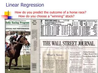
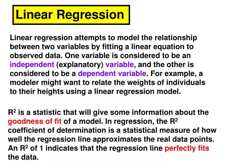
Linear Regression Linear regression attempts to model the relationship between two variables by fitting a linear equation to observed data. One variable is considered to be an independent (explanatory) variable, and the other is considered to be a dependent variable. For example, a modeler might want to relate the weights of individuals to their heights using a linear regression model. R2 is a statistic that will give some information about the goodness of fit of a model. In regression, the R2 coefficient of determination is a statistical measure of how well the regression line approximates the real data points. An R2 of 1 indicates that the regression line perfectly fits the data.
Linear Regression In statistics, the coefficient of determination, denoted R2 and pronounced R squared, indicates how well data points fit a line or curve. It is a statistic used in the context of statistical models whose main purpose is either the prediction of future outcomes or the testing of hypotheses, on the basis of other related information. It provides a measure of how well observed outcomes are replicated by the model, as the proportion of total variation of outcomes explained by the model.
Before attempting to fit a linear model to observed data, a modeler should first determinewhether or not there is a relationship between the variables of interest. This does not necessarily imply that one variable causes the other (for example, higher SAT scores do not cause higher college grades), but that there is some significant association between the two variables.
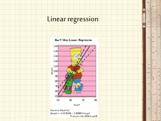
Correlation Statistics – allow one to determine/describe the relationship between variables. a. Linear Regression – Line of best fit used to express the relationship between two variables and predict potential outcomes based on a given value for a variable. The line of best fit follows the familiar equation of y = mx + b, where b is the y intercept and m is the slope of the line. ii. A steep slope indicates a strong effect. iii. A shallow slope indicates a weak effect. iv. A negative slope indicates a negative effect. That is an increase in X results in a decrease in Y. v. The line of best fit can be used to predict a value of one variable given a value for the other variable.
Pearson Product Moment (PPM) Correlation – unit-less value ranging from –1.0 to +1.0 that describes the goodness of fit of the relationship between two variables. i. An |r| value of 1.00 represents a perfect correlation. ii. An |r| value above 0.85 represents a very high correlation. iii. An |r| value of 0.70 – 0.84 represents a high correlation. iv. An |r| value of 0.55 – 0.69 represents a moderate correlation. v. An |r| value of 0.40 – 0.54 represents a low correlation. vi. An |r| value of 0.00 – 0.39 represents no correlation.
A scatterplot can be a helpful tool in determining the strength of the relationship between two variables. If there appears to be no association between the proposed explanatory and dependent variables (i.e., the scatterplot does not indicate any increasing or decreasing trends), then fitting a linear regression model to the data probably will not provide a useful model. Positive correlation Negative correlation No correlation
Scatterplot A scatterplot is a useful summary of a set of bivariate data (two variables), usually drawn before working out a linear correlation coefficient or fitting a regression line. It gives a good visual picture of the relationship between the two variables, and aids the interpretation of the correlation coefficient or regression model.
Each unit contributes one point to the scatterplot, on which points are plotted but not joined. The resulting pattern indicates the type and strength of the relationship between the two variables. The following plots demonstrate the appearance of positively associated, negatively associated, and non-associated variables: Positive correlation Negative correlation No correlation
This scatterplot displays the association between the size of a diamond (in carats) and its retail price (in Singapore dollars) for 48 observations. The scatterplot clearly indicates that there is a positive association between size and price.
A valuable numerical measure of association between two variables is the correlation coefficient, which is a value between -1 and 1 indicating the strength of the association of the observed data for the two variables.
Correlation The strength of the linear association between two variables is quantified by the correlation coefficient. Given a set of observations (x1, y1), (x2,y2),...(xn,yn), the formula for computing the correlation coefficient is given by The correlation coefficient always takes a value between -1 and 1, with 1 or -1 indicating perfect correlation (all points would lie along a straight line in this case).
A positive correlation indicates a positive association between the variables (increasing values in one variable correspond to increasing values in the other variable), while a negative correlation indicates a negative association between the variables (increasing values is one variable correspond to decreasing values in the other variable). A correlation value close to 0 indicates no association between the variables.
Since the formula for calculating the correlation coefficient standardizes the variables, changes in scale or units of measurement will not affect its value. For this reason, the correlation coefficient is often more useful than a graphical depiction in determining the strength of the association between two variables.
Correlation in Linear Regression The square of the correlation coefficient, r², is a useful value in linear regression. This value represents the fraction of the variation in one variable that may be explained by the other variable. Thus, if a correlation of 0.8 is observed between two variables (say, height and weight, for example), then a linear regression model attempting to explain either variable in terms of the other variable will account for 64% of the variability in the data. The correlation coefficient also relates directly to the regression line Y = a + bX for any two variables. Because the least-squares regression line will always pass through the means of x and y, the regression line may be entirely described by the means, standard deviations, and correlation of the two variables under investigation.
A linear regression line has an equation of the form: x is the independent variable y is the dependent variable b is slope of the line is b m is the intercept (the value of y when x = 0)
Least-Squares Regression The most common method for fitting a regression line is the method of least-squares. This method calculates the best-fitting line for the observed data by minimizing the sum of the squares of the vertical deviations from each data point to the line (if a point lies on the fitted line exactly, then its vertical deviation is 0). Because the deviations are first squared, then summed, there are no cancellations between positive and negative values.
Scatter Diagrams and Regression Lines Scatter Diagrams If data is given in pairs then the scatter diagram of the data is just the points plotted on the xy-plane. The scatter plot is used to visually identify relationships between the first and the second entries of paired data.
The scatter plot below represents the age vs. size of a plant. It is clear from the scatter plot that as the plant ages, its size tends to increase. If it seems to be the case that the points follow a linear pattern well, then we say that there is a high linear correlation, while if it seems that the data do not follow a linear pattern, we say that there is no linear correlation. If the data somewhat follow a linear path, then we say that there is a moderate linear correlation.
Given a scatter plot, we can draw the line that best fits the data
1.1.6 Explain that the existence of a correlation does not establish that there is a causal relationship between two variables.. Typically in IB Biology your experiment may involve a continuous independent variable and a continuously variable dependent variable. e.g effect of enzyme concentration on the rate of an enzyme catalyzed reaction. The statistical analysis would set out to test the strength of the relationship (correlation).
There are two tests for correlation: the Pearson correlation coefficient ( r ), and Spearman's rank-order correlation coefficient (rs ). These both vary from +1 (perfect correlation) through 0 (no correlation) to –1 (perfect negative correlation). If your data are continuous and normally-distributed use Pearson, otherwise use Spearman.
What is the Pearson Correlation Coefficient? Correlation between variables is a measure of how well the variables are related. The most common measure of correlation in statistics is the Pearson Correlation (technically called the Pearson Product Moment Correlation or PPMC), which shows the linear relationship between two variables. Two letters are used to represent the Pearson correlation: Greek letter rho (ρ) for a population and the letter “r” for a sample. R2 is a statistic that will give some information about the goodness of fit of a model. In regression, the R2 coefficient of determination is a statistical measure of how well the regression line approximates the real data points. An R2 of 1 indicates that the regression line perfectly fits the data.
Correlation between variables is a measure of how well the variables are related. The most common measure of correlation in statistics is the Pearson Correlation (technically called the Pearson Product Moment Correlation or PPMC), which shows the linear relationship between two variables. Two letters are used to represent the Pearson correlation: Greek letter rho (ρ) for a population and the letter “r” for a sample.
In linear least squares regression with an estimated intercept term, R2 equals the square of the Pearson correlation coefficient between the observed and modeled (predicted) data values of the dependent variable.
What are the Possible Values for the Pearson Correlation? Results are between -1 and 1. A result of -1 means that there is a perfect negative correlation between the two values at all, while a result of 1 means that there is a perfect positive correlation between the two variables. A result of 0 means that there is no linear relationship between the two variables.
What are the Possible Values for the Pearson Correlation? You will very rarely get a correlation of 0, -1 or 1. You’ll get somewhere in between. The closer the value of r gets to zero, the greater the variation the data points are around the line of best fit. High correlation: 0.5 to 1.0 or -0.5 to 1.0 Medium correlation: 0.3 to 0.5 or -0.3 to 0.5 Low correlation: 0.1 to 0.3 or -0.1 to -0.3
In statistics, the Pearson product-moment correlation coefficient (sometimes referred to as the PPMCC or PCC, or Pearson's r) is a measure of the linear correlation (dependence) between two variables X and Y, giving a value between +1 and −1 inclusive. It is widely used in the sciences as a measure of the strength of linear dependence between two variables. It was developed by Karl Pearson from a related idea introduced by Francis Galton in the 1880s.
What Do I Have to Consider When Using the Pearson product-moment correlation? The PPMC does not differentiate between dependent and independent variables. For example, if you are investigating the correlation between a high caloric diet and diabetes, you might find a high correlation of 0.8. However, you could also run a PPMC with the variables switched around (diabetes causes a high caloric diet), which would make no sense. Therefore, as a researcher you have to be mindful of the variables you are plugging in. In addition, the PPMC will not give you any information about the slope of the line — it only tells you whether there is a high correlation.
Real Life Example Pearson correlation is used in thousands of real life situations. For example, scientists in China wanted to know if there was a correlation between spatial distribution and genetic differentiation in weedy rice populations in a study to determine the evolutionary potential of weedy rice.
Real Life Example The graph below shows the observed heterozygosity of weedy rice plotted against the multilocus outcrossing rate. Pearson’s correlation between the two groups was analyzed, showing a significant positive correlation of between 0.783 and 0.895 for weedy rice populations.
Analysis of 4999 Online Physician Ratings Indicates That Most Patients Give Physicians a Favorable Rating Kadry B, Chu LF, Kadry B, Gammas D, Macario A - J. Med. Internet Res. (2011) Figure 2: Pearson correlation comparing overall rating versus staff rating (n = 4999, Pearson correlation, r = .715, P < .001).
Impulsivity, gender, and the platelet serotonin transporter in healthy subjects f1-ndt-6-009: A) Positive correlation between the Bmax and the cognitive complexity factor in men (Pearson correlation = 0.378, P = 0.006). B) Negative correlation between the Kd and the motor impulsivity factor in men (Pearson correlation = −0.673, P = 0.023).
Comparison Between Dynamic Contour Tonometry and Goldmann Applanation Tonometry new method to measure IOP Figure 1: Pearson correlation analysis of intraocular pressure (IOP) measurements obtained by Goldmann tonometry and dynamic contour tonometry (n=451, R=0.853, p<0.001).
Which of these has the highest Pearson coefficient? R=0.987 R=0.999 Fig4: Correlation analysis of the EndoPredict test results in the seven different pathology laboratories. a–g Results of the individual laboratories. h Pearson correlation coefficients
In Excel r is calculated using the formula: = CORREL (X range, Y range) . To calculate rs , first make two new columns showing the ranks (or order) of the X and Y data (either by hand or using Excel's = RANK command), and then calculate the Pearson correlation on the rank data. It is usual to draw a scatter graph of the data whenever a correlation is being investigated.
In the illustrated example the size of breeding pairs of penguins was measured to see if there was correlation between the sizes of the two sexes. The scatter graph and both correlation coefficients clearly indicate a strong positive correlation.
In other words large females do pair with large males. Of course this doesn't say why, but it shows there is a correlation to investigate further.
How to Create a Linear Regression Equation with Microsoft Excel A scatter plot will show you where your points lie will give you a visual clue about whether your data is linear, exponential or some either type of relationship. Therefore, if you aren’t sure your data is linear in nature, create a scatter plot.
Finding a linear regression equation via a scatter plot and a trendline.
If you know that one variable causes the changes in the other variable, then you can use linear regression to investigate the relation. This fits a straight line to the data, and gives the values of the slope and intercept of that line (m and b in the equation y = mx + b). The simplest way to do this in Excel is to plot a scatter graph of the data and use the trend line feature of the graph. Right-click on a data point on the graph, select Add Trend line, and choose Linear. Click on the Options tab, and select Display equation on chart. You can also choose to set the intercept to be zero (or some other value). The full equation with the slope and intercept values are now shown on the chart.
Step 1: Enter your data into an EXCEL file Left column x, right column is y Step 2: Create a scatter plot for your data INSERT / Chart / select XY(scatter) in chart wizard
Step 2: Create a scatter plot for your data INSERT / Chart / select XY(scatter) in chart wizard
Step 3: Click anywhere on the graph. Step 4: Click the “Chart” tab and then chart options to modify things on the graph