Download
1 / 7
70 likes | 233 Views
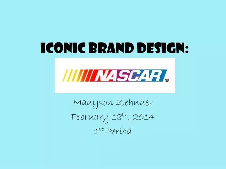
Iconic Brand Design:. Madyson Zehnder February 18 th , 2014 1 st Period. Alignment & Balance.

E N D
Iconic Brand Design: MadysonZehnder February 18th, 2014 1st Period
Alignment & Balance All the letters in the NASCAR logo are aligned in a slanted, italicized pattern. The logo has symmetrical balance because it’s evenly distributed throughout the logo. This gives it more of an appeal and helps your eye focus.
Contrast & Proximity The big, bold letters of the brand are contrasted to be distinctive wherever you may see the logo. The close proximity helps focus and make everything come together as one to strike the eye when looking at it.
Repetition/Consistency • Throughout every version of the design, it’s all the same. The colors, font, direction of the letters.
White Space & Color • Whether the background of the trademark is black or white, the exciting colors will catch your eye. The blue, purple, red, and yellow work together to make everything pop and standout.
Lines and Mass • In the different logos that NASCAR uses for different races and for TV, all the lines in the trademark are bold . The mass of the lines are heavy in the coloring and lettering of the brand.
Z-Pattern & Texture Some of the different logos of NASCAR have texture in them. The NASCAR logo doesn’t really have a Z-Pattern to me.