Download
1 / 23
230 likes | 334 Views
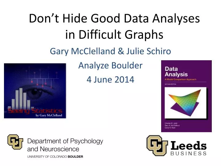
Don’t Hide Good Data Analyses in Difficult Graphs. Gary McClelland & Julie Schiro Analyze Boulder 4 June 2014. Florence Nightingale. “The Passionate Statistician”. John Snow. Charles Minard. 3D Column Chart. “Height of Green Columns”. Blue > Green. Both Answers Correct?.

E N D
Don’t Hide Good Data Analyses in Difficult Graphs Gary McClelland & Julie Schiro Analyze Boulder 4 June 2014
Florence Nightingale “The Passionate Statistician” gary.mcclelland@colorado.edu & julie.schiro@colorado.edu
John Snow gary.mcclelland@colorado.edu & julie.schiro@colorado.edu
Charles Minard gary.mcclelland@colorado.edu & julie.schiro@colorado.edu
3D Column Chart gary.mcclelland@colorado.edu & julie.schiro@colorado.edu
“Height of Green Columns” gary.mcclelland@colorado.edu & julie.schiro@colorado.edu
Blue > Green gary.mcclelland@colorado.edu & julie.schiro@colorado.edu
Both Answers Correct? gary.mcclelland@colorado.edu & julie.schiro@colorado.edu
Green Columns = 5 gary.mcclelland@colorado.edu & julie.schiro@colorado.edu
Same data in 2D gary.mcclelland@colorado.edu & julie.schiro@colorado.edu
But even here… Low contrast where discrimination needed High contrast where not needed gary.mcclelland@colorado.edu & julie.schiro@colorado.edu
Scatterplots from R gary.mcclelland@colorado.edu & julie.schiro@colorado.edu
However DOTS gary.mcclelland@colorado.edu & julie.schiro@colorado.edu
What is the Relationship? gary.mcclelland@colorado.edu & julie.schiro@colorado.edu
Neither helpful nor hurtful Not at all worth it Very worth it gary.mcclelland@colorado.edu & julie.schiro@colorado.edu
Identical graphs, except the red cluster appears in the lower left or upper right gary.mcclelland@colorado.edu & julie.schiro@colorado.edu
Without red clusters - identical gary.mcclelland@colorado.edu & julie.schiro@colorado.edu
With “red” clusters gary.mcclelland@colorado.edu & julie.schiro@colorado.edu
Regression Line Helps gary.mcclelland@colorado.edu & julie.schiro@colorado.edu
Punchlines • “It’s not you, it’s me”: If the decision maker can’t understand your graph, don’t blame the decision maker. Make a better graph. • Unless there really is a 3rd dimension that you really need to display, avoid 3D graphs. • Enhance scatterplots and other graphics from stat programs to help the viewer focus on all of the data, not just some of it. gary.mcclelland@colorado.edu & julie.schiro@colorado.edu
May you make great graphs! Thank you! Gary & Julie gary.mcclelland@colorado.edu & julie.schiro@colorado.edu
Useful Links & Addresses • Gary.mcclelland@colorado.edu • Julie.schiro@colorado.edu • Gary’s ground-breaking but now aging online interactive statistics textbook using Java applets: http://www.seeingstatistics.com • Gary’s data analysis textbook: http://www.dataanalysisbook.com • Gary’s data visualization consulting firm: http://www.bolderstats.com • Java applets for teaching statistical concepts: http://www.seeingstatistics.com/gallery/ [the magic words are ‘model’ and ‘error’] • Steven Johnson’s TED talk about John Snow’s “ghost map”: http://www.ted.com/talks/steven_johnson_tours_the_ghost_map.html • Michael Friendly’s data visualization website, the “Milestones Project” describes and illustrates the ‘Golden Age of Data Graphics’: http://www.datavis.ca • Edward Tufte is usually considered the guru of modern data graphics. His website has LOTs of resources: http://www.edwardtufte.com/tufte/ • This presentation: http://www.bolderstats.com/graphsAB.pptx gary.mcclelland@colorado.edu & julie.schiro@colorado.edu