Download
1 / 13
130 likes | 287 Views
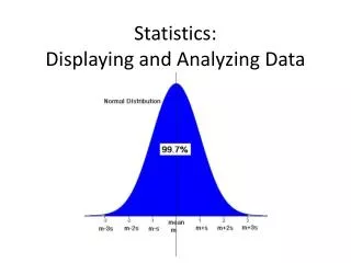
Displaying and Analyzing Data. Chapter 11-1 Notes: Reporting Frequency. Who Remembers Mean, Median, Mode?. The MEAN of a set of data is the sum of the data divided by the number of items (the average) Example: 79 + 42 + 62 + 18 + 54 = 255 = 51

E N D
Displaying and Analyzing Data Chapter 11-1 Notes: Reporting Frequency
Who Remembers Mean, Median, Mode? • The MEAN of a set of data is the sum of the data divided by the number of items (the average) • Example: 79 + 42 + 62 + 18 + 54 = 255 = 51 5 5 • The MEDIAN of a data set is the middle value when the data are arranged in numerical order. • Example: 1 2 2 4 6 6 6 7 8 • The MODE of a data set is the item that occurs most frequently. • Example: 17 16 18 17 16 17 = 17
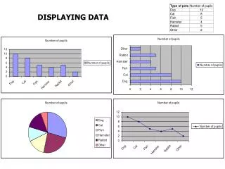
How Can We Report Frequency? • A Frequency Table is a table that lists each item in a data set with the number of times the item occurs. • Let’s look at this example: • Ice Creams sold each day at lunch: 45 48 53 50 46 46 50 51 48 46 45 50 49 46, 51
Try this on your own! • The Numbers below represent the ages of the students in a gymnastics class. • Make a Frequency Table of the data. • 11 5 9 13 8 9 9 11 10 8 6 7 12 11 13 12 7 6 11 12 10 8
Here’s Another way to Display Data: • A LINE PLOT is a graph that shows the shape of a data set by stacking X’s above each data value on a number line. X X X X X X X X X X X X __________________________________________________ 1 2 3 4 5 6 7 8
Let’s Try This One: • For Example: Ty is planning a school garden. He asked his teachers how many rose bushes they would like in the garden. He recorded the data in a frequency table. • Use the Frequency Table to make a Line Plot.
“Rose Bushes Wanted” _____________________________________________________________________ 1 2 3 4 5 6
Investigation!! • Collecting Data: Let’s take a Poll! • AOL’s Top 7 Songs are: • 1. “No One” by Alicia Keys • 2. “Low” feat. T-Pain by Flo Rida • 3. “With You” by Chris Brown • 4. “Yahhh/ Report Card” feat ARAB: Soulja Boy Tell’em • 5. “Our Song” by Taylor Swift • 6. “Crank That (Soulja Boy): Soulja Boy Tell’em • 7. “Crank Dat Batman” by Pop It Off Boyz • Choose A Method to Display the Results!
Does Our Line Plot Agree? ________________________________________ 1 2 3 4 5 6 7
The End • Write your Homework down! • Begin HW if there is time!