Download
1 / 29
290 likes | 462 Views
Sam Crouch. AS Media Production. Planning and Research . PRELIMINARY TASK. Contents Page . 1. 2. 3. 4. 5. 6. 7. 8. 9. 10. 11. 12. 13. 14. Image. Image. Conten t Page Analysis . Image. Image. Image. Image. Message from Editor. Planning. PROJECT PROPOSAL Brief:

E N D
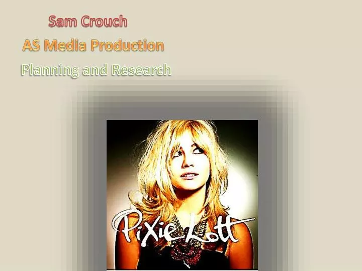
Sam Crouch AS Media Production Planning and Research
Contents Page 1. 2. 3. 4. 5. 6. 7. 8. 9. 10. 11. 12. 13. 14. Image Image Content Page Analysis Image Image Image Image Message from Editor
PROJECT PROPOSAL Brief: Produce a front page, contents page and double page spread of a new music magazine using a minimum of 4 original images. Project Title: GHR Planning: Reconnaissance of locations; organise actors, equipment, props and costumes. Detailed sketches of Front cover, contents page and double page spread. Do a detailed treatment. What research do I need to do into my audience? : Audience questionnaire and survey and summarize findings to define my target audience. What research do I need to do into the Music Press? : To analyse existing music magazines; to carry out secondary research on music press; decode front covers of existing music magazines. Research/analyse music magazines online What technical equipment do I need to use? : Digital camera, tripod, computer: photoshop + word, lighting, powerpoint What do I need to learn about the equipment? ; The dynamics of the digital camera including depth of field, framing and focussing; special effects in photoshop e.g. Blur, opacity, sharpen, feather, drop shadow, outer glow, bevel and emboss, stroke etc. ( Choose others that you know)
Date Issue number Magazine Logo Magazine Name Title Title Background Image Background image Features Subtitle Text Regulars Features Text Features Features Barcode
Magazine logo image image image Introduction to the Interview. Highlights from the text Text Text
Straplines: Feature storylines/headings giving the reader an idea of the promised content. ‘Eminem comes Clean’ is the feature strapline and highlights his fight against drug addiction Sensational story that will grab his core buyers attention. Key image: Eye level, medium shot. Serious facial expressions, intimidating stare, ‘hard’ look from a rapper. Dress Codes: Black vest stop, which is worn in rappers ‘turfs’ and the rosary beads which are prayer beads which are close to a lot of rappers hearts. Use of binary opposites creates extreme contrast, black connotes death & cross connotes rebirth. Composition of Image/location: Pin up, carefully planned publicity shot taken in studio bright artificial lighting. House style: Red, Black & white chromatic are common colours for music magazines, particularly for an issue with a masculine slant. The huge title at the top stands out and the black /red gradients blends connotations of death (black) & danger/passion which reinforces the generic conventions of rap. Chromatic (colour scheme): Black, connotes power and masculinity , and the red connotes danger and Lighting: The lighting is high key, artificial because most of the colours are bright and stand out making him the focal point of the cover. Adverts: ‘The 50 hottest rap blogs ranked’ an unofficial advert promoting other rap artists and their blogs. Brand Values: Aggressive, intimidating, fearless, daring, and empowering which are typical features of a rapper/hip-hip artist. Mode of Address: ‘Speaks’ to its audience in an informal & casual mode of address – talking to its audience in a friendly manner as if they are part of an exclusive club, for example ‘50 Hottest Rap Blogs’. The use of colloquial language to connect with the audience and get them interested and engaged in the magazine. Web address: very common feature nowadays as all magazines have websites so readers can discover more about their products. Media convergence offers the audience a wide range of media formats. Target Audience/Core Buyer: The age of people who would buy this magazine would be around 18+ because it may have bad content in there, also it would generally be for a male gender, but some women would also buy it who enjoy rap. Product details: Issue; Volume 2.
Dress Codes: Casual and informal costume, which relates to rebellious youth, these characters from popular TV programme, typical rock youth rebels. Key Image: Medium 3- Shot of the main Skins charactersmaking direct eye contact with the audience. Composition Of Image: Pin Up Shot – Carefully Planned, Done In Studio. Age: 16-18 Gender: Male/Female all white reinforcing the stereotype of a rocker as it is a white dominated music genre. Chromatic (Colour Scheme): White Background showing purity/innocence which is the complete opposite to how the characters behave as they are rebellious and wild. Lighting: High Key/Artificial Lighting help to make them stand out (focal point of cover) Location: Room with white walls. Title: Big bold yellow serious font text. Anchors key image, helping it to become the focal point of the cover. Price: £2.20 Web Address: http://www.nme.com/ Magazine offers other media formats for consumers to interact with their products – common feature of convergence Tagline: ‘New Musical Express’ unabbreviated format of the title. Mode Of Address: The magazine speaks to it’s audience with direct eye contact from the characters to the reader, inviting the reader to find out more, informal language used that the audience can identify with ‘Sex, Drugs and MySpace’. This reinforces casual lifestyle of rockers. Brand Values/House Style: Casual, Alternative, rebellious, trendy, Styled.
Comparative analysis of two music magazines Title – connotations, appeal The Source – The title from the source magazine connotes a passion for music. I get this impression because it is in big red bold writing. The size of it shows its importance, the title takes up 1/3 of the page which is very common for magazines. Furthermore the colour red connotes its love for music. This is because the colour red can be represented as love, love means you have a passion for something or someone; in this case, it’s a passion for music. This is good because it lets its audience know that they are a good magazine because they put passion into their magazines. The Vibe - the title from the vibe connotes a laid back relaxed sense, I get this impression because the title is in a sunset colour yellow. The colour of it being at sun set gives me the impression of it being relaxed because when you look at the setting it gives you a feeling of a relaxing time. Furthermore, it also shows its importance because the title is very big and clear. The title takes up 1/3 of the screen like most magazines do when publishing their product. The title being this big is good because it shows its consumers that what they do is important, which means that they take care in what they are doing. Audiences like this because they want to buy a product when they know it s good quality and worth spending their money on. Use of colourthe Source - the use of colours that the source use on its magazine front cover are the colours: red/black and white. These colours are good because the red shows its love for music, and the black and white could represent the races of both people who can read this magazine. Doing this widens its market because it is enhancing its market. Vibe – the use of colours that are used in the vibes magazine front cover are: yellow, blue, black and red. These colours are used to emphasize the relaxation of the magazine. This is good because it implies that they are not trying too hard to get audiences to notice them. Furthermore, with these high-key attractive colours, they are very jolly, which could draw its readers in. Use of images
The Source – the source only has one image on its front cover; this image is the key image. It is a mid-shot picture of Kanye West. Kanye West is a top hip-hop artist whom has had several number one selling singles/albums. In this image he looks mysterious; this is a good affect because it could imply to the readers that there is something going on with Kanye, which will be written inside.Vibe – the use of image that the vibe uses is very sexual, this is because the key image is of Mariah Kerry, in a bikini doing a sexual pose. This is different from most vibe magazines because it is usually males who feature on the front cover. Furthermore, of this picture being sexy, could represent that Mariah Kerry has something to say about her love/sexual life, or even as it quotes on the cover ‘ Mariah Kerry hits beach in hills’ which states she is looking for a relaxing break, on the beach... audiences could like to read about this. TaglineThe Source - ‘the magazine of hip hop music culture & politics’ from this tagline the representation is very good. It is very good because it states that it’s not just about being famous and earning money, I get this impression from the words ‘music culture’ and ‘politics’ these words connote that its passion for music is very high because there not just saying music is good, they are saying it’s a culture, it’s a way of living. This shows its dedication to its music it promotes. Which is what audiences like when buying a magazine. More over the word ‘politics’ emphasizes that it isn’t just about the money because politics is a highly talked about subject among not only British but worldwide public. So therefore, it gets respect from the way it talks about important subjects, such as politics. Vibe - Price/frequency/barcodeThe Source – Price £4.10 = $6 / Frequency Weekly / Barcode bottom left hand corner of the magazine front page Vibe – Price £4.10 = $6 / Frequency Weekly / Barcode bottom left hand corner of the magazine front page Backgroundthe source – The background used in the magazine the source is of a distant low-key shot of a city. This is effective because the way it is places is making the key image (Kanye) look more dominant. This is eye catching because the readers might think there is something he has to say, and he is an important artist, so it might be important for the readers to read about it...vibe – the background used in the vibe magazine is a view of the distant sea. This links with the image and a sub title because the sub title says ‘ Mariah Kerry hits beach...’ and Mariah herself is in a bikini. This adds to the effect of a relaxing break because you go to the beach to relax. Again, the key image is placed above the background image, this is to emphasize Mariah’s the main character in this story. Straplines – analyse at least one or twoThe Source – ‘is plastic surgery hip-hops new workout plan?’ this is a good strapline because it has a ‘?’ at the end, which means it is a talking point, but more importantly, it is asking the reader, and the reader doesn’t know so they will want to read the article to find out moreVibe – ‘ the 8 summer jams of 08’ this strapline is good because it is a music magazine, therefore they are going to promote music, therefore, hearing the top 8 tunes of the year will draw in readers to find out what they are...
Essay continued… Text – positioning/colourThe source – the positioning/colour of this magazines text is a very standard structure of a magazine layout. However this is still very successful, this is because it covers up the majority of the page. It is vital that it does this because it fills the page with information that audiences want to see, it stands out catches their eye. The positioning of the text is plotted around the key image, this is done because the key image draws in the audience to see what the text is, and as it is around they key image it will often be associated with them. The colours of the text on this magazine are red ,black and white. These are a good choice of colours because red is often associated with love, which the fans of the magazine want. And the black and white can represent the racial culture to imply that this magazine is not just for one race. Vibe – the positioning of the text in this magazine is roughly the same as the source. All of the text is places around the key image in the centre of the cover. This is done to bring main focus upon the key image, which is what the issue will be about. Furthermore it is placed around the key image to show the audience of what will be in the magazine, most of them will be about the key image artist. The colours of the text used are yellow, black, white and red. The yellow colour is used because the theme of the beach laid-back style of the issue. The red is used to emphasize Mariah Carey’s name, also associated with love to her as red is a representation of love. Furthermore the black and white could be used to show that the magazine is for both races, white and black. This is good because it gives them a wider audience to publish to. How elements work together to create an overall appeal/lookthe source – the elements used in this magazine to create a look/appeal is the way the key image is represented. It is published in a black and white theme; this could be to show audiences that this magazine has been around for a while, from when there was no colour. The look this gives audiences is that they are a successful magazine, and audiences won’t buy a magazine that isn’t of that good quality. Furthermore the dress code that the artist is wearing is a smart casual dress sense. This is good because it implies to the audience that you don’t have to have certain expensive clothes to be able to buy this magazine. Furthermore the posture/pose that the artist is representing is a laid but scene however he is also in a tone of tension. This is to imply the rapper hip-hops representation that they have. Moreover the overall appeal this creates is that you don’t have to look or be like a stereotyped hip-hop rapper to buy this magazine. Furthermore it also implies that if you buy this magazine you are welcome to the community of ‘the hood’ this is good because it enhances the chance of more audience buyers. vibe – there elements used to give a overall look/appeal of this issue. Some of the elements are such as the background of the front page. The background is of the lovely sea and bright blue sky. This gives a representation of a relaxing issue. Furthermore the key image is a sexy image, this could represent that as well as being a laid back magazine it is also has the sexy attraction to it. This is a good technique because as well as Mariah Cary fans, they will also get other audiences buying this issue due to the attraction of the image. This gives an overall appeal because it shows the fact that they don’t just aim to promote to one target audience, that they want to get a variety of audiences involved.
NME MAGAZINE ANALYSIS The NME magazine has been published weekly since March 1952. Was the first British paper to include a singles chart which first appeared in the 14th November 1952 edition. In the 1970’s NME became the best-selling British music magazine. The conclusion I make on IPC, they sell many magazines a year around Britain, and have a vast majority of readers. It gives a lot of agenda setting news, reviews about the weeks best gigs, has a low price tag and is out every week on a Wednesday. I think they changed it to keep up to date with the layouts of other magazines; people were also getting used to reading magazines and also maybe used colours and glossy covers to attract the people to. I think it has won awards as a successful magazine website because they put a lot of news for people on there to keep up to date, also the music charts and music videos and even a radio station to listen to why browsing the website. The target reader of the NME is described as an 'active music purchaser, particularly single tracks' and is also a 'music completest, must have live versions and B sides' I think other ways of media the audience consume things from are places like Facebook, which advertise on their pages, also other magazines and news articles, and even just searching ‘music magazines’ on Google. The March 2008 magazine has the large picture of the band and also bold writing to attract the reader and give a good impression of their magazine by also showing they competitions to win prizes and giving out CD’s and posters to encourage the reader to keep buying. The picture the front is a serious picture of the band and this picture is made serious because the article about them is an angry and serious article. It is also a new band on the front and they try to advertise them on the front so that they sell CD’s and albums, also NME stands for ‘New Music Express’. They use the colour red and white on the font a lot to keep the colour on-going as there’s.
The differences between the two front covers have changed so much in the future. For example on the front on the older one there’s a big space that’s left blank with just a plain background which doesn’t stand out as much as the newer one as there is two people in the picture which feels up the cover and will attract the reader much easier. Also the title ‘NME’ has changed as on the older version the letters aren’t very bold and don’t stand out as much as the newer version which is bold and looks as if it is coming out of the page. There’s also little captions on the front of the new version to tell you about other little stories you will read in the magazine which all stand out because they are written boldly in red compared to the older version which has a little bit of writing over the front page and only tell you the name of the band. The changes that have taken place since 2002 are that they got a new editor in who also brought in new photographers and also brought in a new range of young writers to try and bring in young readers. They started advertising upcoming bands and also less successful bands. I think these changes took place to bring the magazine more up to date with the others and to try bringing in new readers as well. They also done a new redesign to make it look different but keep the stuff the public wanted but make it look even better and giving a goody out. In 2009 the changes and improvements that the NME could make are; making the layout stand out more by colour variety’s and changing the actual layout of the whole magazine. Also on the front cover, they could put a well-known band/singer on their which have a big fan base, and then put the less known groups in there for the little fan bases to read.
Audience Questionnaire • How old are you? • __________________ • 2. What gender are you? (please circle) • MALE FEMALE • 3. What genre of magazine do you prefer reading? • Pop B) Rock C) R&B/Hip-Hop D) Jazz E) All Variety’s • 4. What is your reason for buying a music magazine? (Please explain below) • ______________________________________________________________________________________________________________________________________________________ • 5. Do you think the price you pay for the magazine you read is reasonable? • YES • NO • 6. How often do you buy your magazine? • Once a week B) Fortnightly C) Monthly • 7. What sort of things attracts you to buy the magazine? • Title/ Colour/ Style/ Font/ Other. • 8. If your magazine was released more than once a week would you buy it? • YES • NO
Sam Crouch Music Magazine Evaluation AS Media
In what ways does your music magazine use, develop or challenge forms and conventions of existing music magazines My magazine uses all the common conventions used by music magazines including: large title accompanied by a complimentary tagline, Key image which dominates the page and is the focal point of the cover, this is anchored by the feature strapline (major story of that edition), background, product details ( price, issue, date and barcode), and also the web address of the magazine which is a common feature as post modern media products have website which allow the audience access to more information about their products. This multi-media format access is called convergence as many products and format converge into one another. My magazine reinforces stereotypes of representations of age, ethnicity, gender and class as the grime, hip hop & rap music genre is dominated by young, black, working class males and this is evident in the key image of my magazine cover. Although it slightly challenges stereotypes of ethnicity as one of the band members is Turkish, which is not as common in these music genres. All the artists are making direct eye contact with their readers which is a common generic convention of rap/grime/hip hop reinforcing the arrogant, fearless brand values of their music genre. This direct mode of address is also mixed with an informal and casual mode of address where the magazine uses a friendly manner in communicating to their audience. For example the use of slang and colloquial language which their audience would identify with, ‘ Wiley pops in for a chat’. This is a common generic convention of rap/grime/hip hop magazines. The graffiti background supports the rap/grime/hip hop urban ghetto lifestyle, yet the vibrant chromatic could be seen as challenging the stereotypes of rap/grime and hip hop. Most often the Chromatic is dark and seedy showing the dangerous, ‘hard’ backgrounds that most of these artists originate from.
How does your music magazine represent particular groups? The picture of 3 boys on the front of my magazine are stood facing and staring direct onto the camera to give an intimidating feeling to the reader as that is what most rappers stereotypes are known for. The black rapper on the right develops the typical stereotype of a rapper as most rappers are seen to be ‘moody’ and miserable. Contradicting the normal stereotype, the Turkish rapper in the middle is smiling, this goes against the normal view that rappers are miserable and rude; as he is making direct eye contact with the audience and smiling. By wearing bomber jackets (with hoods)in the photo they are developing the media stereotype of a typical rapper. A typical rapper dresses in casual clothing which mainly contains a hood and suggests connotations of being brought up in an urban environment where sometimes being anonymous is part of survival. Rappers even have there own ‘slang’ which a wide range of the young generation who listen to rap understand. I have used street/contemporary slang so my target audience feel a part of the celebrities lives and feel close to them, this empowers the audience and may lead to being loyal to the new magazine/brand.
Who would be the target audience for your magazine? I have a Blackberry Torch smartphone and I use it a lot for internet and to also download my music for me to listen to when I'm travelling to college or West Ham. The sort of music I am into is some rap, (Eminem, 50 Cent) a lot of hip-hop (Professor Green, Ed Sheeran) and some grime (Wiley, Devlin). My name is Sam Crouch, I’m 17 years old and I was born on the 14th September 1994. I’m currently at college studying Business Studies and Media, but I am looking for an apprenticeship as an electrician at the moment. But as my career I want to be a police officer because it has been a job I’ve always wanted to do since I was a kid. I’m a sporty person and enjoy nearly every sport there is, but my main sport it football. I used to play in goal for a football team but then stopped playing because I enjoyed watching it more, so I‘m now a season ticket holder at West Ham for 6 years and go to every home game and sometimes away games. I have a girlfriend who I have been with for nearly a year now and I spend as much time as possible and have also turned her into a West Ham fan!!! In school holidays I like to go away for the week with my girlfriend to do activity's that we’ve never done before like; go-karting, cliff walking, and trying out different Italians. Some of my most favourite places I like to go is Southend-On-Sea, Hastings & Dymchurch. Although I listen to some sorts of grime, I don’t wear things like snapbacks and chains, but wear things like Ralph Lauren, Lyle & Scott, Chino’s, straight jeans etc…
How did you attract/address your target audience? At the simplest level, by having a bright, bold writing attracts the audience because it stands out and grabs the attention of passers-by. By having a 3 different ethnicity's on the front cover of the magazine it would attract all people to read on, and by using a direct gaze into the camera lens will try to intimidate people in a good way to read the main article and magazine. I used quotes in my magazine, which is in bold, black writing to try and attract the reader to read it, and by reading it they would want to read on to finish what they had started reading. By me using big bold, bright letters in for my strapline it will attract the audiences attention straight away because colours and boldness catch peoples attention. By publishing social network website in my magazine, it may attract peoples attention as the logo’s are seen by the majority of young people and rappers, and most of them have accounts on these sites.
What kind of media institution might distribute your music magazine and why? I would want IPC to distribute my music magazine because they distribute well known magazines such as the NME. The NME has become a unique multi-media platform, distributing new things such as NME.com, NMETV, NME Radio and also there own iTunes app. They also reach an amazing 1 Million music fans each week. NME is the longest published and most respected music source throughout the world and I’d love my magazine GHR to go down the same route as NME and become just as successful. If my magazine was distributed by IPC I would love to still sell GHR as a magazine but then also have a website (GHR.com) for behind the scenes information, videos of rappers and groups and content that is to raw for the magazine market. Id also love to have a TV channel based on just GHR and on weekdays it would be the time to listen to up and coming rappers as well as the modern rappers which have a big fan range. And then on the weekends viewers will be able to own the show by voting which artists videos they would love to watch for an hour at a time, for the whole weekend. Next a radio station for GHR in the coming years would be fantastic, as there would be live performances on air from the likes of Eminem, Drake, 50 Cent, to people who are not well known but have the talent to become as big as the Celeb A- Listers! And then maybe if the rest work out, to try a app for iTunes and Android for users to listen and surf GHR from anywhere in the world, and read the things they want to want when they want.
What have you learnt about the technologies from the process of constructing your music magazine? The first thing that I learnt was how too crop the background from one picture and then add a new background; giving the illusion that the three people shown are somewhere which they are not. I done this by using the magic wand tool (located on the toolbar) too make the original images background disappear. I then added a new layer and inserted another original image that I had taken behind them; giving the audience the illusion that these three young males are in actually standing in front of a graffiti wall rather than just a plain background. I have also learnt how too apply different types of effects to a piece of text that I use. These effects make the text look a lot more advertising and appeal too the reader. Some of them include, inner glow , outer glow, drop shadow, bevel and emboss and many more. You can also select the colour of the affect that you wish too use; as you can see too the picture on the right I have chosen too use the colour red. As well as this you can change the opacity of the effect you are selecting, this means that if it is too harsh or too dull you can change it too suit you. When doing my sub line, I decided that although there are many fonts available too use on Photoshop itself I didn’t not find one that I particularly liked. I ended up looking for one online, and came across one on www.1001fonts.com this website enables you too write out what you would like too try in a certain font and then you can copy it too your destination OR you can download this font straight too your computer so that it is easier too access again. I used a RAP font that I found as I thought it would suit my magazine and target audience.
What do you feel you have learnt in the progression from creating the school magazine (preliminary task), to creating your music magazine? I've learnt how to use Photoshop to different levels which I didn’t know how to do before. For example, on the front page of my music magazine, the picture of the three boys had a white wall as the background, but to try and carry on with the rap stereotype I uploaded a picture of a London Underground Tube with graffiti on it and used it as the background, and to do this I had to crop the white background of the boys and insert my taken picture as the main background image. I also learnt many other skills which I have spoken about on the previous page; but these are all new skills too me and will help me with my future work on Photoshop. By making a contents and a two page spread also taught me more skills on creating new things not just the front page attracts a reader to read, but by carrying on the attraction throughout the magazine to make the reader want to stay. By picking out parts of answers from the interview on my magazine on the two page spread and quoting them with quotation marks, I discovered new ways to communicate with the audience and to persuade them to stay that extra little bit to read on. I also learnt other techniques such as how using certain chromatics throughout my magazine this will keep the reader more enticed, rather than me changing them as I feel. I also learnt how having icons placed around my magazine would attract readers, through social networking sites such as Facebook and many more. I’ve also learnt about the Magazine industry's and what they do. The most known magazine industry's are IPC and Bauer who distribute 100’s of different genres of magazines between them that are well known by people around Britain, and some types of music magazines they distribute are: NME (IPC); Kerrang! (Bauer); Q (Bauer). These two music industry’s also battle it out with there magazines in the market. I have also learnt what it takes for someone too produce a magazine. I have realised that there is a lot of hard work and effort put into doing this, even if its monthly weekly or fortnightly; something that I didn’t have a lot of knowledge on when I first started this media course.