Download
1 / 48
520 likes | 721 Views
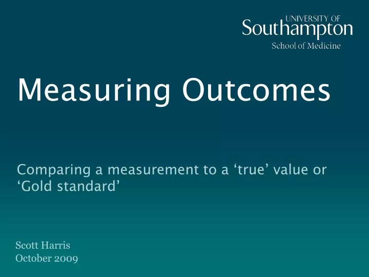
Measuring Outcomes. Comparing a measurement to a ‘true’ value or ‘Gold standard’. Scott Harris October 2009. Setting up your “Zapper”. Press “GO” “4” “1” “GO” on your handset to match the unique frequency for this session.

E N D
Measuring Outcomes Comparing a measurement to a ‘true’ value or ‘Gold standard’ Scott HarrisOctober 2009
Setting up your “Zapper” • Press “GO” “4” “1” “GO” on your handset to match the unique frequency for this session. • You have set it up correctly if an orange-green light is on (for a short period of time), otherwise a red light will show then you will have to try again. • You will be using the handset to answer some questions during this session. • All handsets need to be collected at the end of the session or when you leave the lecture room.
Learning outcomes By the end of this session you should be aware of techniques for assessing the accuracy/precision of measuring the following ‘true’ outcome types with the following measures: • Continuous vs. continuous • Binary vs. binary • Binary vs. continuous
Contents • Introduction • Continuous vs. continuous • The most common mistake • Features of interest (Precision and accuracy) • Setting up a Bland-Altman plot (with examples) • Binary vs. binary • Sensitivity / Specificty • Positive predictive value / Negative predictive value • Binary vs. continuous • Diagnostic tests • Receiver operating characteristic (ROC) curves
Statistical analysis • The full set of statistical analysis techniques are like a cookbook and depending on the ingredients available (the data) only certain analyses will be appropriate. How you record your measurements directly affects the analysis options open to you and this should be considered before data collection. • The statistics section of the RSB course will go through the different tests that are used in different situations with different ‘types’ of data. These sessions will look at associations, relationships and group differences.
Statistical Support Statistical support for SoM PhD students is available from: • Dr Ruth Pickering (rmp@southampton.ac.uk ) • Brian Yuen (hmy@southampton.ac.uk ) • Scott Harris (sharris@southampton.ac.uk ) Up to 3 (1hr) consultations per student.
Types of data • Quantitative – a measured quantity. • Continuous – Measurements from a continuous scale: Height, weight, age. • Discrete – Count data: Children in a family, number of days in hospital. • Qualitative – Assessing a quality. • Ordinal – An order to the data: Likert scale (much worse, worse, the same, better, much better), age group (18-25, 26-30…). • Categorical / Nominal – Simple categories: Blood group (O, A, B, AB). A special case is binary data (two levels): Status (Alive, dead), Infection (yes, no).
Measurement comparison studies • Also known as method comparison studies or measurement error studies. • Can be either a measurement measured a number of times or a number of alternative measures for the same outcome. • Techniques discussed here will focus on only 2 measurements at a time. More advanced techniques do exist looking at repeatability when more than 2 measurements are taken (see a statistician for these).
Measures of a ‘true’ or Gold standard value Aim: To determine the ability of a new test to replicate the score of a ‘true’ or gold standard value accurately and precisely or to distinguish those who have the feature of interest from those who do not. Procedure: • Recruit sample of patients or take a sample of measures in your population of interest. Need to include patients both with and without the outcome of interest if we are dealing with a binary outcome. • All recipients undergo the new test (index test). • Test result is compared against knowledge of true status (reference test or ‘gold standard’ test).
Reference test Reference test = ‘Gold standard’ Often imperfect: • Often invasive or unpleasant (e.g. liver or other biopsy). • May require long term follow-up (may take too long to arrive). • May be resource intensive (time, money etc.) • As close to the truth as possible. (assumed to be the actual truth).
Continuous vs. continuous Accuracy and precision. Bland-Altman plot.
Most common mistake Comparison of European scale peak flow meters with digital spirometer. The most common mistake is that researchers will draw a scatter plot of the two measures against each other and either calculate a correlation or a linear regression. If these results are significant they then conclude agreement between the measures. This would be INCORRECT. The solid red line on the plot shows an approximate line of ‘best fit’. The true line of equivalence is shown with the dotted red line. M. Goyal et al : Comparison of Wright scale and European scale peak flow meters with digital spirometer . The Internet Journal of Pulmonary Medicine. 2008 Volume 9 Number 2
Accuracy Precision • These images illustrate two features of random and systematic errors: • A Random error (measurement error) affects the precision, whereas a systematic error (bias) affects accuracy. • A test score can be highly precise (reliable), without being accurate. • An ideal test score is both accurate and precise.
Producing a Bland-Altman plot • Calculate the mean of your two measures for each observation. • Calculate the difference between your two measures for each observation. • Calculate the mean difference across all observations. • Calculate the Standard deviation of the difference and multiply it by 1.96. • Draw a scatter plot as shown on the next slide:
The mean value is plotted on the x-axis, with the difference on the y-axis. Bland-Altman plot Add in reference lines at the mean difference and the mean difference +/- 1.96xSD. These are then your limits of agreement. If this interval is narrow enough you can conclude agreement between the 2 measures.
The Bland-Altman plot for CUM15, the index that was used to express cough sensitivity in hypertonic saline challenge. Koskela et al.Cough 2008 4:8
Baseline After weight-loss Difference “Bias between the techniques was not observed, as indicated by a non-significant p value (p = 0.648, p = 0.408 and p = 0.665, respectively).” Minderico et al.Nutrition & Metabolism 2006 3:32
Binary vs. binary Sensitivity, specificity, positive and negative predictive values.
Theory: Sensitivity and specificity Sensitivity: Of those with the disease, the proportion with a positive test result. Specificity: Of those without the disease, the proportion with a negative test result. Sensitivity and specificity are inversely related to one another - If the level used to distinguish between a positive and a negative test is shifted, sensitivity and specificity will move in opposite directions.
Theory: Sensitivity Sensitivity = a / (a + c)
Theory: Specificity Specificity = d / (b + d)
Sensitivity & Specificity: Example Sensitivity = a / (a + c) = 62/69 = 89.9% Specificity = d / (b + d) = 34/39 = 87.2%
What does this mean for an individual? • The problem with sensitivity and specificity is that they are not useful for looking at results for individual patients. • If a person has a positive test for some outcome then what we want to say is how likely is it for that person to actually have the outcome. • This is where an alternative, positive and negative predictive values come in: Positive predictive value (PPV): Of those with a positive test result, the proportion who truly have the disease. Negative predictive value (NPV): Of those with a negative test result, the proportion who are truly without the disease.
Theory: Positive predictive value (PPV) PPV = a / (a + b)
Theory: Negative predictive value (NPV) NPV = d / (c + d)
PPV & NPV: Example PPV = a / (a + b) = 62/67 = 92.5% NPV = d / (c + d) = 34/41 = 82.9%
Binary vs. continuous Receiver operating characteristic (ROC) curve, sensitivity, specificity, positive and negative predictive values.
Test Score Perfect diagnostic test performance Cut-off value Normal Diseased Predict as normal Predict as Diseased
Imperfect separation? – Real world! Test value Imperfect test. Is it good enough? Normal Diseased
Imperfect separation? Test value True positives True negatives Normal Diseased
Imperfect separation? Test value False positives False negatives Normal Diseased
Cut point: Maximising Sensitivity Test value Normal Diseased
Cut point: Maximising Specificity Test value Normal Diseased
More ‘Normal’ than ‘Diseased’ Test value Prevalence = All with disease Population False positives False negatives Normal Diseased
Theory: PPV & NPV Whereas sensitivity and specificity were looking at the group truly with the outcome (sensitivity) or the group truly without the outcome (specificity) separately, PPV and NPV look at the ratio of parts of both of these groups. This means that PPV and NPV are linked with prevalence, whereas sensitivity and specificity are not. Low prevalence - The number of negative test results will be much larger than false negatives: NPV very high but not very informative. High prevalence - The number of positive test results will be much larger than false positives: PPV very high but not very informative.
Receiver Operating Characteristic (ROC) curves Quite often we have a continuous value for our new test and we could choose various ‘cuts’ to create a binary prediction of status. An ROC curve demonstrates the effect of varying the cut point on sensitivity and specificity: • Plots a curve of Sensitivity vs. (1 - Specificity) for all cut points that would alter at least one classification. • The top left corner of the plot signifies perfect performance. • Often includes a diagonal line, indicating an uninformative test. • The larger the area under the curve the better the test across the range of cut points. • The nearest one point gets to perfect performance the better the test performance using the single best cut point.
Receiver Operating Characteristic (ROC) curves Perfect performance Better performance
Practical Questions A new test for a disease was evaluated on 50 affected individuals and 50 who were known to be unaffected. The test correctly identified 40 of the affected subjects, but incorrectly classified 5 of the unaffected ones. • What is the sensitivity of the test? • What is the specificity of the test? • What is the positive predictive value of the test? • What is the negative predictive value of the test? • If the real disease prevalence is 2%, how likely is it that someone with a positive test has the disease?
Practical Questions (I to IV) Sensitivity = Specificity = PPV= NPV=
Practical Questions (V) Sensitivity = Specificity = PPV= NPV=
Summary You should now be aware of techniques for assessing the accuracy/precision of measuring the following ‘true’ outcome types with the following measures: • Continuous vs. continuous • Bland-Altman plot • Binary vs. binary • Sensitivity/specificity/PPV/NPV • Binary vs. continuous • ROC curves and sensitivity/specificity/PPV/NPV
References • Bland JM, Altman DG. (1986). Statistical methods for assessing agreement between two methods of clinical measurement. Lancet, i, 307-310. • http://statpages.org/ctab2x2.html • Swets JA, Pickett RM. Evaluation of diagnostic systems. New York: Academic Press,1982. • Langlotz CP. Fundamental measures of diagnostic examination performance: usefulness for clinical decision making and research. Radiology 2003; 228:3-9. • Hanley JA, McNeil BJ. The meaning and use of the area under a receiver operating characteristic (ROC) curve. Radiology 1982; 143:29-36. • Hanley JA, McNeil BJ. A Method of Comparing the Areas under Receiver Operating Characteristic Curves Derived from the Same Cases. Radiology 1983; 148:839-843.