Download
1 / 15
150 likes | 277 Views
Here are top 10 mobile website best practices to make great mobile experience to visitors and convert them into customers.

E N D
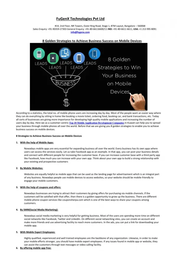
Mobile Website “Top 10 Best Practices” www.zslmobile.com
Why Mobile Website Simple and powerful way to reach customers. Mobile web usage surpassed desktop internet usage. Move on to mobile else large opportunity missed.
Google’s Study About Mobile Websites 67 % of users said mobile friendly sites makes them more likely to buy. 61 % of users said they will move on to other mobile friendly website if they didn’t find what they were looking for on the current website. 52% of users less likely to engage with a company if they had bad mobile experience. 50% of users hesitate to use, even after they like a business, if the website isn't mobile-friendly.
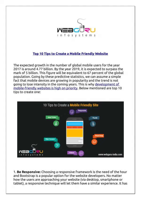
How to make a great mobile experience to turn visitors into customers ? Here are Top 10 Best Mobile Website Practices >>
#1 Keep it Quick Keep in mind that mobile users might use their mobile when they’re on the go. Always they don’t have the time to perform online tasks. Make sure your website is built to load faster and prioritize the features and content that mobile users need most.
#2 Easy to Navigate Mobile users always expect easy navigation. Complex navigation will hurt them as the result, they will go back and search for another site. Make sure to provide clear hierarchy menus and avoid to use more than 7 links.
#3 Focus on visibility Make sure that content is easy to read by users, without causing any strain. Keep in mind, they may use the device from the place with low light. Create the right contrast and right tactic to afford visibility.
#4 Accessibility Build your website should be accessed by all mobile devices and all orientations. Most importantly, find alternatives to flash.
#5 Make it Thumb-Friendly Users may use their fingers to operate their devices. Build your website easy even for large hands to use your website.
#6 Easy to Convert Keep in mind that mobile users use virtual keyboard, not by mouse. So make it easy for your visitor to do with that keyboard. Example, use click-to-call functionality, keep forms as small as possible etc…
#7 Localization Make your website easy for users to get local info easily and effectively. This can be done by using maps and directions.
#8 Mobile Site Redirects Use mobile site redirect code that automatically tell if they are using a mobile device and send them to the mobile version of your site. It will help your visitors to choose the best version of your website for their needs.
#9 Make Seamless Experience Convert as most of the functionalities of your desktop site to your mobile as you can to make a seamless experience to your visitors.
#10 Make it for User Centric Make your website as user centric by listening and learning from their input. Example use analytics and understand how users are interact with your website, then optimize your website as per the analysis.
Get your mobile friendly websites developed by skilled and experienced developers at, www.zslmobile.comSource: howtogomo.com