Download
1 / 8
80 likes | 172 Views
Misleading Graphs. By: Sam Santos, Danielle McLaurin, David Kunde, and Jeremy Payne. Vocabulary. Bar graph-a diagram showing a system of connections or interrelations between two or more things by using bars

E N D
Misleading Graphs By: Sam Santos, Danielle McLaurin, David Kunde, and Jeremy Payne
Vocabulary Bar graph-a diagram showing a system of connections or interrelations between two or more things by using bars Box plot (also known as a box and whisker diagram)-a easy to of graphically portraying groups of numerical data through five number summaries Histogram-a type of bar graph that the area over each interval is proportional to the relative frequency of data within the interval Line graph-graph using a series of lines and points to show a change in time. Mean-average Median-number of middle value Mode-number that appears the most Pie Graph-a circle divided into sections to show connections. Probability-The measure of how likely it is for an event to occur.
Important Information Often graphs and statistics are used to persuade people. Advertisers may intentionally presents false information to convince people to buy their products. This is graphing misleading information. So how can I tell if they are misleading me?
Graph Scale A graph’s data may look like it has tripled in size when it has not. To make sure you aren’t being misleaded, follow these steps • Look at a graph’s scale to see if it starts at zero • Check to make sure the scale has an even interval misleading
Intervals When a graph has an uneven interval, the graph can be distorted. This can make the data look less extreme than it really is. Make sure the interval goes in even steps misleading
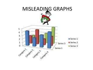
Appearance Although a graph may look nice, it can distort the image and change how the data looks. A 3D graph may look nice but it doesn’t have a y-axis. Make sure the graph has a y-axis displaying the data Make sure the graph is straight across, or 2D Check to see if the graph appears to be growing smaller in the distance misleading
Size When symbols are used to represent data, the size of the shapes can mislead you. Look at the scale and see how much the symbol is representing If the symbols are different sizes, clarify how much they are representing misleading
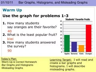
Misleading Graphs!