Download
1 / 26
260 likes | 524 Views
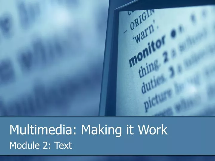
Multimedia: Making it Work. Module 2: Text. Overview. In this module we will discuss: The importance of text in a multimedia presentation Discuss the attributes of text, for example, font, typeface, kerning, leading and color. Describe the difference between Sarif/Sans Sarif.

E N D
Multimedia: Making it Work Module 2: Text
Overview In this module we will discuss: • The importance of text in a multimedia presentation • Discuss the attributes of text, for example, font, typeface, kerning, leading and color. • Describe the difference between Sarif/Sans Sarif. • List different design factors with text. • Describe how to convert a Word document to HTML for importing into Blackboard CE6.
The Power of Text • Reading and writing are expected and necessary skills within most modern cultures. • Text and the ability to read it are doorways to power and knowledge. • With the World Wide Wed, text has become more important than ever. • The native language for the web is HTML(Hypertext Markup Language)
The Power of Text In multimedia it is important to cultivate accuracy in words you choose. Words will appear in: • Titles • Menus • Navigation aids • Narrative or content
Be Precise Be precise and consistent when designing labels for title screens, menus and buttons.
Text Attributes • Font • Typeface • Tracking • Kerning • Leading • Color
Font • A collection of characters of a single size and style belonging to a particular typeface family. • Expressed in point; one point is .0138 inch. * This font is: Times New Roman 20-point bold italic * This font is: Arial 24-point
Typeface Typeface is a family of graphic characters that usually includes many type sizes and styles.
Serif vs Sans Serif Typeface The typeface either has Serif or it doesn't (sans is French for “without”). Serif is the little decoration at the end of a letter stroke.
Serif vs Sans Serif Typeface • On a printed page, serif fonts are traditionally used for body text • In the computer world, sans serif fonts are far more legible when used in the small sizes of a text field on a screen Exception: Large bold serif font for a title or headline can still be used to help delivered message of elegance and character.
Installing Fonts • Fonts 500 is a great way to find fonts and install them on your computer. All these fonts are free.http://fonts500.com/ • Sample of font downloaded:BLAZED
Tracking Tacking: Spacing between the characters.
Kerning Kerning: The spacing between character pairs.
Leading Leading: The space between lines of text sometimes called the line spacing.
Color Consider using color to make your type stand out or be more legible. Use black on white whenever possible. Avoid conflicting colors like red on purple. Don’t use color to convey a message – your user might be color blind.
Designing with Text • Too little text on screen requires annoying page turns and mouse clicks. • Too much text can make a screen seem overcrowded and unwelcoming.
Designing with Text • Be conservative when using different colors, typefaces, font sizes and styles. Sometimes it’s better to be consistent. • Use Meaningful words or phrases for links and menu items. • Use Bold to emphasize text not underline. Underline is commonly used to show a hyperlink.
Scrolling On a web page, put vital text elements and menus in the top 320 pixels. Studies have discovered that only 10 percent to 15 percent of surfers ever scroll any page.
Web Pages and CE6 • Probably the most common way you will be adding text is by uploaded MS Word documents to Blackboard CE6. • You must convert the Word document (.DOC) to a web page (.HTM). • For the most part, all of the fonts, sizes and styles will display the same when converted from .DOC to .HTM.
Web Pages and CE6 • However, if the user’s computer does not have the fonts installed on their computer, the browser will substitute a similar font, but it might not look the same. • Therefore, to assure your document will look the same on the web use common fonts; Times New Roman, Arial, Georgia and Verdana.
Web Pages and CE6 Process for saving a Word .DOC to a Web page .HTM. • From the file drop down menu, select “Save As” (don’t select, “Save as Web Page”).
Web Pages and CE6 • From the Save As dialog box, select “Save as type”, and select “Web Page, Filtered” from the drop down list. • Click “OK”.
Web Pages and CE6 Your .DOC is now converted to a .HTM and ready to be uploaded to Blackboard CE6. * You might loose some formatting, but the information should be useful and easily available to your students.
Summary In this module we discussed: • The importance of text in a multimedia presentation • Discuss the attributes of text, for example, font, typeface, kerning, leading and color. • Describe the difference between Sarif/Sans Sarif. • List different design factors with text. • Describe how to convert a Word document to HTML for importing into Blackboard CE6.
You have completed this module, please participate in the Module Discussion Multimedia: Making it Work Module 2: Text