Download
1 / 14
140 likes | 299 Views
T e x t. One of the Building Blocks By John Sullivan. Communication. Text and symbols 6,000 years ago in Mesopotamia, Egypt, Sumeria, and Babylonia put mud tablets and dried in the sun. Today we have HTML and interactive reading. The Power of Meaning GO BACK! is more powerful then PREVIOUS

E N D
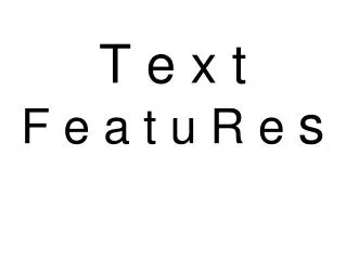
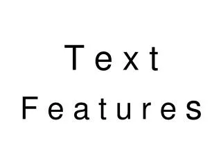
Text One of the Building Blocks By John Sullivan John Sullivan
Communication • Text and symbols • 6,000 years ago in Mesopotamia, Egypt, Sumeria, and Babylonia put mud tablets and dried in the sun. • Today we have HTML and interactive reading. • The Power of Meaning • GO BACK! is more powerful then PREVIOUS • Browse through a thesaurus
Font Wars • In 1985 the Apple Macintosh computer introduced WYSIWYG. Apple used Adobe’s PostScript outline font language. PostScript is really a method of describing an image in terms of mathematical constructs. • 1989 Apple & Microsoft announced a joint effort to develop a better and faster font methodology, called TrueType • Draws at a lower resolution
Text the First Step • Text is one key element in planning and designing a multimedia application • You should determine the font type, size, color and amount (next slide) • It should be appropriate for your theme • HCI • Use one style: APA, MLA, Chicago, etc. • No more than two fonts per application
Text Formats (typeface) • Typeface is a family of graphic characters that usually includes many type sizes and styles • Lester (1995) notes that at least 40,000 typefaces created since Gutenberg's day • Created in a foundry – Microsoft bought their fonts from Monotype a foundry • Fonts are a collection of characters of a single size and style. • Paragraph Formats • left, right, centered, and justified (right and left aligned) • Scrolling Text • Special Effects • WordArt, ULead Cool 3D • To Draw is to rasterize
Special Effects for Text • Font Editing and Design Tools • WordArt, Typestyler, Fontographer, and Adobe Photoshop • ResEdit • FontMonger • Type-Designer • FontChameleon • Making Pretty Text • Use TypeCaster plug-in for PhotoShop, Illustrator, FreeHand • Fireworks
Font Type and Point Sizes • Two kinds • Bitmapped fonts • stored as single characters made of dots that are called to the screen as you use them. • Outline fonts (TrueType fonts), which are composed of filled-in outlines • Both are available in various sizes • Bitmap problems: Platform resizing • Outline recommended for multimedia
Considerations • What will be the applications playback computer? • Remove any non-TrueType fonts • Point size • Character Formats • Mathematics, Science, & Engineering • Kerning • Anti-Aliasing - dithering
Text Design Considerations and the Audience • Single User • Smaller font size < 12 points • Group Users • Larger font size > 24 points • Distance dictates the font size, color, and amount of text
HCI Tips • Studies have shown that words and sentences with mixed upper- and lowercase letters are easier to read than words or sentences in all caps • Fonts do not look the same in different platforms. • Load fonts using either control panel (fonts) or drop them in the Windows sub-directory called fonts. • Experiments show that reading text on a computer screen is slower and more difficult
Advertiser Andy Bookman Old Style Brush Script Federation TNG Title IgollCaps Mickey Techno Scooby Doo Surfer Viking Wide Latin Fonts
Serif versus Sans Serif • Is the simplest way to categorize a typeface • sans is French for without • serif is the little flag or decoration at the end of a letter stroke • Sans Serif is Text (font) without the little flag or decoration • serif: Times • sans serif: Arial • Stay in the same family • <Font-style: Verdana, Arial, Helvetica, san-serif”> • Always try to embed
References • Lester, Paul, M. Visual Communication: Images with Messages, Belmont, CA: Wadsworth, 1995 • Tannenbaum, Robert, S., Theoretical Foundations of Multimedia: New York: Computer Science Press, 1998 • Vaughan, Tay, Multimedia: Making it Work, New York, NY: McGraw-Hill, 2001
The End By John Sullivan