Download
1 / 26
260 likes | 275 Views
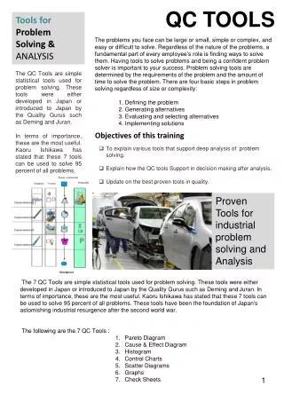
Tools for Problem Analysis. Outline. Cause-and-effect chart Root cause analysis Scatter chart Histogram. Scatter chart. Cause and effect. Histogram. Cause and effect chart. Classical and most widely used tools in quality management

E N D
Outline • Cause-and-effect chart • Root cause analysis • Scatter chart • Histogram Scatter chart Cause and effect Histogram
Cause and effect chart • Classical and most widely used tools in quality management • Main purpose is to identify possible causes for an effect • Effect analyzed can be: • An experienced problem • Future hoped-for state • Chart can be used for: • Finding causes for problem • Planning how to reach a state where problem no longer occur • Types: • Fishbone chart • Process chart
Fishbone Chart • Traditional way of constructing cause-and-effect charts • Main product is a chart that resembles a fishbone • Two ways of creating the chart: • Dispersion analysis: effect being analyzed is drawn on the right side of the chart and groups of possible causes are identified • Cause enumeration: where all possible causes are simply brainstormed and listed in the order they are generated
Fishbone chart with dispersion analysis • The chart gives better result when created in group first step, assemble a suitable group possessing the necessary knowledge about the area to be analyzed • Describe the effect for which causes are sought e.g. low performance • Draw the effect at the end of a large arrow
Identify main categories of possible causes place at branches emanating from the large arrows • For physical processes • main categories: • People • Machines and equipment • Materials • Methods • Measures • For service processes • main categories: • People • Machines and equipment • Frame conditions • Work environment
5. Brainstorm all possible causes and place these in the suitable area of the chart • Brief and succinct description • Proceed through the chart one main category at the time but include surfacing suggestions • Causes that belong to more than one category are placed in all relevant position 6. Analyze the identified causes to determine the most important ones
Example • Identifying the causes of dimension errors Methods Employees Low motivation Unsuitable process route Poor training Unsuitable hardening Dimension errors Poor maintenance Wrong coolant Often temperature too low Too infrequent tool sharpening Environment Equipment
Process Chart • Variant of Cause and effect chart that directly aimed at improvement of business process • Main steps in the process to be improved are drawn • For each step of the process believed to create problems or contribute to low level performance a fishbone chart is constructed
Root cause analysis • Also known as “why-why chart” and “five whys” • The purpose is to find the true root cause of a problem • Can be used in connection with cause-and-effect chart to ensure if each identified cause really is the root cause of the problem
Root cause analysis procedure • Determine the starting point, either a problem or a high-level cause that should be further analyzed • Use brainstorming to find causes at the level below the starting point • For each identified cause, pose the question, “why is this a cause for the original problem?” • For each new answer to the question, ask the question again and again until no new answer results. This will probably be one of the root causes for the problem usually requires five rounds of the question “why” • If the question is twisted slightly to asking “how” instead of asking “why” the technique can be used to find root means for reaching a desired state or effect
Example Finding means for reducing the amount of work-in-progress in a manufacturing company Low level of work-in-progress How? Maintain no stock of finished goods How? Short manufacturing time How? Run small batch sizes How? Frequent and swift deliveries from the suppliers How? Extremely good relationships to the suppliers
Scatter chart • Used to show the relationship between two variables • The variables can be process characteristics, performance measures, or other conditions • Usually measured at specified time intervals
Relations in scatter diagram • When one of the factors increases, the other can either also: • Increase • decrease or • display random variation • If the two variables seem to change in synchronization it might mean that they are related and impact each other • Number of defects increases in proportion with the amount of overtime used • Synchronized variation does not always mean that there is a cause-and-effect relationship between variables!
Different Degrees of Correlation Strong positive correlation Possible positive correlation No correlation Strong negative correlation Possible negative correlation
Developing a scatter chart • Select the two variables, one independent and one dependent, to be examined • For each value of the independent variable, the corresponding value of the dependent value is measured • Typically, should be at least 30 • Preferrably more than 100 data pairs • Draw the chart itself placing the independent variable (the expected cause) on the x axis, and the dependent (effect) on the y axis • Plot the collected data pairs on the chart and analyze it
Interpreting scatter chart • If chart indicates a relationship variables should be analyzed further to confirm the relationship • Chart showing no relationship should not automatically lead to a conclusion that no relationship exists
x x x x x x x Number of complaints x x x x Customer waiting time Number of defects Using Scatter chart Diskusikan bersama satu teman: Jika anda adalah seorang pengambil keputusan apa yang akan anda lakukan setelah melihat kedua diagram ini?
Histogram • Also called a bar chart • Used to display the distribution and variation for a measure • Measure can be length, diameter, duration, costs etc. • Information can be presented in table difficult to spot important patterns in the data material
Constructing a Histogram • Count the number of data points in the data material (labeled N). Should be at least 50 data points • Determine the numerical distance, R, between the largest and the smallest value in the data material • Depending on the number of data points, R is divided into a number of equally large classes C
Constructing a histogram contd. • Determine the width of the class, labeled H using the following formula: H = R/C Width should always have the same decimals as the data points • Determine the lower and upper values for individual classes • Find the smallest value in the data material as the lower value for the first class • Upper value for this class = lower value + width • Insert data material into a check • Create histogram based on the check sheet • Classes are marked along the horizontal axis • Frequency along the vertical axis
Frequency Frequency 1 2 3 4 5 6 7 8 9 3 4 5 6 7 Order processing time (days) Order processing time (days) Histogram Menunjukkan variabilitas sebuah proses
Tugas • Kumpulkan data tinggi dan berat masing-masing anggota kelas • Tentukan dependent variable (Y) dan independent variable (X) • Buat diagram scatter dan histogramnya • Analisis hasilnya dan Simpulkan • Kerjakan secara kelompok • Kumpulkan minggu depan dalam bentuk tulisan tangan dan garis-garis diagram yang rapi • Siapkan presentasinya