Download
1 / 49
490 likes | 595 Views
Design language (codenamed Metro ) Designing delightful applications for Windows Phone Call to action. Designing Windows Phone 7 Series. Albert Shum – That Dude Michael Smuga – Studio Director Chad Roberts – UX Design Lead. Story of Metro. Metro.

E N D
Design language (codenamed Metro) Designing delightful applications for Windows Phone Call to action Designing Windows Phone 7 Series Albert Shum – That Dude Michael Smuga – Studio Director Chad Roberts – UX Design Lead
METRO IS OUR DESIGN LANGUAGE. WE CALL IT METRO BECAUSE IT’S MODERN AND CLEAN. IT’S FAST AND IN MOTION. IT’S ABOUT CONTENT AND TYPOGRAPHY. AND IT’S ENTIRELY AUTHENTIC. ETRO
Feels Fast and Responsive Focus on Primary Tasks Do a Lot with Very Little Fierce Reduction of Unnecessary Elements Delightful Use of Whitespace Full Bleed Canvas Principle: Clean, Light, Open, Fast
Type is Beautiful, Not Just Legible Clear, Straightforward Information Design Uncompromising Sensitivity to Weight, Balance and Scale Principle: Celebrate Typography
Feels Responsive and Alive Creates a System Gives Context to Improve Usability Transition Between UI is as Important as the Design of the UI Adds Dimension and Depth Principle: Alive in Motion
Delight through Content Instead of Decoration Reduce Visuals that are Not Content Contents is the UI Direct interaction with the Content Directly Principle: Content, Not Chrome
Design for the Form Factor Don’t Try to be What It’s NOT Be Direct Principle: Authentically Digital
Clean, Light, Open, Fast Celebrate Typography Alive in Motion Content, Not Chrome Authentically Digital Principles
Focuses on the individual and their tasks Helps organize information and applications Metro User Experience
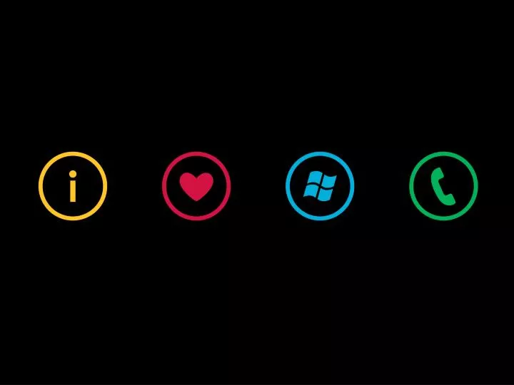
Start Glance & Go Get Me There
Building Great Windows PhoneApplications Focus on designing the experience Build delightful experiences Build experiences that are easy to use Michael Smuga – Studio Director
Anna Part time PR professional and busy mom “My life is a balancing act between work, family, friends, and my own personal needs.” Who we design for: Anna + Miles Miles Growing his own architectural biz “I love running my life real-time so I can take advantage of whatever is inspiring me…whether it’s a new project, a pick up game or a stolen moment with Anna.”
RED THREADS. THESE ARE THE PRINCIPLESTHAT GUIDE THE EXPERIENCES
Weather Personal Weather surfaced on the live tile in Start Relevant Weather updated based on your location Connected Weather for your contacts
Be inspired by Metro …but look for balance between the Metro principles and your own style Build delightful experience
Use color to delight the user • Use color to personalize experience • Use color to emphasize hierarchy Color
Make words feel welcome • Pay attention to balance, • weight & scale Typography
Use motion to delight the user Remember that pacing is important: the more you use it, the less special it becomes Motion
Familiar = Easy to use Provide consistent and predictable experience Make It Easy to Use
Hardware buttons Optional landscape keyboards Design for one hand usage whenever possible Hardware Implications
Recommended touch target size is 9mm Minimum touch target size is 7mm Minimum spacing between elements is 2mm Visual size is 60-100% of the touch target size Touch
Up to 4 icons • Don’t fill all 4 slots if not needed • Swipe up the bar to bring up • the menu • Trigger Application Bar + Menu
Separate multiple tasks • Tap or flick tabs to change them • Trigger Tabs
Rich experience • Aggregate multiple sources Hubs
Icons in the application menu • should be consistent • Test icons with users • (pay attention to context) Iconography
Familiarize yourself with Metro Stay Connected & Get Informed Download & Start Creating Chad Roberts – UX Design Lead Call to Action
Metro Personas Red Threads Focus on designing the experience Make applications delightful and easy to use Summary
Attend “An Introduction to Developing Applications for Microsoft Silverlight”. Watch “Authoring for Microsoft Silverlight 4 with Microsoft Expression Blend. Read about design on Christian Schormann’s blog. http://electricbeach.org Stay Connected & Be Informed
Get the Windows Phone Developer Tools Download the UI Design and Interaction Guide Interact with the design tools when Available http://developer.windowsphone.com Download & Start Creating
Albert Shum – That Dude Michael Smuga – Studio Director Chad Roberts – UX Design Lead Thank you!