Download
1 / 59
630 likes | 737 Views
16-01. Karl Peter Røhl, 1919, 1 st Bauhaus logo Dualistic relationship feathered form on left, swastika on right, calmness and movement. Oskar Schlemmer, 1922, 2 nd Bauhaus logo. 16-01.

E N D
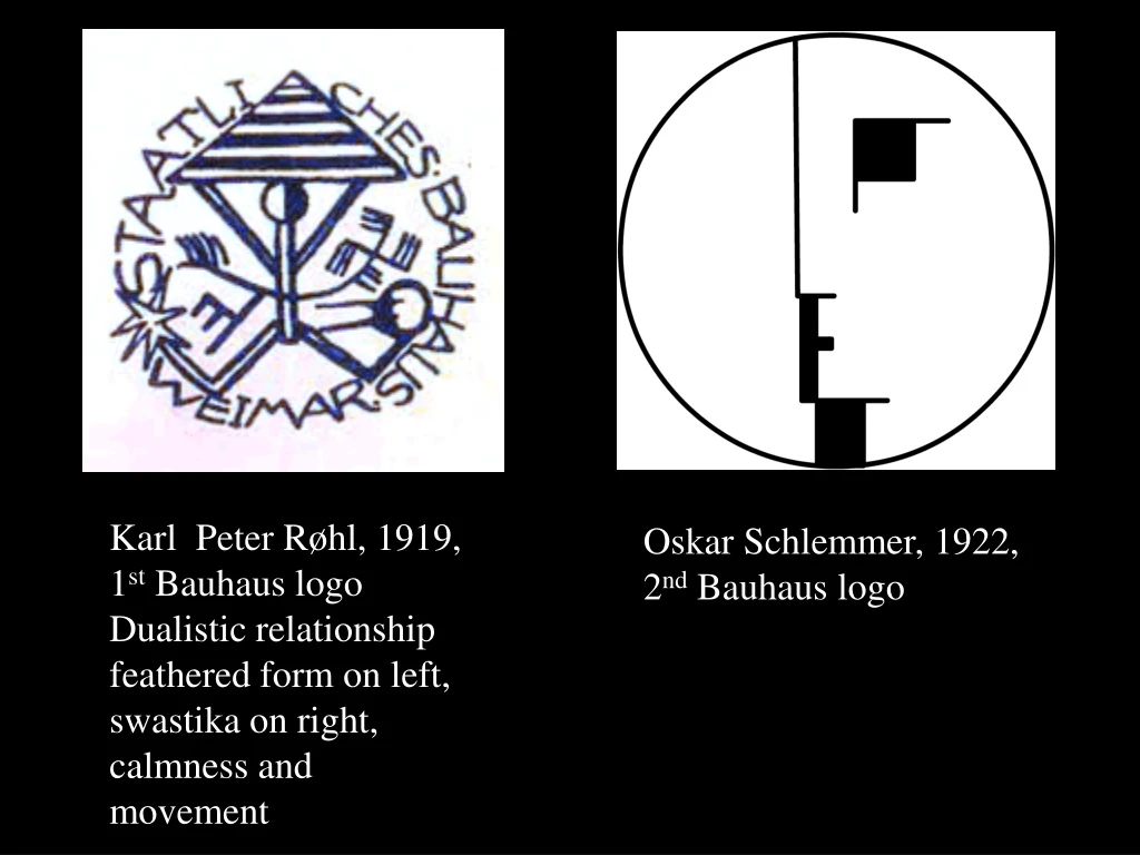
16-01 Karl Peter Røhl, 1919, 1st Bauhaus logo Dualistic relationship feathered form on left, swastika on right, calmness and movement Oskar Schlemmer, 1922, 2nd Bauhaus logo
16-01 Staatliches Bauhaus (building house) early model of the modern art school. Inspired by the ideals of the revolutionary art movements of the early 20th C. Founded by Walter Gropius in Weimar in 1919, moved to Dessau in 1925, berlin in 1932, forced to close in 1933 spreading primarily to US and to Switzerland. No more romance of hand making in the countryside was a major ideoligical split from the earlier connections to the Arts and Crafts movement and the German Werkbund. Instead it was urban and technological and embraced 20th C. machine culture and mass production. It demanded a reduction to essentials only.
16-01 Lyonel Feininger, Cathedral, 1919. This idealized vision of Walter Gropius was printed as a woodcut on the title page of the 1st Bauhaus Manifesto.
16-01 Staatliches Bauhaus, Dessau, Walter Gropius, 1925–26
16-01 Staatliches Bauhaus, Dessau, Walter Gropius, 1925–26
16-01 Staatliches Bauhaus, Dessau, Walter Gropius, 1925–26
16-06 Laszlo Moholy-Nagy, title page, Staatliches Bauhaus in Weimar. This page structure is based on a rhythmic series of right angles. Stripes applied to two words create a second spatial plane.
16-07 Laszlo Moholy-Nagy, proposed title page for Broom, 1923. This inventive design for the avant-garde magazine shows how thoroughly Moholy-Nagy understood cubism and Lissitzky.
16-08 Laszlo Moholy-Nagy, typophoto poster for tires, 1923. Letterforms, photography, and design elements are integrated into an immediate and unified communication.
16-09 Laszlo Moholy-Nagy, Chairs at Margate, 1935. The juxtaposition of two images creates a contrast of pattern and texture and introduces a process of change into the two-dimensional image.
Laszlo Moholy-Nagy, Photogram, 1922. Light itself becomes a malleable medium for generation design and form.
16-11 Laszlo Moholy-Nagy, The World Foundation, 1927. In this satirical photoplastic, Moholy-Nagy shows “quack-clacking super-geese [pelicans]” observing “the simplicity of the world constructed as a leg show.”
16-17 Laszlo Moholy-Nagy, dust jackets for four Bauhaus books, 1924 - 30. Jackets for volumes 5 and 10 evidence close ties with de Stijl; 12 and 14 represent modern architecture.
Jan Tschichold, April, 1902–August of 1974. Early influeces included the 1914 Worlds Fair for Books & Graphics, calligraphy, and the work of Rudolf Koch. At the Bauhaus his layouts began to have rigorous structure and composition, filled with white space, straight lines and thick rules. 1928 saw the publication of perhaps his most influential work, The New Typography, which proclaimed the strengths of assymetrical layout and balance. The vast majority of his books were seized by the Nazis and destroyed. At the end of the 1930’s he relaxed his views on assymetry, primarily in the work done for Penguin Publishing. 16-17
Jan Tschichold was a typographer, book designer, teacher most known for his theories of assymetrical typography. 16-17
16-17 Jan Tschichold Page layout grid based on the revival of the Golden Mean
16-17 Jan Tschichold Page layout grid use of lines of continuity
16-17 Jan Tschichold Page layout grid lines of axis rotated
16-17 Jan Tschichold
16-17 Jan Tschichold On the left work from 1938. On the right work from 1941
16-17 Jan Tschichold Sabon typeface based on Garamond, 1964–67
16-17 Herbert Bayer (April 5, 1900 – September 30, 1985) was an Austrian graphic designer, painter, photographer, sculptor, art director, environmental and interior designer, and architect, widely recognized as the last living member of the Bauhaus. Extremely influential at the Bauhaus for advocating sanserif type only and for a while lowercase letters only.
16-17 Herbert Bayer, Bauhaus's Zeitschrifte, 1928
16-17 Herbert Bayer, World Geo-graphic Atlas, 1953
16-17 Herbert Bayer, Aspen Design Institute, Aspen, CO., 1953
16-17 Herbert Bayer, Bayertype, 1925 Combined upper and lowercase letterforms into a single typeface design
16-17 Herbert Bayer
16-17 Herbert Bayer
Joost Schmidt (5 January 1893–2 December 1948) master at the Bauhaus and professor at the College of Visual Arts, Berlin. He was a visionary typographer and graphic designer who is best known for designing the famous poster for the 1923 Bauhaus Exhibition in Weimar. Studied at the Grand-Ducal Saxon Academy of Fine Art in Weimar, before becoming a student at the Bauhaus School under Max Thedy from 1919–1925, training in the wood-carving workshop. Schmidt taught lettering from 1925–1932, lead the sculpture workshop from 1928–1930, was head of the Advertising, Typography, Printing, and associated Photography department from 1928 to 1932, and taught upper division figure drawing from 1929–1930. 16-17
16-17 Joost Schmidt
16-17 Schmidt used the Constructivist right angled axis of symmetry and rotated them so they were no longer parallel to the edges of the paper
16-17 Joost Schmidt
16-17 Joost Schmidt, Die Form, 1926
16-17 Joost Schmidt, Mann on the Run, 1932
16-17 Joost Schmidt
16-17 Joost Schmidt, Lettering and Offset Lithography, 1926
16-17 Joost Schmidt and Josef Hartwig 1924
16-17 Joost Schmidt
Gunta Stölzl (5 March 1897 – 22 April 1983) As a student beginning in 1920, she was a mentor to others before becoming a junior master in 1927 and a full master the next year. As the Bauhaus’ only female master the weaving department became one of its most successful facilities under her direction beginning in 1925. She increased its weaving and dyeing facilities as it transitioned from individual pictorial works to modern industrial designs, applied ideas from modern art to weaving, experimented with synthetic materials, and improved the department’s overall technical instruction. 16-17
16-17 Gunta Stolzl, Wall hanging “Slit Tapestry Red/Green” 1927/28
16-17 Gunta Stolzl with Marcel Breuer, African Chair, 1921
16-17 Gunta Stolzl with Marcel Breuer, 1922
16-36 Eric Gill, page from The Four Gospels, 1931. Descending type sizes, all capitals on opening lines, unjustified right margins, and initial capitals integrated with illustrations are forged into a unified whole.
16-37 Eric Gill, page from Essay on Typography, 1931. Gill spoke of industrialism, humanism, letterforms, and legibility, while demonstrating his belief in unjustified typography.
16-40 Rudolf Koch, Kabel light, c. 1928. A series of ads introduced Kabel’s range of weights to German designers and printers.
Piet Zwart, folder, 1924. Order is achieved in a complex communication by the rhythmic repetition of diagonals, words, letters, rules, and the dingbat hand. Good example of both the influence of Dada and also Constructivism on Zwart.
16-52 H. N. Werkman, page 1 of The Next Call 1, September 22, 1923. The impression from a lock plate from the side of a door suggests an upper-case E.
16-54 H. N. Werkman, pages 4 and 5 of The Next Call 4, January 24, 1924.
Paul Schuitema, brochure cover for the Berkel Model Z scales, before 1929. Arrows moving from the large word ZOO (meaning “So”) create a double headline: “So clear--every dash 5 grams” and “So small--20 centimeters [wide].” This brochure was printed by letterpress from typographic material assembled on the press bed from Schuitema’s layout. 16-55