Download
1 / 17
170 likes | 363 Views
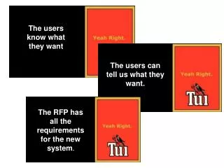
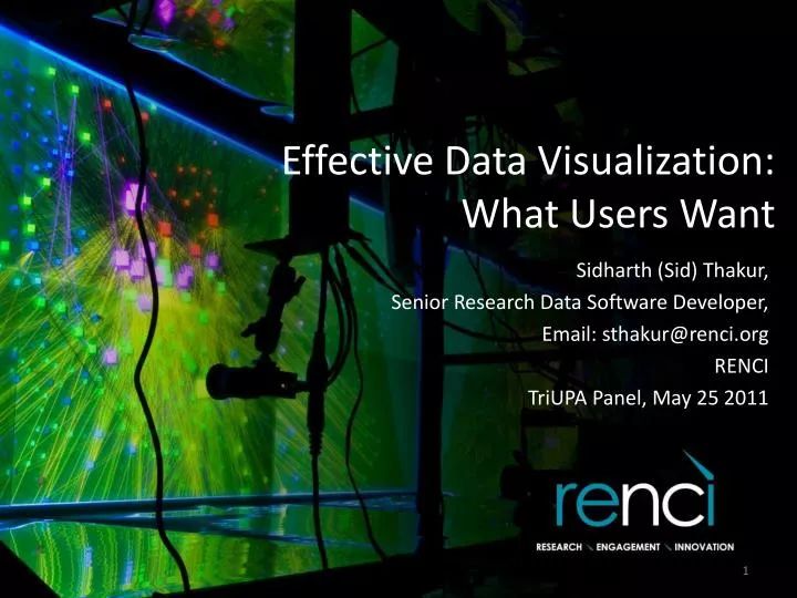
Effective Data Visualization: What Users Want. Sidharth (Sid) Thakur, Senior Research Data Software Developer , Email: sthakur@renci.org RENCI TriUPA Panel, May 25 2011. What User Needs. Source: The Project Cartoon (www.projectcartoon.com). Data Visualization.

E N D
Effective Data Visualization:What Users Want Sidharth (Sid) Thakur, Senior Research Data Software Developer, Email: sthakur@renci.org RENCI TriUPA Panel, May 25 2011
What User Needs Source: The Project Cartoon (www.projectcartoon.com) RENCI
Data Visualization • A visualization is a picture created to explore, analyze, or explain something (observed phenomenon or quantitative data) RENCI
Some Examples of Visualizations Commonly available data visualizations include poster-like, aesthetic ‘single serve’ displays we call info graphics. Two examples of “info graphics” from www.Visualizing.org RENCI
Some Examples of Visualizations Relationships Multiple parameters High-dimensional data Observed/simulated scientific data Hierarchical Relationships RENCI
Advantages of Data Visualization • Graphical representations and data visualizations have tremendous potential to • succinctly convey complicated concepts • enable analysis of multiple parameters and their relationships • enable fast perception of important information in a large data set • generate insight and knowledge • Interactivity provides additional means to explore dense data and discover novel relationships RENCI
A Challenge to Effective Visualization • People who develop graphs and charts are often not familiar fundamental concepts of visualization and visual perception • Visualization experts and practitioners often lack knowledge about the domains they need to serve • How do we encourage creation of data visualizations that are effective and useful to others? RENCI
A Task-Centric Approach to Effective Visualization • Determine the ultimate, overall motive of creating a picture… • Determine the specific analytical questions that the visualization is going to support • For example, key variables or attributes; relationships; or time-dependent behavior Combine two or more of these Exploration, Detailed Analysis Confirm/Validate Hypotheses or Pose New Questions Share or Present Results of Analysis RENCI
Task-Centric Approach… • Understand the data workflow • how data is processed and eventually analyzed • what are the key variables that need to be highlighted • Perform a simple task analysis • What is the end user’s primary goal in using a visualization. For example, a primary goal can be fast comparison of quantitative data (stock market, weather graph) or deep analysis of data • What is the secondary goal - for example, a secondary goal can be perception of patterns and trends over time • Develop graphical representations to support the task hierarchy RENCI
Real-World Application Design of some weather-related products to support decision to close schools during adverse winter weather. Visualization Challenges: • Users have little training to use graphical data displays • Information overload • Little time to dwell over complicated graphs/charts RENCI
Example 1: Hourly Weather Graph Redesign User task: identify rainfall amount and likelihood RENCI
Broader Redesign of the Graph There are some other issues related to how data is displayed in this chart. RENCI
Example 2: Graphical Forecast A graphical forecast is meant to be a visual summary. In this example, however, users have to work hard to extract information because they have to process each piece of information serially. Modified Chart Standard Chart RENCI
Example 3: Area Forecast Discussion Tag cloud visualization As the final example, I have chosen a text-based product to show that simple visualization methods can enhance text display too. Primary task of users is to extract salient information about weather. We identified in user interviews that they look at specific keywords and phrases. The redesign makes the task easier. RENCI
Summary: Some Pre-requisites to Effective Visualization • Understand the process of visual perception • Define the purpose of your visualization • exploration and deep analysis, • confirmation or validation, • sharing and presentation of results • Prioritize analytical tasks that your visualization/graphic is going to support • Understand properties of the data you need to visualize • Whenever possible, use interactivity to allow users to engage with the visualization Explore and Perform Deep Analysis Confirm or Validate Hypotheses Share and Present results or concepts RENCI
Resources • Business Intelligence Blog – PerceptualEdge.com • Visualization Blog – EagerEyes.org • Collaborative/Shared Visualizations – ManyEyes.org • Visual-Analytical tool – Tableau.com • Collin Ware’s “Visual Thinking: for Design,” (Morgan Kaufmann Series in Interactive Technologies) • Info Graphics by New York Times Thank You Special Thanks to Ray Idaszak, Jim Mahaney, and Hong Yi of RENCI and Institute for Emerging Issues. RENCI