Download
1 / 22
291 likes | 678 Views
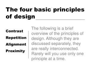
Introduction to Basic Design Principles. Design for Journalists Spring 2013. The CRAP Model. Contrast Repetition Alignment Proximity “…the basic principles of design that appear in every well-designed piece of work.” - Robin Williams, The Non-Designers Design Book .

E N D
Introduction to Basic Design Principles Design for Journalists Spring 2013
The CRAP Model • Contrast • Repetition • Alignment • Proximity “…the basic principles of design that appear in every well-designed piece of work.” -Robin Williams, The Non-Designers Design Book
CRAP: Contrast explained • Elements that are not alike, should be very different. • Why? Because… • Contrast makes elements pop, places an emphasis on what’s most important, attracting attention to the piece and those elements specifically. • Contrast createsa focus, an entry point for the audience, so they know where to begin. • Contrast establishes a visual hierarchy, showing the audience in what order the information should be taken in.
CRAP: How we apply contrast • Type • Large type with small type (headline vs. body type) • Bold text with Roman (plain) text (headline vs. subhead) • All caps with lowercase (dateline vs. body type) • Color • Dark colors with light colors (dark/light background vs. light/dark type) • Bright colors with dull colors (bright photo with dull caption box) • Element Size • Large photos/graphics with small photos/graphics • Big boxes with small boxes (main story vs. sidebar)
CRAP: Repetition explained • Elements that are the same should be repeated throughout the design. • Elements that are different, should not share the same properties. • Why? Because… • Repetition organizeselements into visual units. • Repetition creates unity throughout the design. • Repetition shows which pieces are part of what whole.
CRAP: How we apply repetition • Type • Font families, styles (headlines, body copy, bylines, captions) • Color • Background color, type color, box color (page background, body type, photo box background, etc.) • Element Size • Font size, image size, shape size • Space • Space between alike elements (space between headlines and photos, photos and captions, etc.)
CRAP: Alignment explained • Everything on the page needs to be visually connected to something else. Nothing should be out of place or distinct from all other design elements, unless the designer’s attention is to call attention to that element. • Why? Because… • Aligning elements creates a visual path that leads to a focal point. • Alignment creates unity and organization.
Alignment: How we apply alignment • Text elements with other text elements • Headlines, subheads, bylines, stories, etc. • Graphic elements with other graphic elements • Story graphics, photos, shapes, etc. • Text elements with graphic elements • Main headline vs. lead art
CRAP: Proximity explained • Elements that are part of a group should be grouped together. Related elements should be closer together. Unrelated elements should be further apart. • Why? Because… • Proximity establishes relationships.
Proximity: Where we apply proximity • Stories (one story’s headline, subhead, photos, captions, byline, copy vs. another’s) • Site elements (header elements vs. navigation elements vs. content elements vs. advertisements)