Download
1 / 36
360 likes | 516 Views
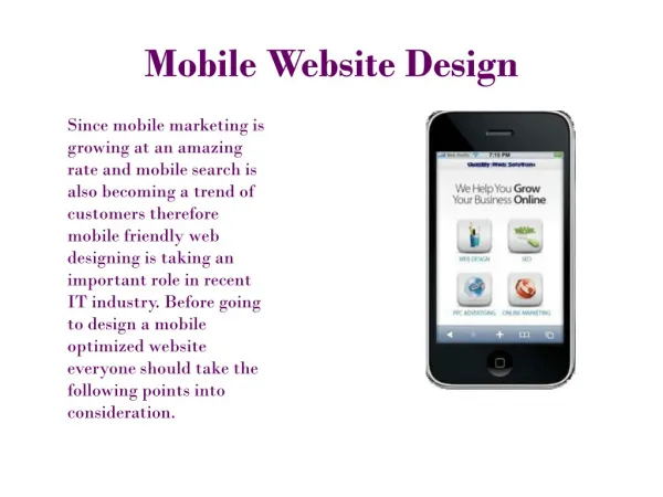
Shirley Carvalhedo and Dave Maruszewski. HealthCoach4Me.com : Mobile App Design. Design Statement.

E N D
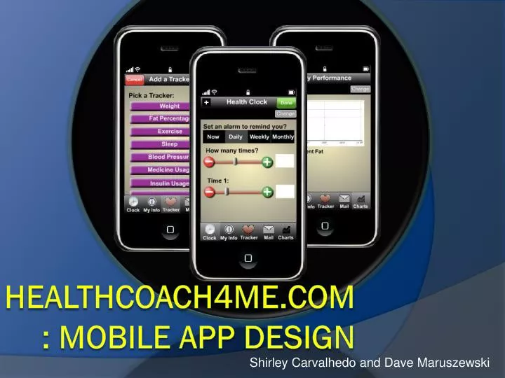
Shirley Carvalhedo and Dave Maruszewski HealthCoach4Me.com: Mobile App Design
Design Statement People who frequently are concerned about their health would use this health application to easily log, view and manage their ‘health performance’, from anywhere that an iPhone may operate. Simplifying the access of health information improves user experience in dealing with their needs; with our application, the user may enter or revise his or her information regarding their age, weight, height and choose tracks that will help them to manage their fat percentage, water intake, exercise frequency and so forth. All these tracks should be set up by the user as the second step.
Four main categories: The information for the decision needs to be there when the decision is needed Keep it simple The best journey is the one with the fewest steps. Shorten the distance between the user and their goal Color is information Lund’s List Heuristics
Design Sketch: The Context of Mobile Interaction • Text input • Small screen • Slow connections • Short battery life • Mobile applications will gain customers by providing them with entertainment, connecting people, managing schedules, arriving at meetings and leisure activities, and making their lives easier.
Scope of the Application • Create an app that works with the website • Site and app mutually updates • Be in line with the HealthCoach4Me’s mission • Incorporate fundamental features designed to manage personal heath interests and improve users’ performance • Be innovative, useful • Balance of the two • Take advantage of smart phone abilities • Smooth, logical animation • Visual feedback of user revisions and actions • Keep in mind audience • Mature, older • People who may have an existing problem
Our App • Tracker • Uses website graphing and health coach to track usages, activity and health stats • Standard and unique tracking • Multiple trackers can be applied • Alarm • Uses phone to remind you to take medicine, do physical activity, run a test, etc. • Uses iPhone technology • Keeps in touch with HealthCoach4Me • Can see the same messages from your health coach • Can store information that the site will up- and download
Basic Functionality Health Clock Alarm, Tracking and Updating Website Graph Tracking Information Storing Health Coaching
Testing • Paper prototype • Technical prototype • General suggestions • Class • Outside of testing
Paper Prototype Testing • Low tech design • Interested in usability over aesthetics • Participant Input • Would they use it? • Ease of use • What would make it more appealing?
Methodology: Paper Prototype • Four users – two women, two men • Session were recorded using video camera • There was a moderator that conducted the test and an observer that took notes during the session • Users were all read the same script and asked to perform the same tasks, which included using the app to: • Manage their health information • Users were asked to “think aloud” while they performed the tasks, so we could understand the reasoning behind their actions • Session recordings were reviewed and the app’s successes and issues were noted
Users: Statistical Information • Older (>50) • Not smart phone savvy • Had health issues • Would be possible users of app
Carolyn - 40, Mechanical Engineer * White indicates what we directly used to improve the app • (Task 1)On initial screen pushed Meditation instead of Medicine Usage • Cancelled out and then went to MU • Questioned if there was enough information on the screen Wanted: • Medicine Name • Dose • With or without food • A little unaware of the slider • Seemed to figure out any mistakes in the interface, wasn’t flustered • Had question about Recurring Times check box (__ time per __ hour) • (task 2) Worked through it well • Did not check message from Unread to Read but read the abbreviated message • Like the app but wouldn’t use it unless it had a little more functionality (more topics) • Would want her daughter to use this as is • Preferred the slider bar over the scroll bar
Steve – 50, Doctor • Did not co-discover with C. but could hear her comments • Was a little unaware if meditation was a typo but did press the right button • Used the plus and minus arrows as opposed to sliding the bar • I believe that he was unaware of what the bar did • He later commented to truth of (1) • Actually went against directions and did not “Take” the medicine • Didn’t think R should be short for Thursday • Didn’t know how to go back later to mark that he later took the medicine without the alarm • Interface was unclear on this matter (see notes for possible fix) • Would like to see a reminder/snooze button (10 minute intervals) • Went to My Information instead of Messages for news from the health coach • Found message, but did not check message from Unread to Read but read the abbreviated message • Would like to see a calendar/medical appointments button on the tracker • Wouldn’t use this app. Doesn’t like apps in general (no smart phone) and he has a good memory (his words)
Richard – 50, Retired professor He is not a iPhone user Presented eagerness to complete the tasks Attempted to establish a relationship between the buttons at the bottom with the screens Preferred the "My Information" as the first screen instead of "Pick a tracker“ Attempted to find the name of the Medicine in the "Health Clock" screen Preferred the slider bar over the scroll bar but commented that he would able to work with both of them Pointed out that there is no exit button in the first "Pick a Tracker" screen Suggested a delete button ("key button") on the "Messages" screen in order to "clean out" the screen and avoid accumulating too many messages Overall, gave a positive review of the app and remarked that it could be useful after a few alterations
Mary Kay – 50, Homemaker • Presented quick logical thinking in completing the tasks • Attempted to find a button in the "Health Clock" screen to set up am-pm • Questioned if there was enough information on the "Health Clock" screen: • Medicine Name • Dose • With or without food • If the chosen medication could be digested with another medication • Pointed out that the scroll bar could be improved so as to provide options for more accurate decisions. Commented that the slider bar would be a better option for men whereas the scroll bar would be a better option for women.
Paper Prototype Results and Outcomes Added a Delete Button
Paper Prototype Results and Outcomes • A subtitle bar was added in order for the user to know the tracker in use • Buttons on bottom took up display space • Moved them to the title bar using the iPhone standard • Changed names to reflect standard and for more understanable • Health bar with plus/minus buttons was preferred over other options • Clock was added military time 2 1 1 3 3 4 4 2
Paper Prototype Results and Outcomes • If answer is yes, the graphing of your project is accessed • If answer is no, you can postpone until later 1 2 1 2
Schematic of Buttons (Specific) Same Screen Layout for Add and Change HomeScreen Entrance Screen After Alarm
Paper Prototype Testing Answers • Would they use it? • Most would or want their siblings to use • Ease of use • Previous slides • Overall, good results • What would make it more appealing? • Previous slides • Innovation to set it apart from other apps
Tech Prototype Click for Link Based on this Design
Tech Prototype Testing • Simulate • Interested in usability over aesthetics • Participant Input • Would they use it? • Functionality • Ease of use • What would make it more appealing? • Did we fix our issues from paper prototype testing?
Methodology: Tech Prototype • Four users – one women, four men • Session were recorded using video camera • There was a moderator that conducted the test and an observer that took notes during the session • Users were all read the same script and asked to perform the same tasks, which included using the app to: • Choosing the fat percentage tracker, placing an alarm on the health clock and getting feedback in the form of a chart. • Users were asked to “think aloud” while they performed the tasks, so we could understand the reasoning behind their actions • Session recordings were reviewed and the app’s successes and issues were noted
Users: Statistical Information • Slightly younger than paper prototype participants • More smart phone savvy • Would be possible users of app • May use different trackers from paper prototype participants
Bill – 47, Officer Pros: • I have diabetes I need to control my weight • Good idea to know your fat percentage fast like that Cons: • Mail-messages confusing (The name could be ( ‘health alert’) • Use colors like red and green. Be more visual. • Chart is hard to read
Rush – 27, Student Pros: Nice clear navigation on the bottom Convenient input bars (plus / minus / dragger thingy) Bright green 'done' bar Cons: Application flow could be communicated via button ordering maybe? ‘Charts' and 'my info' seem redundant - maybe they can be consolidated in an accordion type format. The 'time' inputs could use an up/down arrow scroller mechanism for the minutes (hard to pinpoint)
Amardip – 33, Professor Pros: • Health information is nicely displayed • Good coverage of various health scenarios Cons: • Fat Percentage is … ? Tooltip explaining what Fat % is • ‘My Info’ should be first page till user fills in ‘My Info’ • ‘Place the thumb’, you can put animation – a thumb reaching to the black circles. Put a progress bar in the ‘thumb press’ page, auto click done.
Diane – 46, Engineer Pros: Completed task quickly and efficiently Overall, liked the app much Thought the fat percentage tracker would be very useful Cons: Unsure of AM/PM on time Wanted ‘sticky’ information Confused Tracker and Health Clock Didn’t like some text formatting (i.e. on time)
Tech Prototype Results and Outcomes Use iPhone Convention: Cancel and Done
Tech Prototype Results and Outcomes Force or allow a Rotation for Graph
Tech Prototype Results and Outcomes Use AM/PM over military time
Tech Prototype Testing Answers • Would they use it? • Improved response • Functionality • Improved • Time of completing task was quick • Paper prototype fixes worked for almost all situations • Ease of use • No significant problems were recorded • Improvements made from tech prototype feedback • Did we fix our issues from paper prototype testing • Yes, most all • What would make it more appealing? • Fat Tracker was well received • Steps may need to be more explained
Bibliography • Callahan, Anne. "iPhone UI Design & Prototyping." Designing iPhone Apps: It's More than Just Beautiful Coding. Hill Holliday, 2010. • eBay. eBay | Electronics, Cars, Clothing, Collectibles and More Online Shopping. 6 June 2011 <http://www.ebay.com/>. • Google. Google. 10 June 2011 <http://www.google.com/>. • GSK. A Virtual Health Coaching Site. 25-31 May 2011 <http://HealthCoach4Me.com>. • Hansen, W. J. "User Engineering Principles for Interactive Systems." Proceedings of the Joint Computer Conference. New York: ACM Press, 1971. 523-532. • Hix, D. and Hartson, H.R. Developing User Interfaces: Ensuring usability through product and process. New York: Wiley, 1993. • Laurel, B. (Ed.). The Art of Human-Computer Interface Design. Menlo Park: Addison-Wesley, 1991. • Lund, A. M. "Expert Ratings of Usability Maxims." Ergonomics in Design May 1997: 15-20. • Maleszyk, Brian. "Zen & the Art of Mobile Application Strategy." Designing iPhone Apps: It's More than Just Beautiful Coding. Hill Holliday, 2010. • Nielsen, Jakob. Usability Inspection Methods. New York: Wiley and Sones, 1994. • Savio, Nadav and Braiterman, Jared. Design Sketch: The Context of Mobile Interaction. July 2011 <http://69.89.31.51/~deciphe2/giantant/output/mobile_context_model.pdf>. • Shneiderman, Ben and Plaisant, Catherine. Designing the User Interface. Boston: Addison Wesley, 2010. • Shneiderman, Ben. Designing the User Interface. Boston: Addison Wesley, 1997. • Smith, Sid and Mosier, Jane. Guidelines for Designing User Interface Software. ESD-TR-86-278. Springfield: National Technical Information Service, 1986. • Snyder, Carolyn. Paper Prototyping. San Francisco: Morgan Kaufmann, 2003. • U. S. Department of Health and Human Services. Your Source for Reliable Health Information. 1 June 2011 <http://www.healthfinder.gov>.