Download
1 / 40
410 likes | 837 Views
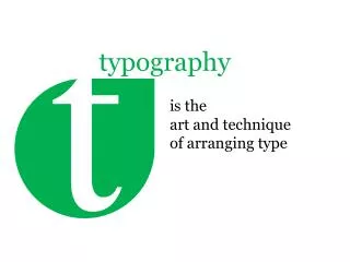
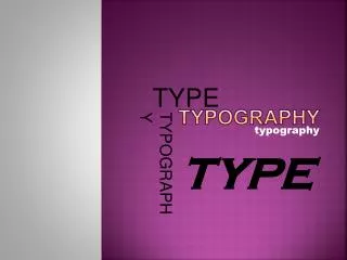
Typography. Typography. Typography is the art of creating and setting type with the purpose of honoring the text it sets. Typography exists to honor the content it sets to enhance legibility and embody the character of the words within. Typography.

E N D
Typography • Typography is the art of creating and setting type with the purpose of honoring the text it sets. • Typography exists • to honor the content it sets • to enhance legibility and • embody the character of the words within.
Typography • Principles of durable typography: • legibility • some earned or unearned interest that gives its living energy to the page. Robert Bringhurst The Elements of Typographic Style
Typography • Typography exists to bring order to information by dividing and organizing. • It aids readers in finding what they are looking for.
Reset • All the browsers have their own default styling for various (X)HTML elements. • Makes it difficult for cross-browser consistency. • You should Reset everything. • YahooReset.CSS • Eric Meyer Reset : meyerweb.com/eric/tools/css/reset/ • http://meyerweb.com/eric/thoughts/2007/05/01/reset-reloaded/
Font sizing • Sizing in pixels is absolute while sizing in ems or percentages are an example of relative terms.
Font sizing |Relative | Use em • EM is relative unit best to be thought of as a box. • It is relative to the point size of a specific font (1 em in typical browser is 16 point). • (Sizing with EM Example | EM Box *)
Font sizing | Relative | Size of the em • Size of the em square does not define the size of individual characters within a font. Most fonts have characters that are either larger or smaller than an em (in height or width). • Size of type refers to the size of the em square, not the size of individual characters.
Font sizing | Relative • Relative font sizes are relative to browser default font size (usually16 pixels) or to the parent element. p { font-size: 80%; } blockquote { font-size: 80%; } • If browser base font is 16px, 80% of 16px is 12.8px, so p and blockquote are same. • However, if p element is inside the blockquote, 80% of 12.8px is 10.42px. (Relative Sizing Example| Blockquote and P *)
Font sizing | Relative | 62.5% • Richard Rutter wrote article outlining a trick to making EM sizing calculations simpler: See: http://www.alistapart.com/articles/howtosizetextincss/ http://www.clagnut.com/blog/348/
Font sizing |62.5% • Browsers’ common default font size is 16px. • Set the body font size to be 62.5%, resetting the default value to 10px. • From here on, using ems is much easier: • 12px in ems is 1.2em • 8px is 0.8em. • This only works for direct child elements of the body; nested elements will be relative to their parents. (Work on Example *)
Absolute font sizes • Specified by designer, done in pixels. • Overrides any preference for larger or smaller type a user may want. p { font-size: 14px; } blockquote { font-size: 14px; } • Both paragraphs and blockquote will be 14px even when a child of another element. • No inheritance. • Simpler than figuring out math of relative font sizing.
Absolute font sizes Downsides • Takes control away from user. • Accessibility issues if user needs larger text to accommodate for poor vision.
Font sizing | Relative |Absolute When to use Relative versus Absolute • Consider target audience, your design, your resources. • Relatively sizing will likely take more time. • Sites with target users who have poor vision use relative. • Situations where abnormally small text has been used for stylistic reasons and you want to make sure someone can resize text to read it - use relative. Jeff Croft, 2008
Stick it to a scale • Stick it to a scale • Use a scale when setting type. • Find what suits you best for a given project and stick to it.
Stick it to a scale • Don’t compose without a scale • “In the sixteenth century, a series of common sizes developed among European typographers, and the series survived with little change and few additions for 400 years. [...] Use the old familiar scale, or use new scales of your own devising, but limit yourself, at first, to a modest set of distinct and related intervals.” Source: http://webtypography.net/Harmony_and_Counterpoint/Size/3.1.1/
Stick it to a scale • Traditionally-set type is composed to a scale. • Above sizes are the classic typographic scale. • Relationships between different sizes of type within a composition is meaningful. • Create a scale thoughtfully and then stick to it. Jeff Croft, 2008
Stick it to a scale • For text which is to be printed, the font-size property can and should be used to set in text in points, for example: p { font-size:12pt }
Stick it to a scale • Body of a web page has 16 px text by default. • Set paragraphs to 12 px would require setting paragraphs at 0.75em. p { font-size:0.75em; /* 16x0.75=12 */ }
Stick it to a scale • The traditional scale: body { font-size:100%; } h1 { font-size:2.25em; /* 16x2.25=36 */ } h2 { font-size:1.5em; /* 16x1.5=24 */ } h3 { font-size:1.125em; /* 16x1.125=18 */ } h4 { font-size:0.875em; /* 16x0.875=14 */ } p { font-size:0.75em; /* 16x0.75=12 */ } (Scale Example 1*)
Stick it to a scale body {font: 1em/1.5em "Lucida Grande“;} h1, h2, h3, h4, h5, h6 {font-family: helvetica, arial, verdana, sans-serif;font-weight: normal;} h1 {font-size: 218%;} h2 {font-size: 164%;} h3 {font-size: 145%;} h4 {font-size: 118%;} (Scale Example 2)
Select a good measure • Measure - length of a single line. • Measure is a key element of readability. • Set with width property. • Best to use ems or percentages to set the width of blocks of text, units are directly proportional to the size of type.
Select a good measure • min-width and max-width properties are very helpful in ensuring a readable measure length, even when text is within larger elements.
Select a good measure | Length • For optimal readability, • a measure of 45-75 characters in length is recommended • Between 30 and 50 ems can be seen as an ideal line length. (Scale Example)
Leading • Space between lines of type. • Comes from traditional letterpress-style typesetting, where strips of lead are used to separate one line of text from the next. • Establishing appropriate leading is one of the fastest ways to make your site look professional.
Leading rules of thumb • Blocks of type typically need positive leading. • Blocks of type do not read well with no leading. • Short elements of type (e.g., headers) need less leading. • Darker (heavier) type needs more leading than lighter type. • Sans serif type needs more leading than serif. • Longer line-lengths need more leading. • Shorter line-lengths require less leading. Jeff Croft, 2008
Shades of gray • For legibility contrast must exist between the background and foreground colors. • Computer screens have much greater black/white contrast than typical printed page. • As a result, many web designers prefer off-black topure black on white backgrounds. • Elegant to use very light gray instead of pure white on black backgrounds. Show Examples 1 - 4
Shades of gray Make all visual distinctions as subtle as possible, but still clear and effective. Edward Tufte Visual Explanations
Grids • Bring order to page and help specify where things should go and their flow. • Use “gutters” (margins between columns) to separate your columns • http://960.gs/ • http://developer.yahoo.com/yui/examples/ Show Grid Examples
Additional items • Set body in a serif and headings in a san serif or visa-versa - add to visual appeal • Set abbr and acronym elements in small caps (using the font-variant property) • Mark new paragraphs with indents, outdents, or other ornaments, drop cap and/or headers. Simon Pascal Klein, Beautiful Web Typography
Additional items • Generally use flush-left (text-align: left;) for running text, particularly with narrow measure. • Justification can work at ample measures and better with serif typefaces. • Use high-contrasting link colors Simon Pascal Klein, Beautiful Web Typography
Resources • http://webtypography.net • http://alistapart.com/topics/design/typography • http://ilovetypography.com • http://cameronmoll.com • http://jeffcroft.com • http://markboulton.co.uk • http://zeldman.com • http://960.gs/ • http://developer.yahoo.com/yui/examples/