Download
1 / 4
40 likes | 145 Views
Option 7 Do bigger earthquakes kill more people?

E N D
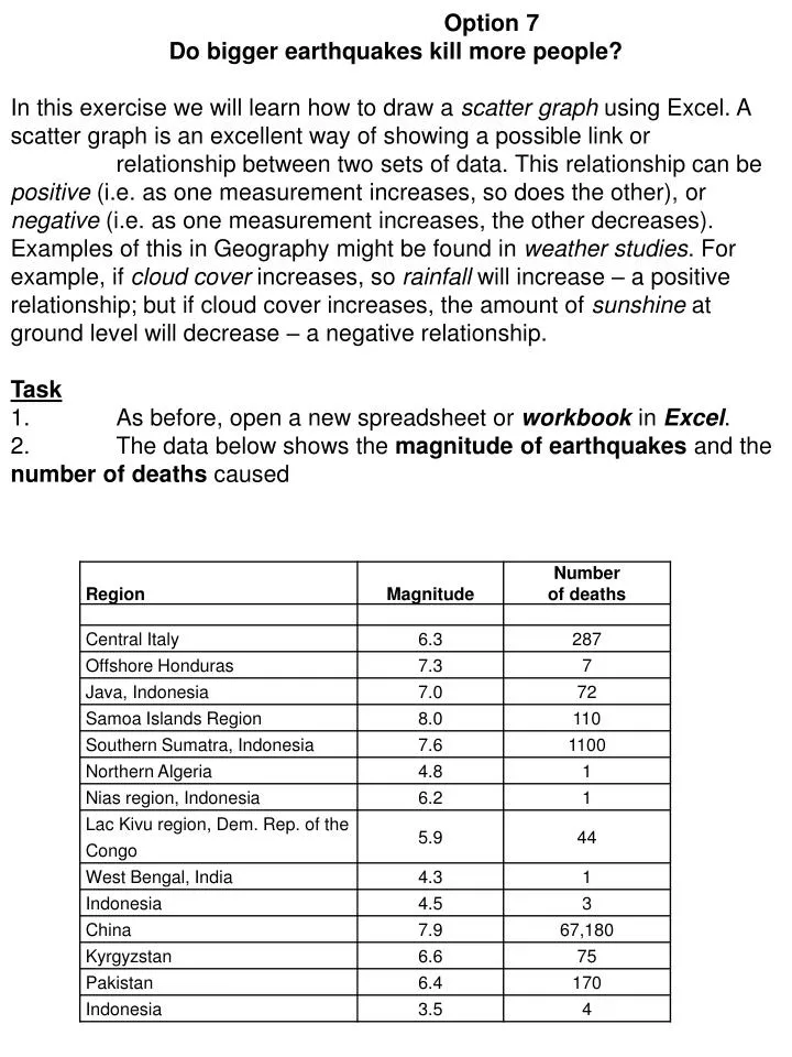
Option 7 Do bigger earthquakes kill more people? In this exercise we will learn how to draw a scatter graph using Excel. A scatter graph is an excellent way of showing a possible link or relationship between two sets of data. This relationship can be positive (i.e. as one measurement increases, so does the other), or negative (i.e. as one measurement increases, the other decreases). Examples of this in Geography might be found in weather studies. For example, if cloud cover increases, so rainfall will increase – a positive relationship; but if cloud cover increases, the amount of sunshine at ground level will decrease – a negative relationship. Task 1. As before, open a new spreadsheet or workbook in Excel. 2. The data below shows the magnitude of earthquakes and the number of deaths caused
3. Enter the data into your spreadsheet as shown on the next screenshot. 4. Highlight the two columns of figures and select XY (Scatter) from the options shown in the Chart Wizard. Highlight the data. Click on the Chart Wizard button. Select XY(Scatter) from the options; then click Next. 5. Click Next again to move to this screen and add the Titles as shown. Add these titles as shown. Also click on the Legend tab and clear the Legend. 6. Click Next to continue, then As new sheet from the next window. Select As new sheet.
7. Your finished scatter graph should now look like something like this: 8. By itself, this pattern of dots may not mean very much. However, if we add a trendline, we can get a clearer idea of any link, or relationship, which may exist between the two sets of data. 9. To do this, simply select Add Trendline from the Chart menu. Choose Linear from the new window which appears, then OK. Your graph should now look like this: Choose Add Trendline from the Chart menu.
10. So what does this mean? The three diagrams below may help. 10. So what does this mean? Three diagrams below may help. (ii) (i) A line which is angled upwards as in this example suggests there may be a positive relationship. This means that an increase in one variable leads to an increase in the other. An example in weather studies would be between cloud cover and rainfall – as one increases, so will the other. A line angled at 45° suggests a very strong positive relationship. A line which is angled downwards in this manner indicates a negative relationship. This means that an increase in one variable will cause a decrease in the other. Another example occurs in weather studies – where an increase in cloud cover (one variable) will lead to a decrease in sunshine (the other variable). A line at 45° suggests a very strong negative relationship. If Excel is unable to draw a Trendline, or if the line is horizontal or vertical, it suggests that there is norelationship between the two sets of data, so that an increase or decrease in one will have no effect on the other. In people, for example, an increase in height is not related directly to an increase or decrease in intelligence! Exam question: 1) What is the relationship between the magnitude of the earthquakes and number of deaths? Circle the correct answer • There is a positive relationship (as magnitude increases so does the number of deaths). • There is a negative relationship (as the magnitude increases the number of deaths decreases • There is no relationship between the magnitude and number of deaths 2) Describe and explain 2 other human and physical factors that could lead to the increase the number of deaths from an earthquake. (6 Marks)