Download
1 / 3
30 likes | 33 Views
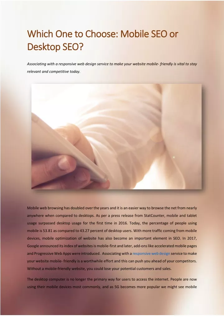
Associating with a responsive web design service to make your website mobile- friendly is vital to stay relevant and competitive today. <br>

E N D
Which One to Choose: Mobile SEO or Which One to Choose: Mobile SEO or Desktop SEO? Desktop SEO? Associating with a responsive web design service to make your website mobile- friendly is vital to stay relevant and competitive today. Mobile web browsing has doubled over the years and it is an easier way to browse the net from nearly anywhere when compared to desktops. As per a press release from StatCounter, mobile and tablet usage surpassed desktop usage for the first time in 2016. Today, the percentage of people using mobile is 53.81 as compared to 43.27 percent of desktop users. With more traffic coming from mobile devices, mobile optimization of website has also become an important element in SEO. In 2017, Google announced its index of websites is mobile-first and later, add-ons like accelerated mobile pages and Progressive Web Apps were introduced. Associating with a responsive web design service to make your website mobile- friendly is a worthwhile effort and this can push you ahead of your competitors. Without a mobile-friendly website, you could lose your potential customers and sales. The desktop computer is no longer the primary way for users to access the internet. People are now using their mobile devices most commonly, and as 5G becomes more popular we might see mobile
traffic become even more important and grow quickly. Businesses must however, consider the following questions before shifting focus to mobile tactics: •Find out whether you target audience are using mobile search to research purchase of both. •At what particular time of the day are they using mobile? •What roles do the different device types play on the path to purchase? •Does mobile search behaviour vary across product lines and territories? •Does my strategy take into account the complementary nature of mobile and desktop? •What role does mobile SEO play when compared to other channels such as social media and paid search? •With the above in mind, am I spending enough time crafting an optimal desktop experience? Desktop is still important It is a known fact that mobile usage is higher than desktop usage for browsing the Internet. In 2019, desktop users spent an average of 128 minutes per day for media consumption and mobile users spent 203 minutes per day and media consumption on mobile devices. The mobile users surpassed desktop users by nearly 37 percent. These figures show that mobile usage is growing whereas desktop usage is stagnant. So the next that business owners should consider is to find out which devices the consumers use on the path to purchase. An analysis of stats pulled from Similarweb revealed that of 39 trillion seconds spent online, visitors from desktop devices spend 1.9 times longer on a site than their mobile counterparts which means that mobile users are less focused. According to Statista, the conversion rate for online shoppers using desktop (4.14 percent) is higher as compared mobile online shoppers (1.53 percent). As the user experience considerations are different for mobile and desktop, business owners must decide which pages should be mobile optimized and which pages desktop optimized. Here are some of the major differences in Mobile SEO and Desktop SEO that webmasters should consider when building their SEO strategy. Search results: Mobile text results are usually larger as the mobile gives more emphasis on visuals. Mobile results are set up as cards, containing a border around the result, which takes up more room. Therefore mobile will fit two to three listings on the screen at once as a result the swipes are shorter and takes longer time to reach the bottom of the search results. So they are likely to choose from the first few search results than scrolling down. In the case of desktop, it fits up to five search results at one time and it easier for the users to scroll down and reach the end of the page in just a few scrolls.
Search layouts: The search layouts change from device to device depending upon the screen space. Mobile device screens are vertical and smaller than desktop screens, which means that search results have a fraction of the search real estate that desktop contains. The features that show up on search also can differ between desktop and mobile, so it’s important to identify what features impact mobile vs. desktop. Mobile often shows more features in results than desktop, and the features that show up can look different. For example, the knowledge panel appears on top of the mobile page and on the desktop page it appears on the right side. Displaying the knowledge panel on top of the page is much easier for mobile users because it pushed down the results further which makes it easier to scroll down instead of swiping left and right. Another feature that is available only on mobile search layout is Finds snippets which uses Google’s algorithms to show somewhat relevant web pages that Google thinks users might find interesting. Desktop also has a wide variety of features many of which appear on mobile as well. They include but are not limited to, featured snippets, knowledge panels, People Also Ask sections and local 3-packs. These features push organic results down the page, but the outcome isn’t quite as drastic as with mobile. Click-through rates: When you look at the click-through rate (CTR) between mobile and desktop, you’ll find that the click-through rate for mobile drops significantly less than on desktop. According to a survey by WebEx, on mobiles, the CTR for the first position is 24%, compared to 14% for the second position. This CTR continues to drop with each position, until position five, from position four to five, the CTR jumps from 6.8% to 9%. This drop is because of the individualized cards for each listing. Since each listing is clearly sectioned off, it’s easier to look at individual listings. However, the desktop’s wider screen has more space to display search results. It also lets you have multiple results visible at one time, multiple sponsored and search features appearing to the side of results. The CTR on a desktop for position one is 31% but drops significantly down to 15% for the second position which is due to the number of listings that fit on one screen. Since users can see up to five listings on one page, they go with the first one instead of vetting through the other listings. With rising number of people having access to mobile data, it is clear that mobile data usage is expected to increase more than desktop. So, business owners must decide where they should invest, mobile SEO or desktop SEO, depending on the device the audience is using to conduct searches. So, designing a responsive website with assistance from a reliable responsive web design service is the right choice for businesses to drive more customers. An experienced company will have professional staffs to ensure seamless web design solutions. These services are cost-effective and you will find your projects completed within the required turnaround time. (631) 494-3324