Download
1 / 11
120 likes | 510 Views
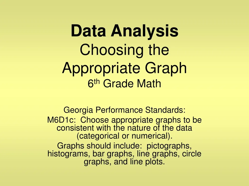
Data Analysis Choosing the Appropriate Graph 6 th Grade Math. Georgia Performance Standards: M6D1c: Choose appropriate graphs to be consistent with the nature of the data (categorical or numerical).

E N D
Data AnalysisChoosing the Appropriate Graph6th Grade Math Georgia Performance Standards: M6D1c: Choose appropriate graphs to be consistent with the nature of the data (categorical or numerical). Graphs should include: pictographs, histograms, bar graphs, line graphs, circle graphs, and line plots.
Essential Question • Can you pick the correct graph to use when given certain information?
Choosing Appropriate Graphs • Pictograph – Visual display of data ***Key Features: Must use a symbol to represent data items “Eye Catching”
A Legend tells you what each bar represent. Choosing Appropriate Graphs… • Bar Graph - categorical data “categories”
Choosing Appropriate Graphs… • Line Graph – change over a period of time
Choosing Appropriate Graphs… • Histogram – a special type of bar graph that displays intervals or ranges Key Features: Ranges and Bars connect
Choosing Appropriate Graphs… Circle Graph – displays percents or fractional parts
Choosing Appropriate Graphs… • Stem-and-leaf Plot – lists numerical data in order from least to greatest ex) Ordered Plot • Line Plot – shows data above number line displayed with “X’s” (outliers and mode easily identified)
What type of graph? • A car dealership sells seven makes of cars. Which data display(s) could be used to compare sales for each make of car last year? 2. 3.The ages of 16 school teachers are: 48, 52, 46, 58, 25, 48, 55, 51, 58, 49, 60, 53, 30, 27, 42, 49 4.
6. How is the graph misleading? • Would you use a bar graph or a stem-and-leaf plot to display the ages of 30 people buying a movie ticket? Explain. • Recreation football sign-ups are complete. The following number of boys registered in each age group are listed below: • 7 to 8 year olds - 48 boys • 9 to 10 year olds – 73 boys • 11 to 12 year olds – 68 boys • What type of graph would you use to display this information?