Download
1 / 13
150 likes | 800 Views
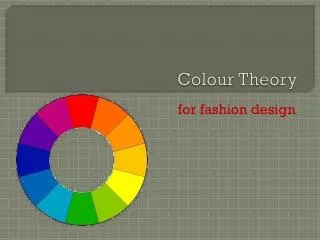
COLOUR THEORY. SIGNS & SYMBOLS. You can greatly enhance any graphic or sketch with the careful addition of colour. There are more rules than you might think regards what colours should be used when. You will get to know what the main rules are by studying the following couple of pages.

E N D
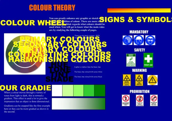
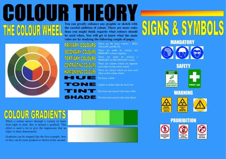
COLOUR THEORY SIGNS & SYMBOLS You can greatly enhance any graphic or sketch with the careful addition of colour. There are more rules than you might think regards what colours should be used when. You will get to know what the main rules are by studying the following couple of pages. THE COLOUR WHEEL MANDATORY These are the basic colours ; RED, YELLOW and BLUE. PRIMARY COLOURS These are made by mixing two PRIMARY colours together. SECONDARY COLOURS These are made by mixing a PRIMARY & SECONDARY colour. TERTIARY COLOURS These are colours which are opposite each other on the colour wheel. SAFETY CONTRASTING COLOURS These are colours which are near each other on the colour wheel. HARMONISING COLOURS The basic colour HUE Lighter or darker than the basic hue TONE The basic hue mixed with some white WARNING TINT The basic hue mixed with some black SHADE COLOUR GRADIENTS PROHIBITION When a colour moves through a variety of tones from light to dark, this is termed a gradient. This effect is used a lot to give the impression that an object is three dimensional. Gradients can be stepped like the first example here or they can be more gradual as shown in the second.
COLOUR THEORY WHAT COLOURS TO USE . . . AND WHEN ! There is no absolute right and wrong when it comes to selecting the right colour for a particular task. Colour is only unsuitable if it is used inappropriately or in combinations which are inharmonious. The choice of colours and colour combinations often comes down to nothing more than personal taste. However, equally as often the choice is governed by a set of rules which will be explained on this page. Keep in mind you will have to say why you chose the colours that you did for every piece of work in your folio and you should rarely, if ever, break any of the rules on this page. So get to know them ! Here are some of the rules governing some colours. Do you agree with them all ? SOME FUNCTIONS OF COLOUR Political colours, National colours. Interior decoration Great power of attraction but too much can be tiring. Hot, bold, exciting, festive, passionate, positive. Red can be associated with rage, aggression, danger, courage, masculinity and speed. RED Colour coding YELLOW The colour which is most easily seen (luminous). Bright, pleasant, happy, sunny, lively and cheerful. Yellow is often associated with sunshine and holidays. Warning signs and advertising Blue is more formal than red or yellow. Cool, sophisticated, aristocratic, serene, passive, elegant and reliable. Rarely used in food because of its association with mould. BLUE Corporate identity ORANGE Sunny, cheerful, warm and happy. Orange is one of the appetite colours associated with flavour and energy. Packaging GREEN Green is the most restful of all of the colours. Fresh, youthful, cool, soothing, natural and informal. It is also associated with safety, health and environmental concern. International signs and symbols PURPLE Purple combines the courage of red and the nobility of blue. Rich, pompous, impressive and regal. Purple is also seen as the colour preferred by moody people ! Traffic lights VIOLET Cool, negative, retiring, subdued and solemn. Violet is associated with peacefulness. BROWN Safe, reliable, wholesome and natural. Brown is often associated with the earth. Army uniforms and team colours GREY Neutral, sedate, dignified, dull and inconspicuous. Grey is often associated with old age. Receding/advancing, Heavy/light Luminous, positive, light, delicate, cold and clean. White is often associated with innocence and purity. WHITE Subdued, solemn, heavy and profound. Black is often associated with death, sorrow and evil. BLACK
COLOUR In Graphic Communication we use colour extensively. However, we do not simply use it for the sake of using it. We use it for specific purposes. We select certain colours to render, design and tone products to suit the individual environment.
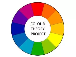
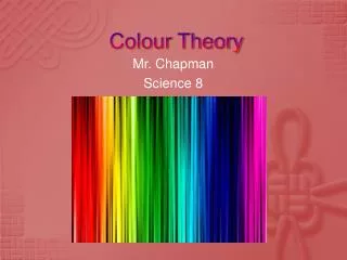
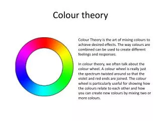
THE COLOUR WHEEL The colour wheel is made up of every colour in the visible spectrum. Inside the colour wheel we have primary, secondary and tertiary colours.
COLOUR ASSOCIATION We are surrounded by colours everywhere and colours are involved in everything we do, both consciously and sub-consciously. In the following few slides we will take a look at what certain colours mean to us and how they are manipulated in every day life. . .
COLOUR ASSOCIATION Red is associated with areas such as passion, danger, speed, stopping, blood, fear and warmth. Certain items will be coloured red due to this colour association. RED
COLOUR ASSOCIATION Blue is a formal colour, it is associated with sophistication, elegance and reliability. It is a cool colour which is rarely used in foods as it is associated with mould! BLUE
COLOUR ASSOCIATION Yellow is an easily seen, luminous colour. It is associated with brightness, sunshine, holidays, being happy and cheerful. YELLOW
COLOUR ASSOCIATION Orange is similar to yellow in its associations. Orange is linked with areas such as warmth, fire, sun, being happy, cheerful and is also associated with flavour and energy. ORANGE
COLOUR ASSOCIATION Green is a very restful and peaceful colour. It is associated with areas such as nature, health, the environment, informal, youthful and cool. GREEN
COLOUR ASSOCIATION Purple combines the courage of red and the nobility of blue. It is a rich, pompous, impressive and regal colour. PURPLE
COLOUR ASSOCIATION White is luminous, positive, light, delicate and clean. It is also associated with innocence and purity in our culture but with death in some other cultures. WHITE
COLOUR ASSOCIATION Black is very subdued, solemn, profound, it is associated with death, sorrow and evil in our culture. BLACK