Download
1 / 30
300 likes | 546 Views
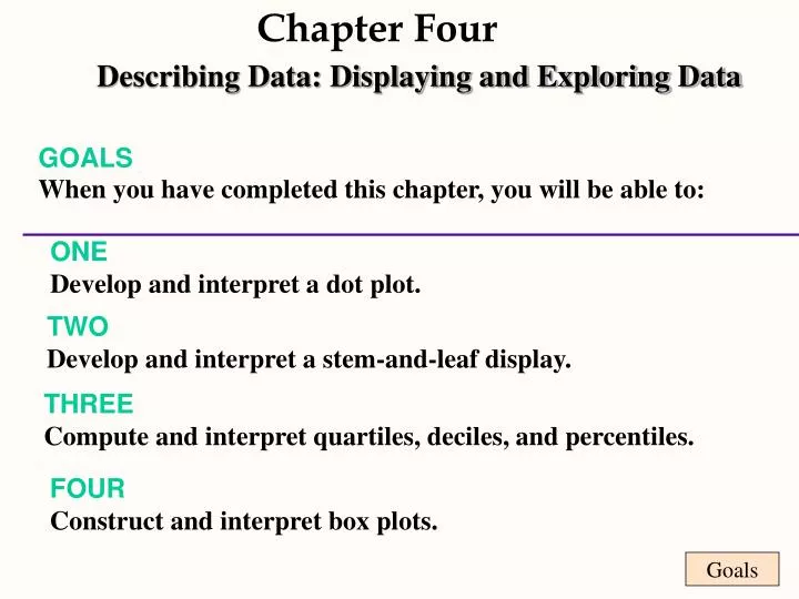
Chapter Four. Goals. Describing Data: Displaying and Exploring Data. GOALS When you have completed this chapter, you will be able to:. ONE Develop and interpret a dot plot. TWO Develop and interpret a stem-and-leaf display. THREE Compute and interpret quartiles, deciles, and percentiles.

E N D
Chapter Four Goals Describing Data: Displaying and Exploring Data GOALS When you have completed this chapter, you will be able to: ONEDevelop and interpret a dot plot. TWODevelop and interpret a stem-and-leaf display. THREECompute and interpret quartiles, deciles, and percentiles. FOURConstruct and interpret box plots.
Goals Chapter Four Describing Data: Displaying and Exploring Data FIVECompute and understand the coefficient of variation and the coefficient of skewness. SIXDraw and interpret a scatter diagram. SEVEN Set up and interpret a contingency table.
Dot Plot Dot Plot • Dot plots: • Report the details of each observation • Are useful for comparing two or more data sets
Example 1 This example gives the percentages of men and women participating in the workforce in a recent year for the fifty states of the United States. Compare the dispersions of labor force participation by gender.
Example 1 (continued) This example gives the percentages of men and women participating in the workforce in a recent year for the fifty states of the United States. Compare the dispersions of labor force participation by gender.
Example 1 (continued) Percentage of women participating In the labor force for the 50 states. Percentage of men participating In the labor force for the 50 states.
Stem-and-leaf Displays Stem-and-leaf Displays Stem-and-leaf display: A statistical technique for displaying a set of data. Each numerical value is divided into two parts: the leading digits become the stem and the trailing digits the leaf. Note:an advantage of the stem-and-leaf display over a frequency distribution is we do not lose the identity of each observation.
Stock prices on twelve consecutive days for a major publicly traded company Example 2
Example 2 (Continued ) Stem and leaf display of stock prices
Quartiles Quartiles
Quartiles (continued) Quartiles
Quartiles (continued) Quartiles Quartiles
Quartiles (continued) Quartiles Quartiles
Quartiles (continued) Quartiles Quartiles Lp = (n+1)
Example 2 (continued) Using the twelve stock prices, we can find the median, 25th, and 75th percentiles as follows: Quartile 3 Median Quartile 1
Example 2 (continued) 75th percentile Price at 9.75 observation = 88 + .75(91-88) = 90.25 12 11 10 9 8 7 6 5 4 3 2 1 96 92 91 88 86 85 84 83 82 79 78 69 Q4 Q3 50th percentile: Median Price at 6.50 observation = 85 + .5(85-84) = 84.50 Q2 25th percentile Price at 3.25 observation = 79 + .25(82-79) = 79.75 Q1
Interquartile Range The Interquartile range is the distance between the third quartile Q3 and the first quartile Q1. This distance will include the middle 50 percent of the observations. Interquartile range = Q3 - Q1
Example 3 For a set of observations the third quartile is 24 and the first quartile is 10. What is the quartile deviation? The interquartile range is 24 - 10 = 14. Fifty percent of the observations will occur between 10 and 24.
Box Plots A box plot is a graphical display, based on quartiles, that helps to picture a set of data. Five pieces of data are needed to construct a box plot: the Minimum Value, the First Quartile, the Median, the Third Quartile, and the Maximum Value.
Example 4 Based on a sample of 20 deliveries, Buddy’s Pizza determined the following information. The minimum delivery time was 13 minutes and the maximum 30 minutes. The first quartile was 15 minutes, the median 18 minutes, and the third quartile 22 minutes. Develop a box plot for the delivery times.
The coefficient of variation is the ratio of the standard deviation to the arithmetic mean, expressed as a percentage: Coefficient of Variation Relative dispersion
( ) - 3 X Median = sk s Skewness is the measurement of the lack of symmetry of the distribution. Movie Thecoefficient of skewnesscan range from -3.00 up to 3.00 when using the following formula: A value of 0 indicates a symmetric distribution. Some software packages use a different formula which results in a wider range for the coefficient.
Example 2 revisited ( ) - 3 X Median = sk s Using the twelve stock prices, we find the mean to be 84.42, standard deviation, 7.18, median, 84.5. Coefficient of variation = 8.5% Coefficient of skewness = -.035
Scatter diagram Scatter diagram:A technique used to show the relationship between variables. Variables must be at least interval scaled. Relationship can be positive (direct) or negative (inverse). Example The twelve days of stock prices and the overall market index on each day are given as follows:
Example 2 revisited Index (000s) Price 8.0 7.5 7.5 7.3 7.2 7.2 7.1 7.1 7.0 6.2 6.2 5.1 96 92 91 88 86 85 84 83 82 79 78 69
Contingency table A contingency table is used to classify observations according to two identifiable characteristics. Contingency tables are used when one or both variables are nominally scaled. A contingency table is a cross tabulation that simultaneously summarizes two variables of interest.
Example 5 Weight Loss 45 adults, all 60 pounds overweight, are randomly assigned to three weight loss programs. Twenty weeks into the program, a researcher gathers data on weight loss and divides the loss into three categories: less than 20 pounds, 20 up to 40 pounds, 40 or more pounds. Here are the results.
Example 5 continued Compare the weight loss under the three plans.