Download
1 / 11
110 likes | 236 Views
Evaluation of Ancillary Texts. Ellie Hodge. My Final Film Poster. Firstly to create my film poster I had to do some research to see what is generic for a film poster.

E N D
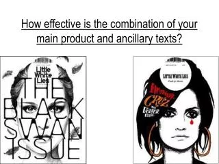
Evaluation of Ancillary Texts Ellie Hodge
Firstly to create my film poster I had to do some research to see what is generic for a film poster. • I looked at existing products e.g. posters in the cinema, on film website & film trailers on the TV. I than narrowed my search for Social Realism (as this the genre of my short film) film posters only to see if there was anything different this genre did for their film posters. • I was especially interested in the film posters for Fish Tank; This is England & Billy Elliot. These were all British films with a Social Realist feel. (I found the layout of these posters quite different than other genres – especially Fish Tank, with it even having a landscape poster). • I had to know what targeted the audience so looked at the break down of a film poster, deconstructing an array of them. Looking at the layout, the text, font size, dates & colour schemes, it appeared these characteristic were included in the majority, if not all, film posters.
Tag Line, something memorable that is a summary of the whole film. Title Block Pointing out the producer – seen other films by him? This may make you want to see the film more. Critics Opinions Main Stars/Characters Billing block
Studios & Producing Companies used – You may like previous films by these people? Critics Opinions Layout, The layout is very different on this poster it is landscape & not many poster are landscape. Title Block Tag Line Billing block Certificate, so appropriate audiences can be interested. High Ratings by critics may making you want to see it more as you respect their opinion? Main Star
Names of other films produced by the same people – you may like these films & make a connection between them making you want to see this one as well. Main Star The layout of the poster sets the boy apart from the others, he is the main focus of the poster suggesting the film is about him. Title Block Billing block Including all members of the cast & the crew who created the film e.g. Directors & producers. Release Date, so the audience are aware & know when the can see it.
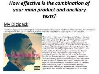
I have displayed the main character as the focus of the poster. This may attract previous audiences who enjoyed the actors films or other work. His name is not stated, this could be changed to encourage his ability or display his ‘value’ as an actor. Our Tagline is Memorable & gives a suggestion on what the film is about overall. A Summary of it, it gives the audience an idea of what the film is about drawing them in & attracting them to it. High Ratings have been given to draw the attention of people. If they believe critics think is good them may see more reason to go & see it. The font is bold & it stands out against the background. It can be used across all promotional production pieces. This is so it is eye catching & people will definitely notice it. I have given a rough estimation of the release date so that people stay intrigued but are also aware of when they can see the film so they do not loose interest in it. The certificate has been stated so the right audience is attracted. People know if it is suitable for them to see or for children to go. The Billing Block lists all the main cast members, & key crew members the font is small & long to ensure everybody’s names can fit. On this poster I am missing the actors name this however could be as he is not a household name as of yet so displaying his name would be a useless promotion strategy.I also believe the picture could be better suited for the genre we have chosen to do. It does not follow any triangular positioning like many other movie posters & the colour scheme is not too eye catching.
It was not as challenging as expected, however the colour schemes were harder to create with limited choice. • It was also difficult laying out everything in particular places as they moved easily when adding more, or removing text. • Overall I think my film review is somewhat professional looking, it uses all characteristics of big company film posters. The only thing I would say is a setback is the choice of colours I have used.
Before writing a film review I researched other, already existing film reviews on various Film blogs e.g. Fast Tomato & looked at film magazines e.g. Sight & Sound, Empire & Total Film. • This helped me establish some sort of outline or rough guide to what a Film Review included. They were quite short including Actors, Directors, a rough plot synopsis, Verdict & Date released. • This also gave me ideas on what a film reviews layout looks like. I than looked at a pro former, this was more detailed including what the actors & directors have previously done, quotes, ratings, opinions of other film reviews. • I followed the outline of the pro former adding characteristics of the other film reviews I’d read. • The variation of reviews I looked at helped me create mine, they showed that despite a difference in genre a film review is the same. • Each company or film review writer has a different layout & chooses what they include in it.