Download
1 / 1
10 likes | 17 Views
Take a look at LightningChart .NET gallery. Observe the various types of charts examples! The fastest data visualization tool for WPF and Windows Forms. Visit us: https://www.arction.com/gallery/<br>

E N D
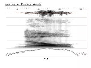
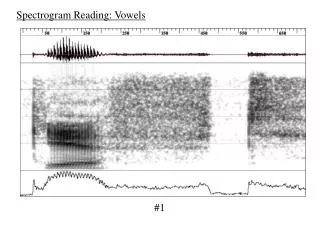
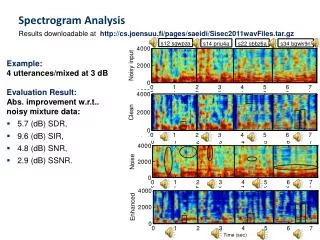
Spectrogram Charts Are A Great Addition To Your Advanced Scientific Applications Spectrogram charts visualise spectral density over time. The data itself is 3-dimensional. Each data point has frequency, time and magnitude info. Traditionally, people talk about waterfall charts, which actually, are composed of the lines. Nowadays, the data can be shown in 2D charts as heatmap, and in 3D charts a surface chart. Most commonly, spectrogram charts are used in vibration analysis, sonar devices, music visualization, radar, etc. If you remember the old windows media player, the waterfall-like lines that would interact with the music is an example of a spectrogram chart. The spectrogram charts can be a static plots of collected data, or a scrolling real-time ones – vertical or horizontal. To get spectrogram values, the data time-domain data sensor data is FFT (Fast Fourier Transform) converted, power level computed typically in dB scale, and depending on the resolution, applying overlapping computation to get the data suitable for spectrogram charts resolution. What Are The Main Advantages Of A Spectrogram Chart? There are plenty of significant advantages to using a spectrogram chart. Some of the main advantages are as follows: 1.Ability to create beautiful, fluid, and scrolling charts: a disadvantage with most types of graphs and chart is that they are 2D, and usually stationary except for a few exceptions. However, when you want to project dynamic information such as sounds, radar, or sonar frequencies, it can be difficult to do so with a chart that is not dynamic, or a chart that is stationery. This not only affects the functionality and accuracy of the information portrayed, but it is often aesthetically jarring as well. Spectrogram controls go one step further and ensure that the data projection needs are met effectively, and in a manner that ensures that the integrity of the data that is presented is not affected in any manner. 2.Ability to show data in very high resolution. By trying to have as many lines as there are rows or columns in the spectrogram, it would become a mess. As spectrogram chart, the data is nicely in matrix format, and data values easily understood from colors. 3.Versatility: 2-dimensional spectrogram charts are preferred in serious scientific applications with very high amounts of data, or when there only a limited screen space available for the chart. 3-dimensional spectrogram charts are better when you want to rotate the view and see the data from the end of frequency or time axis. Or just when you want the get the ‘WOW’ factor high to getuser’s attention. For all of these reasons, a spectrogram chart is optimal visualization for many demanding data visualization cases.