Download
1 / 39
720 likes | 1.73k Views
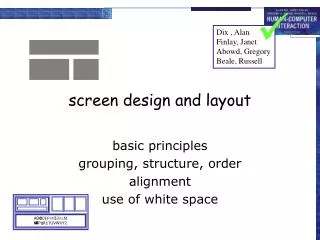
. Dix , Alan Finlay, Janet Abowd, Gregory Beale, Russell. A B C D E F G H I J K L M N O P Q R S T U V W X Y Z. screen design and layout. basic principles grouping, structure, order alignment use of white space. basic princ iples. ask what is the user doing? think

E N D
Dix , Alan Finlay, Janet Abowd, Gregory Beale, Russell ABCDEFGHIJKLM NOPQRSTUVWXYZ screen design and layout basic principles grouping, structure, order alignment use of white space
basic principles • ask • what is the user doing? • think • what information, comparisons, order • design • form follows function
available tools • grouping of items • order of items • decoration - fonts, boxes etc. • alignment of items • white space between items
Billing details: Name Address: … Credit card no Delivery details: Name Address: … Delivery time Order details: item quantity cost/item cost size 10 screws (boxes) 7 3.71 25.97 …… … … … grouping and structure logically together physically together
order of groups and items • think! - what is natural order • should match screen order! • use boxes, space etc. • set up tabbing right! • instructions • beware the cake recipie syndrome!… mix milk and flour, add the fruit after beating them
ABCDEFGHIJKLM NOPQRSTUVWXYZ decoration • use boxes to group logical items • use fonts for emphasis, headings • but not too many!!
alignment - text • you read from left to right (English and European) align left hand side boring but readable! Willy Wonka and the Chocolate Factory Winston Churchill - A Biography Wizard of Oz Xena - Warrior Princess Willy Wonka and the Chocolate Factory Winston Churchill - A Biography Wizard of Oz Xena - Warrior Princess fine for special effects but hard to scan
alignment - names • Usually scanning for surnames make it easy! Alan Dix Janet Finlay Gregory Abowd Russell Beale Dix , Alan Finlay, Janet Abowd, Gregory Beale, Russell Alan Dix Janet Finlay Gregory Abowd Russell Beale
alignment - numbers think purpose! which is biggest? 532.56179.3256.3171573.94810353.142497.6256
alignment - numbers visually: long number = big number align decimal points or right align integers 627.865 1.005763 382.583 2502.56 432.935 2.0175 652.87 56.34
multiple columns • scanning across gaps hard:(often hard to avoid with large data base fields) sherbert 75toffee 120chocolate 35fruit gums 27coconut dreams 85
sherbert 75toffee 120chocolate 35fruit gums 27coconut dreams 85 multiple columns - 2 • use leaders
multiple columns - 3 • or greying (vertical too) sherbert 75toffee 120chocolate 35fruit gums 27coconut dreams 85
multiple columns - 4 • or even (with care!) ‘bad’ alignment sherbert 75 toffee 120 chocolate 35 fruit gums 27 coconut dreams 85
white space - the counter WHAT YOU SEE
THE GAPS BETWEEN white space - the counter WHAT YOU SEE
defrost settings type of food time to cook physical controls • grouping of items • defrost settings • type of food • time to cook
1) type of heating 1 2) temperature 3) time to cook 2 4) start 3 4 physical controls • grouping of items • order of items • type of heating • temperature • time to cook • start
different colours for different functions lines around related buttons (temp up/down) physical controls • grouping of items • order of items • decoration • different coloursfor different functions • lines around relatedbuttons
centred text in buttons physical controls • grouping of items • order of items • decoration • alignment • centered text in buttons? easy to scan ? ? easy to scan ?
gaps to aid grouping physical controls • grouping of items • order of items • decoration • alignment • white space • gaps to aid grouping
user action and control entering information knowing what to do affordances
Name: Alan Dix Address: Lancaster Name: Alan Dix Address: Lancaster Name: Alan Dix Address: Lancaster entering information • forms, dialogue boxes • presentation + data input • similar layout issues • alignment - N.B. different label lengths • logical layout • use task analysis (ch15) • groupings • natural order for entering information • top-bottom, left-right (depending on culture) • set tab order for keyboard entry ? N.B. see extra slides for widget choice
knowing what to do • what is active what is passive • where do you click • where do you type • consistent style helps • e.g. web underlined links • labels and icons • standards for common actions • language – bold = current state or action
appropriate appearance presenting information aesthetics and utility colour and 3D localisation & internationalisation
name size chap1 chap10 chap11 chap12 chap13 chap14 … 17 12 51 262 83 22 … name size chap10 chap5 chap1 chap14 chap20 chap8 … 12 16 17 22 27 32 … presenting information • purpose matters • sort order (which column, numeric alphabetic) • text vs. diagram • scatter graph vs. histogram • use paper presentation principles! • but add interactivity • softens design choices • e.g. re-ordering columns • ‘dancing histograms’ (chap 21) size
aesthetics and utility • aesthetically pleasing designs • increase user satisfaction and improve productivity • beauty and utility may conflict • mixed up visual styles easy to distinguish • clean design – little differentiation confusing • backgrounds behind text … good to look at, but hard to read
colour and 3D • both often used very badly! • colour • older monitors limited palette • colour over used because ‘it is there’ • beware colour blind! • use sparingly to reinforce other information • 3D effects • good for physical information and some graphs • but if over used … e.g. text in perspective!! 3D pie charts
baduseofcolour • overuse - withoutverygood reason (e.g. kids’ site) • colour blindness • poor use of contrast • do adjust your set! • adjust your monitor to greys only • can you still read your screen?
across countries and cultures • localisation & internationalisation • changing interfaces for particular cultures/languages • globalisation • try to choose symbols etc. that work everywhere • simply change language? • use ‘resource’ database instead of literal text… but changes sizes, left-right order etc. • deeper issues • cultural assumptions and values • meanings of symbols • e.g tick and cross … +ve and -ve in some cultures … but … mean the same thing (mark this) in others
iteration and prototyping getting better … … and starting well
OK? design prototype evaluate done! re-design prototyping • you never get it right first time • if at first you don’t succeed …
moving little by little … but to where Malverns or the Matterhorn? 1. need a good start point 2. need to understand what is wrong pitfalls of prototyping