Download

1 / 22
220 likes | 548 Views
Good Web Design. And other life skills…. “I can recognize good and poor web design .”. What makes good web design?. Great content Great design, and Great organization. Good Work Ethic. Be on time. Don’t call in sick to get a day off.

E N D
Good Web Design And other life skills…. “I can recognize good and poor web design.”
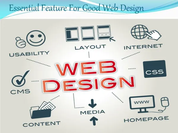
What makes good web design? • Great content • Great design, and • Great organization
Good Work Ethic • Be on time. • Don’t call in sick to get a day off. • Avoid the “gotta have a life” attitude..also called the “High School Mentality” • Put forth extra effort. • You will be noticed. • Ask “What can I do now?”
In Utah County, how much can a student, part-time programmer in HTML/Web Design make per hour? • Minimum wage • $6 – 9 per hour • $10 – 12 per hour • $15 per hour • $20 per hour
A student tester or student computer programmer (someone who codes the “back-end” of a website), can make… • Minimum wage • $6 – 9 per hour • $10 – 12 per hour • $15 per hour • $20 per hour
Proofread • Use correct grammar. • Use correct punctuation. • Check for spelling/typo errors. • Make sure all links work. • Have correct e-mail addresses. • Avoid fractured pictures.
Formatting Guidelines • Use italics ONLY in certain situations. It may be hard to read. • Don’t type in ALL CAPS (shouting). • Use hard ruled lines sparingly. • Avoid blinking text and constant animated gifs. • Don’t use “Click Here.” • Don’t use under construction signs! • Use a subtle background texture.
Use of Color • Choose pleasing color combinations. • Have a high contrast between text and background color. • Keep the same color theme through the site. • A white background is professional. • Avoid using black as a background, unless it is appropriate for the theme.
Too many hard ruled lines <HR /> on a web page can: • Make the page appear cluttered • Take your eyes off the page • NOT very useful in separating many topics or paragraphs; better to use tables.
Backgrounds • White is the MOST professional and used often by business web sites. • A good rule of thumb is to use a WHITE background. • If you are going to use texture or a picture as a background, it should be very light and not distract from the contents on the web page.
Never have your body text this color:WHY? • White • Grey • Blue • Orange
Avoid text that …. • Is italicized • Is Grey • Is blinking
Additional Things to Consider • Is the cutting edge technology right for the site? • Sounds, scrolling java, and animations can get annoying. • View your page on different machines and different browsers. • Make sure the style of the web page fits the subject matter. • Graphics must have a purpose, don’t use them just because they are “cool” or look “cool.”
Additional Things to Consider--Continued • Reading flows from top to bottom, left to right. • Have consistent graphics and text analogies. • Does the site entice people to buy the product/service? • Within 5 seconds, the reader should know the topic of the page. • Will the viewers have the necessary plugin?
Worst Sites to Critique • http://www.osfes.org/ • What is this site about? What is OSFEST 5? • http://wereworthit.com/ • What web design mistake is made? • http://www.mrbottles.com/ • What are they selling? • http://www.lingscars.com/ • Just because you can blink, blink, doesn’t mean you should!
Bad Sites to Critique • http://www.chestertourist.com/morehotels.htm • A lot of the text is difficult to read because of the lack of contrast and the size of the type—it's too small. • http://www.thomasedison.org/ • You shouldn’t have to ENTER to enter! • The screen font is too small and dark to read. • http://www.iccm-1.org/ • Voted the most intense website intro ever!
Good Site to Criticwww.startrek.com • Do you like Star Trek? “Trekkies” will love this site! • Lots of fun movie trailers, games, jokes, and trivia for Star Trek enthusiasts.
Good Site to Criticwww.airforce.com • Excellent use of flash. • Excellent choice of color (blue = Air Force) • Encourages enlistment. • Very informative.
Good Site to Criticwww.pillsbury.com • Wonderful Use of Color and Pictures—Makes me Hungry! • Easy to Get to Information/Recipes • Excellent Use of Navigational/Picture Rollovers • Easy to Navigate the Site • GREAT SITE!
Good Site to Critichttp://www.worldwildlife.org/ • Great graphics and excellent use of their logo (panda bear). • Appealing pictures. • Pictures look crisp because of white background behind the photos. • Navigation at the top is easy to determine within the first 5 seconds: Who we are, What we do, and How to Help.
http://www.dokimos.org/ajff TURN UP YOUR SOUND FOR THIS ONE !!
Rated Worst Sites on the Web 2012 • http://www.staggeringbeauty.com/ • http://www.sixtiespress.co.uk/ • http://www.pinesol.com/ • http://www.supervideo.com/ • http://www.pandminc.com/ • http://www.richardsbrothersseafoods.com.au/ • http://isyourcomputeron.com/