Download
1 / 21
210 likes | 220 Views
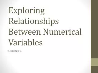
Using Graphs to Illustrate Relationships Between Economic Variables. LEARNING OBJECTIVE. Appendix. Review the use of graphs and formulas. Graphs of One Variable. FIGURE 1A-1. Bar Graphs and Pie Charts. Values for an economic variable are often displayed as a bar graph or as a pie chart.

E N D
Using Graphs to Illustrate Relationships Between Economic Variables
LEARNING OBJECTIVE Appendix Review the use of graphs and formulas. Graphs of One Variable FIGURE 1A-1 Bar Graphs and Pie Charts Values for an economic variable are often displayed as a bar graph or as a pie chart. In this case, panel (a) shows market share data for the U.S. automobile industry as a bar graph, where the market share of each group of firms is represented by the height of its bar. Panel (b) displays the same information as a pie chart, with the market share of each group of firms represented by the size of its slice of the pie.
LEARNING OBJECTIVE Appendix Review the use of graphs and formulas. Graphs of One Variable FIGURE 1A-2 Time-Series Graphs Both panels present time-series graphs of Ford Motor Company’s worldwide sales during each year from 2001 to 2008. Panel (a) has a truncated scale on the vertical axis, and panel (b) does not. As a result, the fluctuations in Ford’s sales appear smaller in panel (b) than in panel (a).
LEARNING OBJECTIVE Appendix Review the use of graphs and formulas. Graphs of Two Variables FIGURE 1A-3 Plotting Price and Quantity Points in a Graph The figure shows a two-dimensional grid on which we measure the price of pizza along the vertical axis (or y-axis) and the quantity of pizza sold per week along the horizontal axis (or x-axis). Each point on the grid represents one of the price and quantity combinations listed in the table. By connecting the points with a line, we can better illustrate the relationship between the two variables.
LEARNING OBJECTIVE Appendix Review the use of graphs and formulas. Graphs of Two Variables Slopes of Lines FIGURE 1A-4 Calculating the Slope of a Line We can calculate the slope of a line as the change in the value of the variable on the y-axis divided by the change in the value of the variable on the x-axis. Because the slope of a straight line is constant, we can use any two points in the figure to calculate the slope of the line. For example, when the price of pizza decreases from $14 to $12, the quantity of pizza demanded increases from 55 per week to 65 per week. So, the slope of this line equals –2 divided by 10, or –0.2.
LEARNING OBJECTIVE Appendix Review the use of graphs and formulas. Graphs of Two Variables Positive and Negative Relationships FIGURE 1A-6 Graphing the Positive Relationship between Income and Consumption In a positive relationship between two economic variables, as one variable increases, the other variable also increases. This figure shows the positive relationship between disposable personal income and consumption spending. As disposable personal income in the United States has increased, so has consumption spending.
LEARNING OBJECTIVE Appendix Review the use of graphs and formulas. Graphs of Two Variables Determining Cause and Effect FIGURE 1A-7 Determining Cause and Effect Using graphs to draw conclusions about cause and effect can be hazardous. In panel (a), we see that there are fewer leaves on the trees in a neighborhood when many homes have fires burning in their fire places. We cannot draw the conclusion that the fires cause the leaves to fall because we have an omitted variable—the season of the year. In panel (b), we see that more lawn mowers are used in a neighborhood during times when the grass grows rapidly and fewer lawn mowers are used when the grass grows slowly. Concluding that using lawn mowers causes the grass to grow faster would be making the error of reverse causality.
LEARNING OBJECTIVE Appendix Review the use of graphs and formulas. Graphs of Two Variables Are Graphs of Economic Relationships Always Straight Lines? The graphs of relationships between two economic variables that we have drawn so far have been straight lines. The relationship between two variables is linear when it can be represented by a straight line. Few economic relationships are actually linear.
LEARNING OBJECTIVE Appendix Review the use of graphs and formulas. Graphs of Two Variables Slopes of Nonlinear Curves FIGURE 1A-8 The Slope of a Nonlinear Curve The relationship between the quantity of iPods produced and the total cost of production is curved rather than linear. In panel (a), in moving from point A to point B, the quantity produced increases by 1 million iPods, while the total cost of production increases by $50 million. Farther up the curve, as we move from point C to point D, the change in quantity is the same—1 million iPods—but the change in the total cost of production is now much larger: $250 million. Because the change in the y variable has increased, while the change in the x variable has remained the same, we know that the slope has increased.
LEARNING OBJECTIVE Appendix Review the use of graphs and formulas. Graphs of Two Variables Slopes of Nonlinear Curves FIGURE 1A-8 (continued) The Slope of a Nonlinear Curve In panel (b), we measure the slope of the curve at a particular point by the slope of the tangent line. The slope of the tangent line at point B is 75, and the slope of the tangent line at point C is 150.
Using and Interpreting Graphs Showing Economic Changes over time A Look at Current National Economic Indicators Published by the Federal Reserve Bank of New York and the Federal Reserve Bank of St. Louis
Explain what this graph shows. What happens to payroll jobs growth over time?
In what economic conditions does unemployment peak over this 35-year period?