Download
1 / 14
140 likes | 183 Views
Use Excel to analyze weather data from Shawbury, Nairn, and Eastbourne observation sites. Explore hypotheses, collect and sort data, find averages, spreads, and draw graphs to support or challenge your hypotheses.

E N D
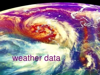
You are going to use Excel to look at some weather data. Shawbury, Nairn and Eastbourne are weather observation sites used by the national Met office.
Have another question (hypothesis) to explore the data handling cycle Have a question (hypothesis) to explore Make comparisons and use statistics to support or cast doubt on your hypothesis Get enough data collected and sorted out Find averages, spreads etc and draw graphs
hypothesis Have a question (hypothesis) to explore something that seems to be true a question that you will look at in some detail – posed as a statement, which may seem to be correct, need to be modified or be wrong a starting place, to give your work a focus, that might need to be changed later, to look more deeply into an aspect
examples of hypotheses or aspects to explore: …… is the wettest month As you move south ….. the average yearly maximum and minimum temperatures are steadily increasing …… has the most sunshine hours there will be a strong negative correlation between max temperature and amount of rainfall …… is the wettest season …… is drier overall than …... …… is wetter than ……
secondary data is provided for you Have a question (hypothesis) to explore the data is reliable because it is from a national weather station that uses accurate equipment Get enough data collected and sorted out it will need to be sorted so that you can work out summary statistics (mean etc) and draw graphs you will need to balance having enough data to be accurate and not having too much (work to do)
data degC degC days mm hours 1957 jan 8.6 1.6 11 30.9 43.4 1958 jan 6.3 -1.0 15 63.3 46.2 1959 jan 4.2 -3.2 24 93.9 77.2 1960 jan 6.6 1.1 12 101.3 27.7 1961 jan 6.2 0.1 16 65.0 26.9 1962 jan 7.4 0.2 8 66.2 66.9 1963 jan -0.1 -6.9 30 21.0 73.6 year month tmax tmin air frost rain sun … The data is in a file called ‘weather data’ There are 7 fields; the data is mostly continuous When you sort make sure you highlight all the cells – so that your data doesn’t get all muddled up
analysing the data, in several ways Have a question (hypothesis) to explore mean, median, mode (averages) range, interquartile range (spread) Get enough data collected and sorted out comparative bar charts, stem and leaf graphs, boxplots, scatter graphs, frequency polygons Find averages, spreads etc and draw graphs
Average monthly temperature in the UK, 1999 to 2008 inclusive
evaluating and interpreting results Have a question (hypothesis) to explore Make comparisons and use statistics to support or cast doubt on your hypothesis Get enough data collected and sorted out Find averages, spreads etc and draw graphs
total sunshine hours median = 132.3 hours 70 90 110 130 150 170 190 median = 124.7 The average (median) was bigger for the first month I looked at Data was more spread out in the first month (range and IQR) Both data sets are fairly symmetrical Overall there were more sunshine hours in the first month than the second – which supports my hypothesis
Have another question (hypothesis) to explore the data handling cycle Have a question (hypothesis) to explore Make comparisons and use statistics to support or cast doubt on your hypothesis Get enough data collected and sorted out Find averages, spreads etc and draw graphs
Extension: Compare Shawbury weather data with data from somewhere in the World on the same longitude. Shawbury is 52.7756 degrees north. Calgary in Canada has a similar longitude. this comparison may illustrate the benefits of the Gulf Stream!