Download
1 / 3
30 likes | 196 Views
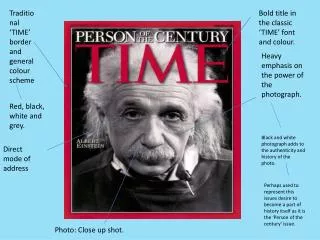
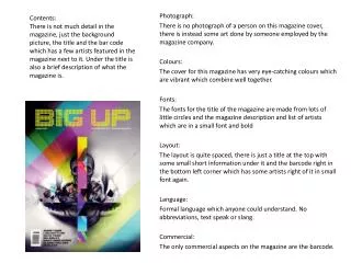
Contents: There is not much detail in the magazine, just the background picture, the title and the bar code which has a few artists featured in the magazine next to it. Under the title is also a brief description of what the magazine is . Photograph:

E N D
Contents: There is not much detail in the magazine, just the background picture, the title and the bar code which has a few artists featured in the magazine next to it. Under the title is also a brief description of what the magazine is. Photograph: There is no photograph of a person on this magazine cover, there is instead some art done by someone employed by the magazine company. Colours: The cover for this magazine has very eye-catching colours which are vibrant which combine well together. Fonts: The fonts for the title of the magazine are made from lots of little circles and the magazine description and list of artists which are in a small font and bold Layout: The layout is quite spaced, there is just a title at the top with some small short information under it and the barcode right in the bottom left corner which has some artists right of it in small font again. Language: Formal language which anyone could understand. No abbreviations, text speak or slang. Commercial: The only commercial aspects on the magazine are the barcode.
Photograph: The photo is of the Dubstep artist Skrillex, he is positioned to the right of the picture with empty space to the left of him. Colour: The three colours featured in the cover are green, black and white (and Skrillex’s skin colour and a little orange on his nail). Fonts: The fonts are bold and box-y to draw the eyes of consumers. Contents: The magazine has the background picture, title, barcode, what’s featured in the magazine and it also has an advertisement too. Language: Formal language which anyone could understand. No abbreviations, text speak or slang. Commercial: The only commercial aspects on the magazine are the barcode. Layout: The text is concentrated to the top left and bottom right of the magazine with the barcode and an advertisement in the bottom left and top right.
Photograph: The photograph is of a Dubstep artist called Deadmaus and the picture is of him during one of his shows. The picture is also in black and white. Colours: Coloursfeatured in the front cover are black and white in the picture and green and yellow for the text. Fonts: Fonts are big, bold and eye catching and the magazine title has been edited by putting a scratch like effect through it which makes some of the title not visible even though it is still readable. Layout: The text is situated to the top, left and right of the magazine to not cover the picture too much and the barcode is in the bottom right corner with an issue number on it. Language: Formal language which anyone could understand. No abbreviations, text speak or slang. Commercial: There is a barcode and a price next to the barcode which wasn’t in the previous two I looked at. Contents: The contents of the cover are background picture, title, what’s in the magazine and barcode.