Download
1 / 21
230 likes | 463 Views
Chapter 2 Exploring Data with Graphs and Numerical Summaries. Section 2.2 Graphical Summaries of Data. A graph or frequency table describes a distribution .

E N D
Chapter 2Exploring Data with Graphs and Numerical Summaries Section 2.2 Graphical Summaries of Data
A graph or frequency table describes a distribution. A distribution tells us the possible values a variable takes as well as the occurrence of those values (frequency or relative frequency). Distribution
The two primary graphical displays for summarizing a categorical variable are the pie chart and the bar graph. Pie Chart: A circle having a “slice of pie” for each category. Bar Graph: A graph that displays a vertical bar for each category. Graphs for Categorical Variables
Pie Charts: Used for summarizing a categorical variable. Drawn as a circle where each category is represented as a “slice of the pie”. The size of each pie slice is proportional to the percentage of observations falling in that category. Pie Charts
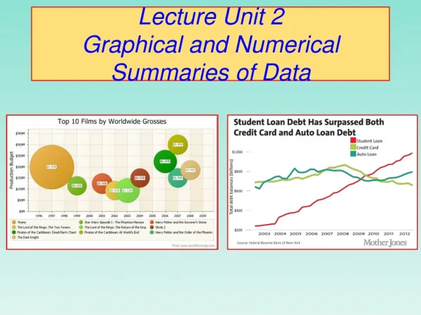
Example: Renewable Electricity Table 2.2 Sources of Electricity in the United States and Canada, 2009
Example: Renewable Electricity Figure 2.1 Pie Chart of Electricity Sources in the United States. The label for each slice of the pie gives the category and the percentage of electricity generated from that source. The slice that represents the percentage generated by coal is 45% of the total area of the pie. Question: Why is it beneficial to label the pie wedges with the percent?
Bar graphs are used for summarizing a categorical variable. Bar Graphs display a vertical bar for each category. The height of each bar represents either counts (“frequencies”) or percentages (“relative frequencies”) for that category. It is usually easier to compare categories with a bar graph rather than with a pie chart. Bar Graphs are called Pareto Charts when the categories are ordered by their frequency, from the tallest bar to the shortest bar. Bar Graphs
Example: Renewable Electricity Figure 2.2 Bar Graph of Electricity Sources in the United States. The bars are ordered from largest to smallest based on the percentage use. (Pareto Chart).
Dot Plot: shows a dot for each observation placed above its value on a number line. Stem-and-Leaf Plot: portrays the individual observations. Histogram: uses bars to portray the data. Graphs for Quantitative Variables
How do we decide which to use? Here are some guidelines: Dot-plot and stem-and-leaf plot More useful for small data sets Data values are retained Histogram More useful for large data sets Most compact display More flexibility in defining intervals Choosing a Graph Type
Dot Plots are used for summarizing a quantitative variable. To construct a dot plot Draw a horizontal line. Label it with the name of the variable. Mark regular values of the variable on it. For each observation, place a dot above its value on the number line. Dot Plots
Divide the range of the data into intervals of equal width. Count the number of observations in each interval, creating a frequency table. On the horizontal axis, label the values or the endpoints of the intervals. Draw a bar over each value or interval with height equal to its frequency (or percentage), values of which are marked on the vertical axis. Label and title appropriately. Steps for Constructing a Histogram
Example: Sodium in Cereals Table 2.4 Frequency Table for Sodium in 20 Breakfast Cereals. The table summarizes the sodium values using eight intervals and lists the number of observations in each, as well as the proportions and percentages.
Histogram for Sodium in Cereals Figure 2.6 Histogram of Breakfast Cereal Sodium Values. The rectangular bar over an interval has height equal to the number of observations in the interval.
Overall pattern consists of center, spread, and shape. Assess where a distribution is centeredby finding the median (50% of data below median 50% of data above). Assess the spreadof a distribution. Shapeof a distribution: roughly symmetric, skewed to the right, or skewed to the left. Interpreting Histograms
Shape Symmetric Distributions: if both left and right sides of the histogram are mirror images of each other. A distribution is skewed to the left if the left tail is longer than the right tail. A distribution is skewed to the right if the right tail is longer than the left tail.
Used for displaying a time series, a data set collected over time. Plots each observation on the vertical scale against the time it was measured on the horizontal scale. Points are usually connected. Common patterns in the data over time, known as trends, should be noted. To see a trend more clearly, it is beneficial to connect the data points in their time sequence. Time Plots
The number of people in the United Kingdom between 2006 and 2010 who used the Internet (in millions). Time Plots Example Adults using the Internet everyday