Download
1 / 11

E N D
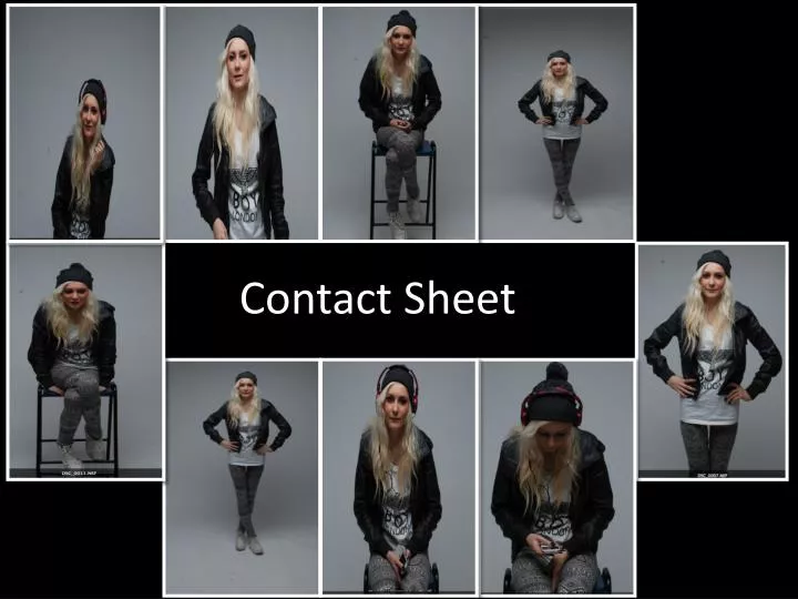
Photo 1 • I decided to use this photograph on my double page spread. I already had 3 pictures where the cover model was standing and the camera shot was a long shot. However I decided that I wanted a medium close-up to make it look more interesting. This allowed the readers to see her facial expressions as she is smiling whilst listening to music which is something she likes doing.
Photo 2 • I decided not to use this photograph as it looks unprofessional, although I could have use Photoshop to edit it I think I took better pictures then this one. The positing of her arm was in an awkward position and looks confusing and as if she was not ready to take the photo graph. Her facial expressions are boring therefore I found it difficult to think where I could place this image in my music magazine.
Photo 3 • I did not choose to feature this image in my music magazine because the position she s. in. The cover model does not look comfortable and she is not giving the camera eye contact. The chair also looks ‘cheap’ and randomly. I felt this picture would not be a good representation of the cover model or the magazine. The image looks boring and dull and it would take a lot of work to edit in order to improve the overall look.
Photo 4 • I used this image on my front cover. I choose this picture as it was a long shot which shows the whole body. You could see her choice of clothing and this was important as I was targeting students, and I wanted the cover model to be a representation of them.
Photo 5 • I did not select this image to appear in my music magazine. I did not think this would be suitable as the cover model is not looking at the camera. The image does not look professional. The cover model is shrugging and l did not want this image to represent the target audience. The image does not look appealing.
Photo 6 • I also used this on my double page spread this is a similar image to photo 4 however her stance is different as she is standing straighter. I decided to use this image as you can see her clothing and her facial expressions. Her hands on her hips shows that she is confident and this links in with the double page spread article.
Photo 7 • I did not use this picture in my music magazine because I think it looks boring. The cover model looks as if she is not interested, therefore making the overall look seem unprofessional. I think that the props were irrelevant, you can see clearly that the cover model is using her phone, I thought that this image was inappropriate.
Photo 8 • I decided not to chose this image also. I did not like how the cover model is not looking directly at the camera. The stance she is in looks quite negative as if she does not care. I thought that this would portray the incorrect message of the magazine. You can not see the cover models face in enough detail. Therefore I did not use this picture.
Photo 9 • I decided to use this image and placed it on the on the contents page. I think that this image is clear and shows her facial expressions as well as her clothing. However because this was not as important as the image on the front cover I reduced the size so the readers can see who the person is, but made sure the image did not take away any attention from the text beside it.
All together I used 4 photos • Photo 1 which appeared on my double page spread • Photo 4 which appeared on the front cover • Photo 6 which appeared on the double page spread • Photo 9 which appeared on the contents page.