Download
1 / 2
20 likes | 96 Views
This guide explores key principles for effective font and design choices to create a coherent visual layout. Learn how proximity, contrast, repetition, and alignment play crucial roles in enhancing design elements. Understand font families and how to use them strategically for better aesthetics. With tips on color choice, text size variation, and alignment techniques, you can elevate your design skills to create visually appealing and organized page layouts. Discover the power of unity and consistency in design for impactful visual communication.

E N D
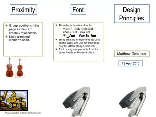
Proximity Font Design Principles • Group together similar page elements to create a relationship. • Keep unrelated elements apart. • Three basic families of fonts: • Serif – with “little feet” • Sans-Serif – sans feet • Fun – fun is fun • Try to limit the number of fonts used on the page, and use different fonts only for different page elements. • Avoid using multiple fonts from the same family in the same place. Matthew Gonzales 13 April 2010 Images courtesy of library.thinkquest.com
Contrast Repetition Alignment • Create excitement through contrast. • Color Choice – use contrasting colors for design elements. • Fonts – use different fonts for different page elements. • Text Size – Use differentsize text for different page elements. Make certain elements stand out with BIG text or little text. • Use consistency in your design elements – use the same font for all of your headings, for example. • Use color families, and repeat colors. • Creates unity in design. • Use alignment to create organization within the page. • Left align, right align, and center align can be used in different places for different purposes. • Align page elements.