Download

1 / 16
160 likes | 162 Views
Learn about the different parts of statistics involving data, how graphs can be misleading, and how to read and interpret bar and circle graphs. Explore the population growth of bald eagles and global population trends. Homework problems included.

E N D
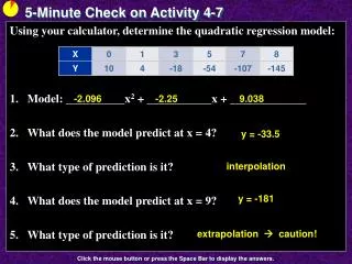
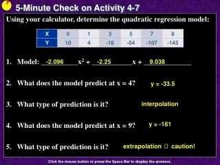
5-Minute Check on Activity 7-1 • What are the three parts of the science of statistics involving data? • What can make comparisons of graphs misleading? • Besides scaling, what else can make a graph misleading? • Name two things to avoid in good graphs. Gathering, analyzing and making predictions Their scaling on axes Different class widths Distortion and 3-D effects Click the mouse button or press the Space Bar to display the answers.
Activity 7 - 2 Bald Eagle Population
Objectives • Read tables • Read and interpret bar graphs • Read and interpret circle graphs
Vocabulary • None new
Activity The bald eagle has been the national symbol of the United States since 1782, when its image with outspread wings was placed on the country’s Great Seal. Bald eagles were in danger of becoming extinct about thirty years ago, but efforts to protect them are working. In 1999, President Clinton announced a proposal to remove this majestic bird from the list of endangered species. The bald eagle was eventually declared recovered and was delisted in July 2007. The following bar graph displays the number of nesting bald eagle couples in the lower 48 states for the years 1963 to 2000. The horizontal direction represents the years from 1963 to 2000 and the vertical direction represents the number of nesting pairs.
Activity cont What was the number of nesting couples in 1963? In 1986? In 2000? How did you locate these numbers on the bar graph? Estimate the number of nesting couples in 1982, in 1988 and in 1996. 417 1875 6471 heights were given on graph 1500 2500 5100 How did you estimate the numbers? From 1986 to 1998, what do the bars indicate about the number of eagle couples? used the scale on left to estimate these years’ data numbers are increasing
Activity cont Estimate the number of bald eagle couples in Louisiana in 2000. a little over 180 182 Estimate how many more bald eagle couples were observed in Louisiana compared to Texas in 2000 Texas about 78; so about 104 or so difference
Activity cont Which animal group actually saw a drop in the number of endangered and threatened species between 95 and 05? Which animal group show the largest increase and by how many species? Birds – only group where dark bar is smaller Mammals 65 to 79 is 14 (Fish 105 to 116 is 11)
Activity cont Which animal group had the largest number of endangered species in 1995? Which animal group had the smallest number of endangered species in 1995? Fish (36%, but we don’t know how may from this graph) Reptiles
Global Population Chart For each of the following statements give specific data from the bar graph that either supports of refutes the claim. a) No matter what the age group, there are more females than males b) The largest age group, regardless of gender, was 10-14 year olds c) Males and females were very close in number for all age groups between 40 and 59 d) World-wide birthrate appears to have increased dramatically during 1988-2002 time period Males are more in the lowest age groups bars in this age group are the longest the bars for these age groups are very close to same length bars for the 14 year old and younger groups are shrinking; not growing
Global Population Growth a) What will be the increase in global population from 2002 to 2050? b) In 2030, what is the projected number of children? about 0.4 billion people about 2 billion c) In 2030, what is the projected number of adults? about 6.2 billion
Summary and Homework • Summary • Bar graph is a plot of categorical data where the number of data values is represented by the height or length of the bar • Pie chart (circle graph) displays the relative number (percentage) of each category of the data in a slice of the pie • Homework • page 798-803; problems 1, 3-6