Download
1 / 40
400 likes | 411 Views
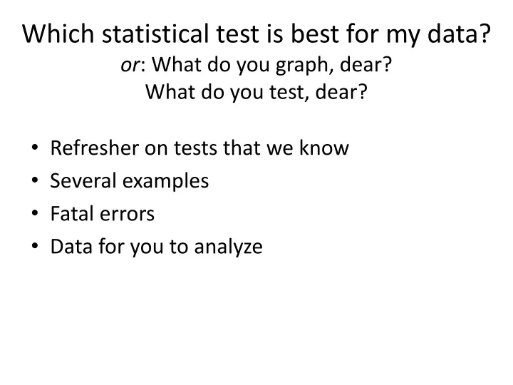
Which statistical test is best for my data? or : What do you graph, dear? What do you test, dear?. Refresher on tests that we know Several examples Fatal errors Data for you to analyze. Which tests and graphs fit which situations?.

E N D
Which statistical test is best for my data?or: What do you graph, dear?What do you test, dear? • Refresher on tests that we know • Several examples • Fatal errors • Data for you to analyze
Which tests and graphs fit which situations? All of these tests assume that the data are independent and normally distributed (more on this later!)
Claim 1: Money can’t buy you love, but it can buy you a good ball team • Specifically, claim is that baseball teams with bigger salaries win more games than those will smaller salaries • Data are average (mean) salaries and winning percentages for the 2012 baseball season
How is this claim best evaluated?-graph and statistical analysis
How is this claim best evaluated?-graph and statistical analysis Scatter plot
How is this claim best evaluated?-graph and statistical analysis Scatter plot, Linear regression
Conclusion • Money can’t buy you a winning ball team, either
Claim 2: Eels control crayfish populations • Specifically, claim is that crayfish population densities are lower in streams where eels are present • Background: dietary studies show that eels eat a lot of crayfish, and old Swedish stories suggest that eels eliminate crayfish • Data are crayfish densities (count along transects, snorkelling) in local streams with and without eels
How is this claim best evaluated?-graph and statistical analysis
How is this claim best evaluated?-graph and statistical analysis Bar graph
How is this claim best evaluated?-graph and statistical analysis Bar graph, t-test p = 0.02
Conclusion • Looks like streams containing eels have fewer crayfish
Claim 3: Human life expectancy varies among continents • Data are mean life expectancy for women in different countries
How is this claim best evaluated?-graph and statistical analysis
How is this claim best evaluated?-graph and statistical analysis Bar graph Note that y-axis doesn’t start at 0
How is this claim best evaluated?-graph and statistical analysis Bar graph, 1-way ANOVA, p = 0.0000001
Conclusion • Life expectancy of women appears to differ among continents • (The ANOVA doesn’t tell us which continents are different; further tests would be necessary to test claims about specific continents)
Claim 4: predators with experience eat more invasive prey • Specific claim is that sunfish from bodies of water that were invaded a long time ago will eat more zebra mussels than sunfish from recently invaded waters or waters without zebra mussels • Data are from an aquarium experiment using sunfishes from rivers invaded 20 years ago, a lake that was invaded 9 years ago, and streams without zebra mussels • Each aquarium contained 15 zebra mussels; the number of mussels eaten in 3 days was recorded
How is this claim best evaluated?-graph and statistical analysis
How is this claim best evaluated?-graph and statistical analysis Bar graph
How is this claim best evaluated?-graph and statistical analysis Bar graph, p = 0.00000009
Conclusion • Fish living in places that have had zebra mussels for a long time eat more zebra mussels
Claim 5: Zebra mussels reduce phytoplankton biomass in the Hudson • Data are growing-season (May-Sept) means for zebra mussel population filtration rate and phytoplankton biomass in the freshwater tidal Hudson River
How is this claim best evaluated?-graph and statistical analysis
How is this claim best evaluated?-graph and statistical analysis scatterplot
How is this claim best evaluated?-graph and statistical analysis Scatterplot, linear regression, … but clearly not linear
How is this claim best evaluated?-graph and statistical analysis • Non-linear regression (available in many statistical packages) • Not really fair to choose a non-linear model after looking at the data, so think about whether your claim suggests a linear model or a non-linear one before analyzing the data
Conclusion • Yes, it looks like zebra mussel feeding reduces phytoplankton population in the Hudson • The relationship is nonlinear
What to do if the predictor variable is continuous but the response variable is a class variable? Baby mussels present Baby mussels absent
Claims for you to test • Large, mobile predators (i.e., crabs) reduce zebra mussel populations in the Hudson • Cell phone ownership increases with income among countries • Levels of dissolved oxygen affect behavior of baby mussels