Download
1 / 9
90 likes | 258 Views
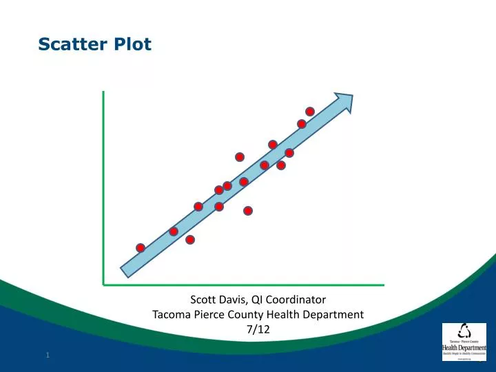
Scatter Plot. Scott Davis, QI Coordinator Tacoma Pierce County Health Department 7/12. Scatter Plot. When would I use this tool? You want to see if there is a relationship between 2 continuous variables You want to test a theory. Scatter Plot. Continuous Variable Scale.

E N D
Scatter Plot Scott Davis, QI Coordinator Tacoma Pierce County Health Department 7/12
Scatter Plot When would I use this tool? You want to see if there is a relationship between 2 continuous variables You want to test a theory
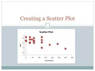
Scatter Plot Continuous Variable Scale Data plotted at intersection for each case Dependent Variable Continuous Variable Scale Independent variable
Scatter PlotTypes of Relationships Positive Negative None Complex
Scatter PlotExample – Positive correlation without unlikely relationship Price per 5th
Scatter PlotExample– Negative (complex) correlation with possible causal relationship Days to deliver Doses Ordered
Scatter Plot Beware Assuming correlation is necessarily a causal relationship Over interpreting a vague correlation Making inferences with too little data
Scatter PlotSteps – by hand Clarify the relationship you are trying to establish Gather at least 15 data points and preferably much more Create axes for each variable with proportional scales The variable you assume to be causal will go on the horizontal axis (generally) Plot data
Scatter PlotSteps – using Excel Clarify the relationship you are trying to establish Gather at least 15 data points and preferably much more Enter data in side by side columns Choose scatter graph