1 / 10
100 likes | 108 Views
Website design is done by every designer, but only a few of them fully test their products. Whether it is visual, interaction or navigation elements, each of them needs close attention. You canu2019t be sure about the outputs a website is going to produce unless you run a complete test. It is mandatory to ensure that everything is in place and aligns with your goal. Else, if visitors come to your site and they donu2019t get a great experience. Read more on https://bit.ly/2zNjTWD

E N D
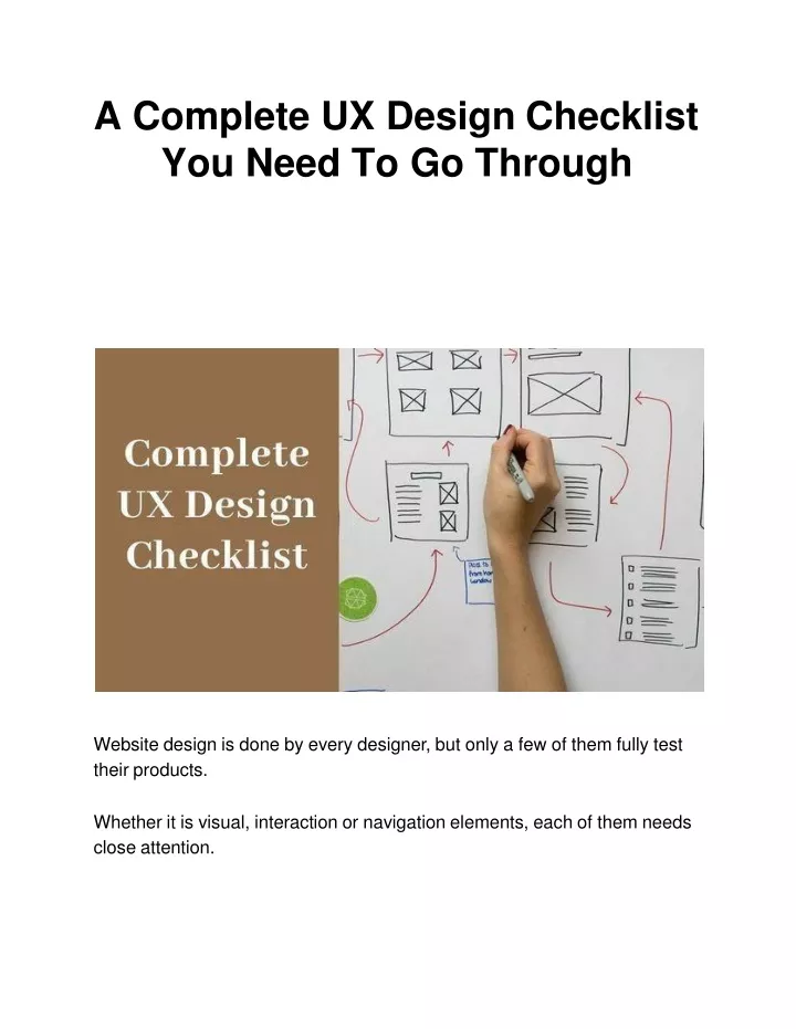
A Complete UX DesignChecklist You Need To GoThrough Website design is done by every designer, but only a few of them fully test theirproducts. Whether it is visual, interaction or navigation elements, each of them needs closeattention.
You can’t be sure about the outputs a website is going to produce unless you run a completetest. It is mandatory to ensure that everything is in place and aligns with your goal. Else, if visitors come to your site and they don’t get a great experience, the first thing they will do is abandon your page and switch tocompetitors. This way your chance to bring potential customers to the sales funnel will bediminished. To avoid such a situation and ensure that your site is doing best at its work, you need to perform a thoroughcheck. That should include every single component of your website that’s there for users’notice. In this blog, we will have a discussion about some points that you need to check before launching asite. However, prior to initiating the long-awaited topic, I would like to introduce you to the prominentweb design Los Angeles company - SFWP Experts. Located in the heart of California, this agency is focused on offering quality services within stipulated time all over the world. Generally speaking, they have specialization in a slew of services that will be beneficial for your brands like user-centric web design and development, customized software development, online marketing, SEO, PPC, and conversion rateoptimization. With that off the mind, let’s enter the subject matter of this post - the ultimate UX design checklist for webdesigners.
The UX Design Checklist Designers Must LookAt Confirm The Loading Speed of YourSite Website speed is the first and foremost opportunity for you to make a good impression on visitors. You don’t want your potential customers to wait until you show your online presence, right? So, it’s the first UX hurdle that you should overcome to interestingly draw in your targetaudience. Remember slow websites lead to visitors’ agitation and create trust issues in the first place. Keeping professionalism in mind, you should optimize your website to load between two and threeseconds. Anything slower than that is going to land your business in financial trouble. Because a poor user experience leads to less consumeracquisition. To bring your website reputation on a higher level, make sure your server speed is exceptionally well, and reduce the file sizes of different elements taking up space on the homepage. This should result in quick site pop up when someone clicks on yourlink. Check If A Bold CTA Is On YourPage An effective call-to-action button plays a key role in informing your visitors about what exactly they have to do. That could be like “Sign up” or “Buy Now” or sometimes even “Add to Cart”. Make sure the one having on your site looks commanding, straightforward, and describes the value of doing so. Now you would be wondering what your CTA should look like? Make it neat, clear and fill with bold colors such as green, orange or similar shades. More importantly, don’t forget to surround it with white space since thatwill
increase its visibility. At the end of the day, you want your users’ eyes to be drawn straight to it, conveying them clearly that this is what you shoulddo. If you are looking for a design professional to create an appealing CTA for your site, bear in mind we will definitely live up to your expectations. Successfully catering to 600 clients around the world, our Los Angeles web design company has evolved as a trusted professional partner for businesses and enterprises of late. You can rely on us without a doubt if you need services like responsive web design and development, landing page design and development, email marketing, social media marketing, search engine optimization andall. See If Your Hierarchy Direct Users Where To Go Next The moment you start designing a site, you should have a frictionless “user journey” in mind. Just, for instance, assume that you are said to build a site where the client will teach online courses. Then, what should a simple user journey looklike? Read newer blog posts > download free test report > sign up newsletters > register in a paid onlinecourse. If you have such a clean and clear user journey, you can create a visual hierarchy and show users the destination where you want them to go. In this case, you need to make sure they see your blog first and then you can put multiple links to your mailinglist. Determine If Your Site Has A Simple 3-ColorPalette
Again, this is all about ensuring things look simple, not over-complicated. Combining more than 3 primary colors is often difficult and if done ignorantly that could lead to viewers’confusion. Believe it or not, color is also a crucial factor in shaping users’ experience. Do you know why? It is linked with the psychology and emotion of humans. For instance, people usually associate blue with trust (perhaps this is the reason why Facebook uses blue color everywhere). In addition to connection, you should also ensure that your color palette matches your product. In case, you have some color in mind you want to represent your brand with, speak up with us and we will help in shaping your brand appearance. Seasoned designers at ourWordpress website design companyare looking for different types of projects to unveil their skills. Not just your brand representation, we will also work on brand promotion to help you reach your targeted goal. To be frank, we are an all-rounder organization for business development, offering services like beautiful web design and development, logo design, icon design, social media management, copywriting, SEO, andPPC. 5. Make Certain You Have Just Two FontFamilies Consistency and branding are the essentials of excellent user experience. Imagine a situation where your logo font is Futura, your body text is Comic Sans, your call to action is Times New Roman and your headlines are Windings, everything will look confusing. Won’tthey? That’s why it is recommended to stick to just two font families if you want the layout to look consistent. Moreover, going with this tip will make your web content easier to read and look more professional andengaging.
Watch Out For A ConsistentNavigation The way users explore your website and navigate through your products and services decides whether or not they are going to complete their goal on your site. So what can you do to make your navigationconsistent? Have a look at your information architecture documentation and ensure that your navigation is understandable and reachable by every individual who comes to your site. On top of that, you also need to check that your navigational elements render well on all screen sizes and don't change or disappearanyway. We highly recommend you to try out card sorting or tree testing techniques before experimenting with visual design since that will ensure your information architecture is intuitive anduser-friendly. Now that you know how important it is to have easy-flowing navigation, it’s time to get designed the same as early as possible. If you want some sort of help from an experienced designer or agency, we have your back. With over 5 years of experience in the IT industry and an additional 5 years in online marketing, we are capable of fulfilling all types of website needs. So, don’t forget to establish a connection withWordpress developer professionals, if your organization needs services more so, eCommerce web design and development, website checking and redesign, speed optimization, search engine optimization, and pay per clickadvertising. Analyze If The Navigation IsScalable Let’s be blunt here - it’s nearly impossible to redesign a product’s navigation and information system every single time when all of a sudden the need to add new features or content arises. Navigation menus and the overall layout needs to be stretchable enough so it can accommodatemore
topics or categories without a problem. Conclusively, designing a menu structure with room for growth in mind will help in ensuring that it can scale easily down theroad. To make scalable navigation, what you need to do is to ask all stakeholders about how content could grow in the future course of time? Will having more static content on the site be good enough? Will the website architecture supportvideos? 8. Reassure The Availability of Progress Indicator For Multi-StepWorkflows In the usual cases of multi-step workflows, the chances are users can wonder how long it will take to finish a task. At that place, having a progress indicator will help users to locate which stage they are in. More importantly, it creates a sense of accomplishment after going through the process and lowers down the droprates. An easy way to check its functionality is to test all the flows inside your products where users are taken through various steps to accomplish a certain activity. Then make sure that each progress is being shown through anindicator. If you are facing issues in designing multi-step workflows, keep remember that you can count on us. Having proficient tech geeks at our Los Angeles web design company is like a boon for all our clients since they are committed to helping everyone to meet website needs. To get hold of them what you need to do is just drop an email or speak on a call. We can help grow your business through professional web design and development, homepage design and development, social media promotion, internet marketing, SEO, PPC andall.
Pay Heed To Repetitive Actions (If They Feel Painless) Repetitive actions for the same input looks like a stressful task that resists users achieve their goal quickly and easily. Filling web forms, for example, feels like a frustrating job when you are required to enter the same information in different forms. At that point, the user is likely to find an alternative way to get their task done. They might switch to your competitors who can help him to do it faster or better or somethingelse. One of the nice ways to test it is to start analyzing all your product’s flows and closely observe how users behave on your site. You want to ensure that if repetitive actions are required to do certain tasks on your site, it must be facilitated. Just think this way, how good will it be for users if they can use an option to use previously enteredinformation? Find Out If Alert Messages AreConsistent Alert messages are notifications that have the same visual style as other website elements and appear usually at the top ofpages. Consistently, sending alert messages to users is an extremely necessary task since that will allow them to understand what immediately deserves attention and whatnot. If you are not being consistent with the alerts would mean users have to put a little pressure on their mind every time a new alert popsup. To test if alert messages are consistent or not, you just have to ensure if they are in the same visual style and positioned at the rightplace. A Quick Wrap Up On UX DesignChecklist
That’s all about the UX design checklist that you needed to know to create an awesome user experience. Check out all the points discussed above and you will be able to attract most visitors’ attention, ending up at capturing your target audience, building trust, and making them feel happy with the interaction experience. Needless to say, what you should do if you come up with a problem throughout the process. Put in mind thatSFWP Expertsis a cutting edge web design company in Los Angeles focused on healing client’s website problems. We can help your brand reach the next level if you collaborate with us for result-oriented services like gorgeous-looking web design and development, online advertising and promotion, email marketing, content writing, search engine optimization, and therest. ContactDetails: 213-277-9177 la@sfwpexperts.com Visit Reference ProfileWebsites: https://bit.ly/2LF0Nod https://bit.ly/3dYkseS https://bit.ly/3g9lVRM https://bit.ly/2LBV2rt https://bit.ly/3bNsTZm
https://bit.ly/3bNsTZm AmbushMarketing https://bit.ly/367C5X0 https://bit.ly/36bVFkR https://bit.ly/2X5BEIS https://bit.ly/2ygNzeuh ttps://bit.ly/2yb9N1hh ttps://bit.ly/2ZfVIuO https://bit.ly/2Xlnt2z https://bit.ly/2WEEMw4 Lead MagnetExpert