Download
1 / 5
50 likes | 59 Views
UX design is the process of enhancing user satisfaction by improving the usability, efficiency and accessibility of a website. Also, the conversion rate is directly proportional to the UX design of the website. Hence, the main emphasis of businesses is to hire the best UX designer.<br>

E N D
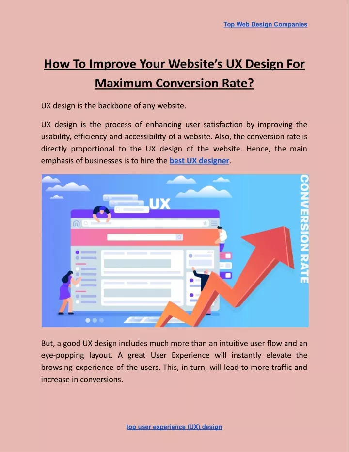
Top Web Design Companies How To Improve Your Website’s UX Design For Maximum Conversion Rate? UX design is the backbone of any website. UX design is the process of enhancing user satisfaction by improving the usability, efficiency and accessibility of a website. Also, the conversion rate is directly proportional to the UX design of the website. Hence, the main emphasis of businesses is to hire the best UX designer. But, a good UX design includes much more than an intuitive user flow and an eye-popping layout. A great User Experience will instantly elevate the browsing experience of the users. This, in turn, will lead to more traffic and increase in conversions. top user experience (UX) design
Top Web Design Companies Improving your User Experience will convert visitors into leads, buyers and brand advocates. Here are 4 ways on how to improve the User Experience of your website: 1. Design a Clear Call to Action Button Call to Action(CTA) are the buttons that are used in a website to guide users towards conversion. The most common CTAs are: Start a trial, sign up for updates, download the app, book a consultation and many others. Using a clear and attractive Call to Action button improves the user experience of any website. The Call to Action attribute should be placed on every page of the website. It has been observed that websites which have a clear CTA have higher conversion rates. Having a clear CTA also improves the overall user experience. Moreover, if your website is designed in folds, it is important to keep your Call to Action above the fold so that it is easily visible to the users. Here are a few things that you should keep in mind: ● The colour of CTA matters. Using colours can make the CTA stand out and give them more prominence. Use contrasting colours in CTA’s as compared to the colour scheme of the entire web page. ● The CTA text should be action-oriented. Avoid using passive verbs in the text. The text should be subtle yet active enough to prompt the user to take the requested action. ● While writing the Call to Action text, the word count should not be more than five words. top user experience (UX) design
Top Web Design Companies Hence, a clear and visible Call to Action in your web design is imperative to a great User Experience. 2. Catch Your 404 Errors While searching, users generally expect to land on the exact specific page they were searching for. In case they land an error, a 404 error in most cases, they will navigate to another site in their search for a faster service. Well, 404 errors have the capability to drive users away from your webpage. But, I understand, 404 errors are not completely unavoidable. So, how do you tackle the problem? ● The first step is to find out for which searches the 404 errors are displayed and then fix them as soon as possible. ● Rather than allowing your site to navigate to the standard ‘404 error: page cannot be displayed’ page, personalize the error messages so that users find them friendly and appealing. ● Use relevant, entertaining and pleasing images on the error page to reduce the annoyance caused to the user. ● Make it clear to the users that you will provide a comfortable and smooth browsing experience. To achieve that, customize the error text and add a personal touch to it. While it is not possible to completely eliminate the error messages, fixing these no-found errors will bring you one step closer towards designing a good UX. top user experience (UX) design
Top Web Design Companies 3. Use Authentic Images Images instantly lift up any webpage and make the content visually appealing. But, the kind of image you choose, can make the overall design of the page appear good or bad. Rule — Stay away from stock photos, always. While it is cheap and extremely easy to use stock photos, trust me, it will do more harm than good. Stock images might look professional, but, within no time the users will be able to make out that these are stock images and thus lose interest. Original photos draw more visitors as they have a realistic approach to them and the user can connect with them. Whereas stock images are overused and don’t appeal to the users. One more thing to keep in mind is that using stock photos will send across a message to the sure that you have not invested many efforts in designing the website. Also, it won’t look unique as they might have already seen it somewhere else. So, always use authentic images, no matter how basic and simple they might look. But, stay away from stock photos. 4. Faster Page Loading Time If your webpage loads slowly, it will frustrate the users who will eventually abandon your website and move on to another site which has a faster loading time. It has been observed that if your page takes more than 2 seconds to load, the user leaves the website. Also, based on the loading time of your website, users decide whether to further visit your site or move on to another site. top user experience (UX) design
Top Web Design Companies So, if the landing page of your website is slow, there are high chances that the user might not even go through your website. Remember, just improving the page load speed of the website for desktop is not enough. It is important to optimize for mobile users as well. With the mobile-first approach being promoted by Google, optimizing and designing your webpage for mobile users has to be done without fail. There are many online tools which can help you check whether your website delivers a speedy user experience across all platforms. One of them is PageSpeed Insights by Google. Using this tool, if you enter the URL of the site you want to check, Google will highlight the areas where your page speed is weak and also give suggestions on how you can improve. To sum up: A great User Experience is not just about providing useful information. Rather, it includes providing useful information in an engaging and pleasing manner. No matter how good your service or product is; if it is not able to catch the users attention, it is not enough. Hence, invest time and efforts to create an engaging website design. Rest assured, your focus and efforts on improving the User Experience of your website will surely generate more traffic and improve conversion rates. Source Link:- https://medium.theuxblog.com/how-to-improve-your-websites-ux-design-fo r-maximum-conversion-rate-d93956c6e8ce top user experience (UX) design
