Download
1 / 5
50 likes | 148 Views
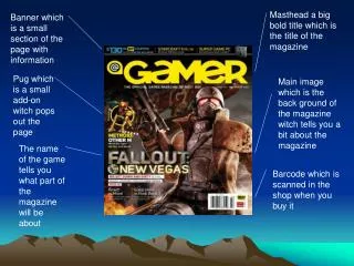
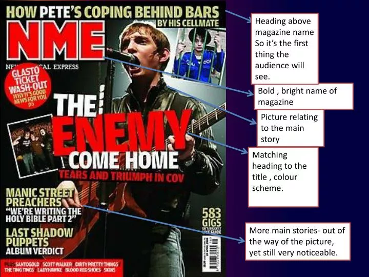
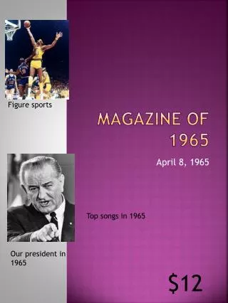
Heading above magazine name So it’s the first thing the audience will see. Bold , bright name of magazine. Picture relating to the main story. Matching heading to the title , colour scheme. More main stories- out of the way of the picture, yet still very noticeable.

E N D
Heading above magazine name So it’s the first thing the audience will see. Bold , bright name of magazine Picture relating to the main story Matching heading to the title , colour scheme. More main stories- out of the way of the picture, yet still very noticeable.
The heading of the magazine cover Is very important as it is one of the first things the consumer sees.It explains the main story which Is covered within the magazine .It is in a white font so that it stands out from the black background of the image.
The title / name of the magazine also has to be eye catching so it is the first thing the audience see when they look at the magazine.This is important because you want to know what magazine you are looking at without having to read the front cover in detail.
The magazine uses a simple colour scheme that is seen on many covers , of white , red , and black. The contrast of the bold white and red colours makes each other stand out to the reader, the black background emphasises this more, yet the colour scheme is still continued with the black fading to white from right to left.
The side heading continue this theme of colour , but vary the white slightly for the band names of the articles, one of the stories uses a quotation from the interview to make the audience want to read on which is commonly used on magazine covers to keep make sure readers buy the product.


![Your Name [Calibri, 25 pt , bold] University of Houston](https://cdn1.slideserve.com/2580289/slide1-dt.jpg)