Download

1 / 26
0 likes | 7 Views
Creative website design and development company delivering innovative, responsive, and user-friendly digital solutions.

E N D
Quora Web Solution Website Design and Development Company Web Design & Web Development Company in Bangalore, India www.quorawebsolution.com +91 9986 056 909 info@quorawebsolutions.com 24A, 1st Main Rd, Chandra Reddy Layout, Koramangala 4th Block, Koramangala, Bengaluru, Karnataka 560034
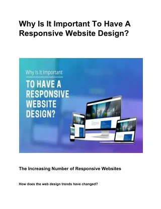
Why Mobile-First Website Design is No Longer Optional: A Deep Dive into Responsive Design Introduction In today’s digital landscape, mobile devices have surpassed desktops as the primary way people access the internet. www.quorawebsolution.com
With over half of global web traffic coming from smartphones and tablets, businesses can no longer afford to ignore mobile users. www.quorawebsolution.com
Mobile-first design has evolved beyond being just a trend—it is now a fundamental requirement for modern web development. www.quorawebsolution.com
This article explores why mobile-first website design is critical, how it impacts user experience (UX) and search engine optimization (SEO), and how businesses can implement it effectively. www.quorawebsolution.com
What is Mobile-First Design? Mobile-first design is a web development strategy that prioritizes designing for mobile devices before scaling up to larger screens like desktops and tablets. This approach ensures that websites are optimized for smaller screens, touch navigation, and varying connection speeds. Mobile-first design is part of responsive web design (RWD), where a website dynamically adjusts its layout to fit different screen sizes. Why is Mobile-First Design Important? Google’s Mobile-First Indexing Since 2019, Google has prioritized mobile versions of websites for indexing and ranking. If your website isn’t optimized for mobile users, it could suffer in search rankings. User Behavior Trends www.quorawebsolution.com
Studies show that mobile devices account for over 60% of web traffic worldwide. Ignoring mobile users can result in poor engagement and high bounce rates. Enhanced User Experience (UX) Mobile-first design ensures intuitive navigation, faster load times, and better accessibility. A positive UX can lead to increased conversions and customer retention. Improved SEO Performance Mobile-friendly websites rank higher on Google, which means more visibility and organic traffic. Competitive Advantage Companies that adopt a mobile-first approach are better positioned to attract and retain customers compared to competitors with outdated web designs. www.quorawebsolution.com
Key Principles of Mobile-First Design 1. Responsive Web Design (RWD) Mobile-first design relies on fluid grids, flexible images, and media queries to ensure a seamless experience across different screen sizes. CSS frameworks like Bootstrap and Tailwind CSS are commonly used to create responsive layouts. 2. Prioritizing Speed and Performance Mobile users expect fast-loading websites. Techniques to improve speed include: Compressing images and videos Minimizing JavaScript and CSS www.quorawebsolution.com
Using content delivery networks (CDNs) Implementing lazy loading 3. Touch-Friendly Navigation Since mobile devices rely on touch input, design elements should be finger-friendly with properly sized buttons, easy-to-scroll pages, and simple menus. 4. Minimalistic and Scalable Design A clutter-free, minimalistic design improves readability and usability. Designers should focus on essential content and avoid unnecessary elements that slow down performance. www.quorawebsolution.com
5. Mobile-Friendly Forms and CTAs Forms should be optimized for touch screens with large input fields and autofill options. Call-to-action (CTA) buttons should be clearly visible and easy to tap. How to Implement Mobile-First Design Step 1: Start with a Mobile Wireframe Begin by sketching out the mobile version of your site before designing for larger screens. Focus on the most important content and actions that users need. www.quorawebsolution.com
Step 2: Use a Mobile-First CSS Approach Apply CSS styles starting from the smallest screen size and progressively enhance for larger screens using media queries. Step 3: Optimize Images and Media Use next-gen image formats (WebP, AVIF) and scalable vector graphics (SVGs) to reduce load times. Step 4: Test Across Devices and Browsers www.quorawebsolution.com
Regularly test your website on different mobile devices and browsers using tools like Google’s Mobile-Friendly Test, BrowserStack, or Lighthouse to identify and fix issues. Step 5: Implement Mobile SEO Best Practices Ensure your website follows mobile SEO guidelines: Utilize structured data markup to enhance how search engines interpret and display your website’s content in search results. Optimize meta tags and headings for mobile search results. Improve internal linking and navigation for better UX. www.quorawebsolution.com
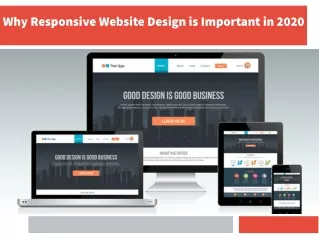
Conclusion A mobile-first website design is no longer optional—it’s the foundation for modern web development. By prioritizing mobile users, businesses can enhance UX, improve search rankings, and stay ahead of the competition. Implementing responsive design principles, performance optimizations, and mobile SEO will ensure a seamless experience for all users, regardless of their device. Now is the time to embrace mobile-first design and future-proof your website! The Ultimate Guide to Modern Website Design: Trends, Best Practices, and Future Innovations Introduction www.quorawebsolution.com
In the rapidly evolving digital landscape, website design plays a crucial role in shaping user experience, brand perception, and overall business success. A well-designed website is more than just aesthetics; it integrates usability, accessibility, and performance to create seamless interactions for users. This guide explores the latest trends, best practices, and future innovations in website design to help businesses stay ahead in the competitive online space. Latest Trends in Modern Website Design 1. Minimalist and Clean Aesthetic www.quorawebsolution.com
Modern websites emphasize simplicity, whitespace, and clean layouts to enhance readability and usability. The minimalist approach reduces distractions and allows users to focus on key content. 2. Dark Mode and Customizable UI Dark mode has gained popularity for its aesthetic appeal and reduced eye strain. Many websites now offer users the ability to switch between light and dark themes for a personalized experience. 3. Advanced Microinteractions and Animations Subtle animations, hover effects, and interactive elements help enhance user engagement without overwhelming the experience. These elements provide feedback and create a dynamic browsing experience. www.quorawebsolution.com
4. AI-Powered Personalization Artificial intelligence is being integrated into web design to deliver personalized user experiences. AI-driven recommendations, chatbots, and adaptive interfaces improve user satisfaction and engagement. 5. Voice User Interface (VUI) and Conversational UI With the rise of voice assistants, websites are incorporating voice navigation and AI-powered chatbots to enhance accessibility and usability. 6. 3D Elements and Immersive Design www.quorawebsolution.com
Advancements in web technologies allow for the integration of 3D graphics, augmented reality (AR), and virtual reality (VR) elements to create immersive digital experiences. 7. Mobile-First and Responsive Design As mobile traffic continues to grow, responsive web design ensures seamless experiences across devices. Mobile-first strategies prioritize touch-friendly navigation and fast-loading elements. Best Practices for Modern Website Design www.quorawebsolution.com
1. User-Centered Design (UCD) Understanding user behavior and needs is essential for effective website design. Conducting user research, creating personas, and testing prototypes help improve usability and engagement. 2. Fast Loading Speeds Website speed significantly impacts user experience and SEO rankings. Optimizing images, leveraging caching, and using Content Delivery Networks (CDNs) improve site performance. 3. Accessibility and Inclusive Design www.quorawebsolution.com
Ensuring that websites are accessible to users with disabilities is a crucial best practice. Using proper color contrast, alt text for images, and keyboard navigation improves inclusivity. 4. SEO-Optimized Structure A well-structured website with proper headings, meta descriptions, and schema markup enhances search engine visibility. Optimizing for Core Web Vitals also improves rankings. www.quorawebsolution.com
5. Secure and Privacy-Focused Design Implementing HTTPS, data encryption, and GDPR-compliant policies help build trust and protect user data. 6. Intuitive Navigation and Clear CTAs Simplified menus, logical information architecture, and clear call-to-action (CTA) buttons enhance usability and conversions. www.quorawebsolution.com
Future Innovations in Website Design 1. AI-Generated Web Design AI-powered design tools like automated code generators and layout suggestions will streamline the web development process. 2. Blockchain for Web Security www.quorawebsolution.com
Decentralized web technologies and blockchain-based authentication may redefine data security and online privacy. 3. Web 3.0 and the Decentralized Internet www.quorawebsolution.com
The next phase of the internet, Web 3.0, aims to create a decentralized web experience with enhanced user control over data. 4. Augmented Reality (AR) Integration www.quorawebsolution.com
AR-enhanced web experiences will enable interactive product previews and immersive storytelling. 5. Biometric Authentication for UX Facial recognition and fingerprint authentication will enhance security and streamline login processes. Conclusion Staying updated with modern website design trends and best practices is essential for businesses aiming to create compelling digital experiences. By adopting a user-first approach, leveraging emerging technologies, and prioritizing performance, accessibility, and security, businesses can build future-proof websites that drive engagement and success in the digital age. www.quorawebsolution.com
Quora Web Solution: Quora Web Solution is a trusted website development company based in Bangalore, India, offering a wide array of services to not only domestic but global clientele. Be it Website Design and Development, SEO services, Digital Marketing, Branding, App Development, Ecommerce Solution, and Logo Creation . Quora Web Solution has the best website developers offering top quality services and that is the reason why we are well known as one of the best Website Development Companies in Bangalore, India. Visit Us - www.quorawebsolution.com Call Us - +91 9986 056 909 Mail Us - info@quorawebsolutions.com www.quorawebsolution.com
WORDPRESS DEVELOPMENT ECOMMERCE DEVELOPMENT PHP DEVELOPMENT CMS DEVELOPMENT DRUPAL DEVELOPMENT WEBSITE SERVICES WEBPORTAL DEVELOPMENT MAGENTO DEVELOPMENT WEBSITE DEVELOPMENT JOOMLA DEVELOPMENT SMALL BUSINESS DEVELOPMENT CHEAP WEBSITE DEVELOPMENT STATIC WEBSITE DEVELOPMENT DYNAMIC WEBSITE DEVELOPMENT WEBSITE DESIGN COMPANY TOUR AND TRAVEL WEBSITE DEVELOPMENT Services