Download
1 / 47
520 likes | 815 Views
Composing With Color. Dana Schutz , Bad Instincts. Color schemes: specific arrangements of colors, based on their placement on the color wheel Triadic, monochromatic, etc are color schemes. Color schemes depend on a LIMITED PALETTE—not all colors will be used-- to ensure harmony. Sol Lewitt.

E N D
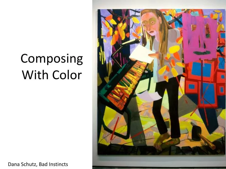
Composing With Color Dana Schutz, Bad Instincts
Color schemes: specific arrangements of colors, based on their placement on the color wheelTriadic, monochromatic, etc are color schemes.Color schemes depend on a LIMITED PALETTE—not all colors will be used-- to ensure harmony
Sol Lewitt OPEN PALETTE: is when any colors from the color wheel are used—there is no limit Open-palette compositions will be more pleasing if saturation and value are taken into consideration.
AKA, “ Color Keys” None of these colors are at full-saturation. Each is a shade of a hue. These are all: DARK-KEYED colors. Desaturated colors on the low (dark) end of the value scale. Deeper, heavier Colors
Low-Keyed Colors: Tints, desaturated colors mixed with white HIGH-KEYED Colors: Colors at their full-saturation Brighter, more intense colors Lighter, subtler “quieter” colors
Spatial effects of colors Brighter, more saturated (high keyed) colors will seem to pull closer to the viewer than duller colors. Colors that are lighter at pure saturation seem (yellows) will seem to take up more space than darker saturated colors (blues) Full saturation colors will seem closer than dark keyed colors (shades) Larger areas of brighter colors appear closer Smaller shapes appear farther Peter Halley
Repeating colors in this Mark Grotjahn image define the distance between the yellow marks.
Luminosity: The appearance of Light in an image Lighter colors placed within darker colors will create an illusion of luminosity, as will warm colors contrasted with cool colors. Tobey Archer
Color weight: color’s tendency to seem to rise or fall in a composition (depending on it’s relationships) LIGHT HEAVY Achromatic Colors High Saturation Colors Light Value Colors Dark Value Colors High Saturation Warm Colors Medium Cool Colors Low Saturation Light Colors High Saturation Dark Colors Inherently Dark Hues Inherently Light Hues
Traditional Color Contrasts, thought to balance a composition Light/Dark Contrast Hue Contrast Cool/Warm Contrast Complementary Contrast
Light/Dark Contrast JWM Turner, Storm at Sea
Warm/Cool Contrast Graham Nickson
Hue Contrast Stuart Davis
PRINCIPLE OF FAMILIARITY Familiarity is pleasing and readily accepted. Color schemes based on nature will seem pleasing to most people, because we are used to them. Light and dark variations of the same color will harmonize. Mary Heilmann, Hermosa Beach
Principle of Resemblance Colors harmonize better when the differences between them are less. Salvador Dali
Principle of Novelty Mostly analogous blues and greens, the orange creates a ‘pop’. While we crave harmony and balance, too much becomes boring. A new or unexpected color will draw attention to itself and enliven the piece.
Principle of Order • Having an orderly plan to determine color choices, like a specific color scheme Triadic, secondary color scheme
Avoidance of Ambiguity Don’t use colors that seem incongruous with the rest of your scheme—a gray amongst vivid colors may draw attention away from the rest of the composition and ruin the flow. An off-hue color may be distracting because the viewer won’t know if it is intentional. There are three reds in this photo, and they don’t quite work together. Are they meant to match?
Compositional Tools to create harmony Harmony: compositional oneness, cohesion the following create harmony: • Repetition: The use of the same visual element (in this case, colors) to create unity • Continuity: degree of flow between parts of a composition • Focal points: Parts of the composition that command the viewer’s attention and allow them to look closer
Ben Vautier, Store Repetition
Dana Schutz Continuity As these colors blend into one another (white to yellow, blue to grey to yellow) they create continuity, allowing the viewer’s eye to travel from one section and one element to another
Emphasis will depend on a contrast of value, color, or saturation, causing one color-area to stand out. Kaye Donachie
Van Gogh Focal Point
Focal Points Juan Miro, Portrait of a Man
Victor Moscos What is going on in this image? Repetition? Unity? Focal points? Continuity?
Balance • The equal distribution of weight or force among elements of a composition • Symmetry: mirror imaging across an axis • Asymmetrical balance: uneven yet balanced components to a composition (think of balance like a scale—it needn’t be identical to be balanced—one ten lb. brick weights the same as ten one lb. bricks)
George Harriman ,Krazy Kat Comic How is the palette limited (what is the color scheme)? How does the artist use color to lead our eye through the composition? What does he do to create balance?
How is this painting balanced through color? Wassily Kandinsky
Most of the painting is depicted in warm brown/orange hues. The white scumbled over the top further unifies this piece. The dark ice creates contrast to the white falling snow, and the bright light reflected in the ice creates further contrast and interest. Peter Doig, Pink Snow
Achromatic Color scheme: no color, all neutrals (black, brown, grey)
Faul Cezanne, Still life with apples Complementary Color scheme
Jacob Lawrence, The Family Triadic
Dana Schutz Double-complementary Red-green, purple-yellow
This book jacket is not based on any color scheme. However, it ‘works’. The green and red are similar values, as are the pink and yellow. The black stands out in contrast. Bruno Paul