Bullets in PowerPoint
10 likes | 154 Views
This is an example of a short, informative title. Introduction

Bullets in PowerPoint
E N D
Presentation Transcript
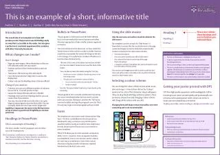
This is an example of a short, informative title • Introduction • The overall aim of our templates is to help staff produce posters that present research findings easily in a way that is accessible to the reader, but also gives a professional, consistent appearance that correlates with other University documents. • What changes can I make? • Don’t change: • Page size and margins: these should stay as they are. DPS will print at the size you require. • Position and size of the University device and unit names • Top banner: this must stay the same depth • Font: the University font ‘RdgVesta’ is used as the display font • Colour: only use the Reading colour schemes offered • Change if you need to: • Columns: you can use a different number of columns but aim for 8–12 words per line of text • Layout: the layout of boxes and text is flexible • Headings: there are three headings built in, you can create more if you need to • Text size: the size of the text in the title is set quite large, to encourage you to write short titles. You can manually shrink the text if you need a longer title. • Legibility is important: the styles in the file have been set up to ensure a good level of legibility at common print sizes. • Headings in PowerPoint • This is an example of Heading 2 • This text is another ‘normal’ paragraph, and can follow any of the heading levels. • This is heading 3, deliberately misaligned (i.e. without a ‘Tab’ character before it). Notice that the second line is indented correctly, but the first line is wrong • This is heading 3 as it should look • Using the slide master • Only the unit name and authors should be edited in the slide master. • Our templates use the concept of a ‘Slide Master’ in PowerPoint to ensure that the crucial elements in the page cannot be changed, moved or distorted unintentionally. Content contained in the slide master includes: • the University device • the unit name (must be your official unit name) • the colour of the banner at the top of the page • the list of authors • a ‘master text frame’ that defines the sizes and styles for each level of bullet in the document • You must be on the top master slide in order to edit the unit name and authors (this is the slide on the top of the left-hand column in Slide Master view). • Selecting a colour scheme • You can change the colour scheme of your poster at any time via Design > Colours then click on the ‘Colours’ options arrow. A list of the University colours will appear (they are all prefixed with Rdg conference poster). There are nine to choose from and changing a colour scheme will change all the colours with one click. • Changing fonts and shape colours manually is very time consuming and is not recommended. Bullets in PowerPoint This paragraph is a bullet point with the bullet deleted, but it is recommended that research posters use bullets whenever appropriate to help simplify complex arguments or theories. • This text is identical to the above, but we have clicked the ‘Bullets’ button in the tool bar to make it a bullet. However, a bullet that sits outside the normal left margin of the text is a bit strange. It is usually better to indent all bullets to at least level two of the hierarchy. • This one is the same as the above, but we have clicked the ‘Increase indent’ button to increase the level of the bullet. • You can also increase the indent using the ‘Tab’ key • On this one, we have clicked the ‘Numbering’ button in the formatting toolbar. • This generates a numbered list instead of bullets. • You can also nest numbers by pressing the ‘Tab’ key • Another example. • Use the ‘Decrease Indent’ button to return back up the hierarchy. This paragraph of text is actually a bullet point. By putting the cursor immediately before the first word in a bullet point, you can press ‘Backspace’ and then the ‘Tab’ key to remove the bullet and align the paragraph correctly. This is the only way to get a normal paragraph without a bullet. Fonts The template uses our custom-made University font ‘RdgVesta’. This font is embedded into the document (on Windows PCs only), so that you can print this poster anywhere without having to install the fonts. RdgVesta is the only University font that we use in our conference poster templates. Office 2010 allows you to insert equations via equation editor. Insert > Equation. Once an equation has been inserted/edited, it has its own text box and be scaled in the same way as standard text. If you need a special character to display scientific information, standard Windows fonts like Arial can be used. Heading 1 Heading 2 Heading 3 Please don’t delete these headings until you’ve finished, you will need them. Pull-out box with bullets • You can use these boxes to highlight part of your text. • It’s best to type directly into this box if you want to retain the formatting of this text. • Don’t put everything in a box, use them sparingly and with purpose. • This box is actually made up of two boxes, but they are not grouped together. This allows you to increase the size of the box, without distorting the relationship between the two parts. You should always move the two boxes together, but enlarge them separately. • This box is set to increase in size automatically as more text is added. Getting your poster printed with DPS DPS have high-quality equipment and knowledgeable staff on hand to get your poster printed quickly and professionally. Our new process for placing poster orders means our service is faster and more reliable than ever before. To place your order: www.reading.ac.uk/dps-posterorder.aspx • References • Author’s name, Book title, (Publisher: Year) pp. XX-YY • Author’s name, ‘Article title’, Journal title, publication info, pp. AA-BB • Researcher’s name, Institution • Acknowledgements • Write here anyone you would like to thank. It works best if this list is bulleted. • Another person to thank here. • Contact information • Department of XXXXXXXXXXX, University of Reading, Whiteknights, RG6 6AH • Email: person@reading.ac.uk • www.reading.ac.uk/xxxxxxxxx Figure 1. This diagram has been positioned accurately within the column, as defined by the guides (choose View > Grids and Guides). You can copy and paste this text box to help you produce captions that align neatly with the rest of your text. Notice that this box has a 1.6mm left margin, to compensate for the indentation of bullets in the main text boxes.
