Download
1 / 35
350 likes | 443 Views
Understand the formal elements of graphic design such as line, shape, color, and texture to create visually striking designs. Explore figure/ground relationships, color systems, value, and texture to enhance your design skills. Learn about patterns for cohesive design compositions. 8 Relevant

E N D
Objectives • Learn the formal elements of graphic design • Understand the principles of design • Examine visual hierarchy • Learn about scale • Comprehend mathematical ratios and proportional systems • Grasp illusion and the manipulation of graphic space
The Formal Elements of Design • Any graphic designer must have a foundation in two-dimensional design and color. • The formal elements are the building blocks of two-dimensional design. • Line • Shape • Color • Texture
Line • A line is an elongated point, considered the path of a moving point; it also is a mark made by a visualizing tool as it is drawn across a surface. • Lines can be straight, curving, or angular; they can guide the viewer’s eyes in a direction. • A line can be implied by the arrangement of shapes. (TOP) LINES MADE WITH VARIOUS MEDIA (BOTTOM) MARAGRITA MIX: PACKAGING LOUISE FILI LTD., NEW YORK
Shape • The general outline of something is a shape; it is created either partially or entirely by lines or by color, tone, or texture. • A shape is essentially flat—meaning it is actually two-dimensional and measurable by height and width. • All shapes may are essentially derived from: the square, the triangle, and the circle. • Each of these basic shapes has a corresponding solid form: the cube, the pyramid, and the sphere.
Shape • There are some basic types of shapes, including: • geometric • organic, biomorphic, or curvilinear • rectilinear • curvilinear • Irregular • nonobjective or nonrepresentational • abstract • representational
Figure/Ground • Figure/ground, also called positive and negative space, is a basic principle of visual perception and refers to the relationship of shapes, of figure to ground, on a two-dimensional surface. • The figure or positive shape is a definite shape; it is immediately discernible as a shape. • The shapes or areas created between and among figures are known as the ground or negative shapes. HOPE FOR PEACE: POSTER RONALD J. CALA II
Color • Additive color system • When working with light, the three primaries are green, red, and blue. • Primaries are also called the additive primaries because, when added together, they create white light. • The color system of white light is called the additive color system.
Color • The subtractive color model is built on the subtractive primary colors. • The subtractive primary colors in pigment are yellow, red, and blue. • In printing, yellow, magenta, and cyan are the colors of the process inks used for process color reproduction. • A fourth color, black, is added to increase contrast.
Color • Designers should have a basic awareness of color print production, ink mixtures, and screen “safe” colors—and their problems. • Basic color knowledge should include awareness of the printer primaries of CMYK, the process of layering dots of ink to produce color, and the Pantone™ color system of ink selection. • The Pantone color system is a standardized color matching set of inks used in printing processes. • Designers should be aware that colors on the web can be unstable; therefore a palette of 16 “web-safe” colors was standardized. PANTONE MATCHING SYSTEM: SWATCH
Value • Value refers to the level of luminosity—lightness or darkness—of a color, such as light blue or dark red. • To adjust the value of a hue, two neutral colors are employed: pure black and white. • Black is the darkest value and white is the lightest. • Value contrast is most useful for purposes of differentiating shapes. The value contrast most clearly differentiates the figure from the ground. • Hue contrasts alone have less impact and therefore may not be as effective for differentiating between the figure and ground images or between elements of a single composition
Texture • In the visual arts, there are two categories of texture: tactile and visual. • Tactile textures have actual tactile quality and can be physically touched and felt; they are also called actual textures • There are several printing techniques that can produce tactile textures on a printed design, including embossing and debossing, stamping, engraving, and letterpress.
Texture • Visual textures are those created by hand, scanned from actual textures (such as lace), or photographed; they are illusions of real textures. • Using skills learned in drawing, painting, photography, and various other image-making media, a designer can create a great variety of textures.
Pattern • Pattern is a consistent repetition of a single visual unit or element within a given area. • In all cases, there must be systematic repetition with obvious directional movement. • If you examine patterns, you will notice that their structures rely on the configuration of three basic building blocks: dots, lines, and grids. • In a pattern, any individual small unit, whether nonobjective or representational shape, can be based on the dot or point. • Any moving path is based on lines, also called stripes. • Any two intersecting units yield a pattern grid.
Format • The format is the defined perimeter as well as the field it encloses— the outer edges or boundaries of a design. • In addition, designers often use the term format to describe the type of application—that is, a poster, a CD cover, and so on. • Format examples: • CD cover (square shape) • Single-page magazine ad (vertical rectangular shape) • Two-page spread (horizontal rectangular shape) • Size is determined by the needs of the project, function and purpose, appropriateness for the solution, and cost. • No matter what shape or type of format, each component of the composition must form a significant relationship to the format’s boundaries. FORMATS: RECTANGLES, SQUARE, CIRCLE
Balance • Balance is an equal distribution of weight. • A balanced composition can be symmetric or asymmetric. • Symmetry is the arrangement of all identical or similar visual elements so that they are evenly distributed on either side of an imaginary vertical axis, like a mirror image. • When you arrange dissimilar or unequal elements of equal weight on the page, it is called asymmetry. NEW YORK TIMES STYLE MAGAZINE: COVER NEW YORK TIMES MAGAZINES
Visual Hierarchy • One of the primary purposes of graphic design is to communicate information, and the principle of visual hierarchy is the primary force for organizing information and clarifying communication. • To guide the viewer, the designer uses visual hierarchy, the arrangement of all graphic elements according to emphasis.
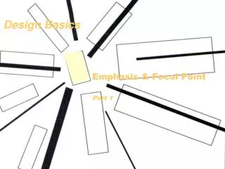
Emphasis • Emphasis is the arrangement of visual elements according to importance, stressing some elements over others, making some superordinate (dominant) elements and subordinating other elements. • Emphasis is directly related to establishing a point of focus— the focal point (the part of a design that is most emphasized or accentuated). • Position, size, shape, direction, hue, value, saturation, and texture of a graphic element all contribute to making it a focal point. • Once past the establishment of a focal point, a designer must further guide the viewer. SUPERDRUG HERBAL SUPPLEMENTS: PACKAGE DESIGN TURNER DUCKWORTH, LONDON
Emphasis • There are several means to achieve emphasis: • Isolation • Placement • Scale • Contrast • Direction and pointers
Rhythm • A strong and consistent repetition, a pattern of elements can set up a rhythm, similar to a beat in music, which causes the viewer’s eyes to move around the page. • Timing can be set by the intervals between and among the position of elements on the page. • A strong visual rhythm aids in creating stability. • Rhythm—a sequence of visual elements at prescribed intervals—across multiple-page applications and motion graphics, is critical to developing a coherent visual flow from one page to another. • Equally important is incorporating an element of variance to punctuate, accent, and create visual interest. • Many factors can contribute to establishing rhythm—color, texture, figure and ground relationships, emphasis, and balance.
Unity • There are many ways to achieve unity where all the graphic elements in a design are so interrelated that they form a greater whole • all the graphic elements look as though they belong together. • An ideal layout might be viewed as a composition of graphic elements so unified as a whole that it cannot be described merely as a sum of its parts. • Most designers would agree viewers are able to best take in (understand and remember) a composition that is a unified whole.
Perceptual Organization • The mind attempts to create order, make connections, and seek a whole by grouping— perceiving visual units by location, orientation, likeness, shape, and color. • Methods of perceptual organization: • Similarity • Proximity • Continuity • Closure
Correspondence and Continuity • When you repeat an element such as color, value, shape, texture, or parallel directions or establish a style, like a linear style, you establish a visual connection or correspondence among the elements. • Continuity is related to correspondence. It is the handling of design elements—like line, shape, texture, and color—to create similarities of form. FLAMING LIPS: POSTER MODERN DOG DESIGN CO., SEATTLE
Alignment • Various structural devices can aid in unifying a static page or multiple-page applications. • Viewers will perceive a greater sense of unity in a composition when they see or sense visual connections through the alignment of elements, objects, or edges. • Alignment is the positioning of visual elements relative to one another so that their edges or axes line up. TESCO FINEST: IDENTITY AND PACKAGING PENTAGRAM, LONDON
Flow • Elements should be arranged so that the audience is led from one element to another through the design. • Flow is also called movement and is connected to the principle of rhythm. • Rhythm, in part, is about a sense of movement from one element to another.
Scale and Proportion • Control scale for the following reasons: • Manipulating scale can lend visual variety to a composition. • Scale adds contrast, dynamism, and positive tension to relationships between and among shapes and forms. • Manipulation of scale can create the illusion of three-dimensional space. • Proportion is the comparative size relationships of parts to one another and to the whole.
Mathematical Proportion • Most designers prefer to rely on their learned and innate sense of proportion; however, some employ graphic devices that can aid in establishing harmony, such as Fibonacci numbers and the golden section, among others. (LEFT) FIBONACCI SQUARES (RIGHT) GOLDEN RATIO (8.5” x 11” PAGE)
The Picture Plane and Depth • When you set out to create a design on a two-dimensional surface, you begin with a blank, flat surface. That surface is called the picture plane. • The illusion of spatial depth means the appearance of three-dimensional space, where some things appear closer to the viewer and some things appear farther away—just as in actual space.
The Picture Plane and Depth • We tend to see graphic elements in terms of three main planes: • the foreground (the part of a composition that appears nearest the viewer) • the middle ground (an intermediate position between the foreground and the background) • and the background (the part of a composition that appears in the distance or behind the most important part) DIRECTION: MAGAZINE COVER PAUL RAND
Summary • Design principles underpin every effective visual solution. Without a complete understanding of two-dimensional design, a designer creates primitively rather than with design intelligence. • The formal elements of two-dimensional design are line, shape, color, and texture. • A line is an elongated point, considered the path of a moving point. • The general outline of something is a shape; it is a configured or delineated area on a two-dimensional surface. • Figure/ground, also called positive and negative space, is a basic principle of visual perception and refers to the relationship of shapes, of figure to ground, on a two-dimensional surface.
Summary • The figure or positive shape is a definite shape; it is immediately discernible as a shape. The shapes or areas created between and among figures are known as the ground or negative shapes. • The colors we see on the surfaces of objects in our environment are perceived and known as reflected light or reflected color. • The digital colors seen in screen-based media are also known as additive colors—mixtures of light. • Value refers to the level of luminosity—lightness or darkness—of a color. • The actual tactile quality of a surface or the simulation or representation of such a surface quality is a texture.
Summary • Pattern is a consistent repetition of a single visual unit or element within a given area. • The basic principles of design are absolutely interdependent. • The format is the defined perimeter as well as the field it encloses—the outer edges or boundaries of a design. • Balance is stability or equilibrium created by an even distribution of visual weight on each side of a central axis as well as by an even distribution of weight among all the elements of the composition. • Symmetry is a mirroring of equivalent elements, an equal distribution of visual weights, on either side of a central axis.
Summary • Asymmetry is an equal distribution of visual weights achieved through weight and counterweight, by balancing one element with the weight of a counterpointing element, without mirroring elements on either side of a central axis. • To guide the viewer, the designer uses visual hierarchy, the arrangement of all graphic elements according to emphasis. • Emphasis is the arrangement of visual elements according to importance, stressing some elements over others, making some superordinate (dominant) elements and subordinating other elements. • In graphic design, a strong and consistent repetition pattern of elements can set up a rhythm, similar to a beat in music, which causes the viewer’s eyes to move around the page.
Summary • Repetition occurs when you repeat one or a few visual elements a number times or with great or total consistency. • Variation is established by a break or modification in the pattern or by changing elements, such as the color, size, shape, spacing, position, and visual weight. • Unity occurs when all the graphic elements in a design are so interrelated that they form a greater whole. • Alignment is the positioning of visual elements relative to one another so that their edges or axes line up. • Flow is also called movement and is connected to the principle of rhythm. • In a design, scale is the size of an element or form seen in relation to other elements or forms within the format.
Summary • Proportion is the comparative size relationships of parts to one another and to the whole. • Some designers employ graphic devices that can aid in establishing harmony, such as Fibonacci numbers and the golden section, among others. • A form can give the illusion of having weight, mass, or solidity. • Volume is the representation of mass on a two-dimensional surface; it can be bound by planes and has position in space. • The illusion of spatial depth means the appearance of three-dimensional space, where some things appear closer to the viewer and some things appear farther away—just as in actual space.