Download
1 / 25
250 likes | 426 Views
Hel. vetica. It’s Everywhere. Literally Everywhere. Everywhere!. Not done yet!. Are you starting to get the picture?. So, I t’s E verywhere – Why?. Seems neutral and efficient Rationality conveyed by ratio of thick strokes to thin strokes Smoothness of the letters implies humanity

E N D
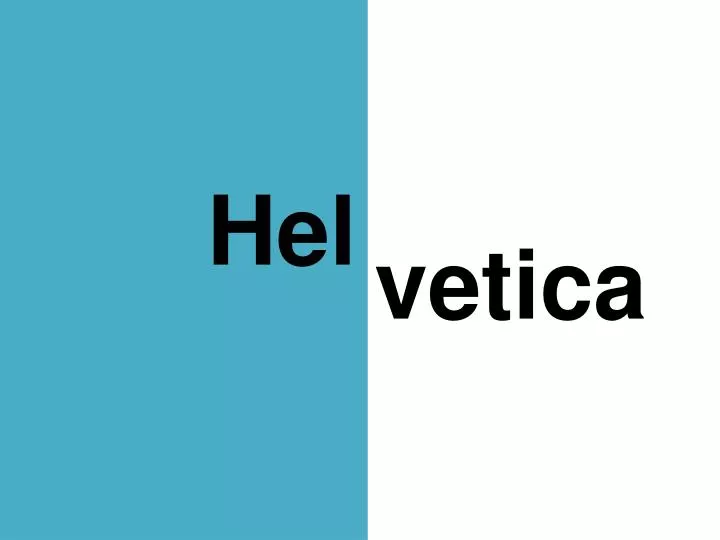
Hel vetica
So, It’s Everywhere – Why? • Seems neutral and efficient • Rationality conveyed by ratio of thick strokes to thin strokes • Smoothness of the letters implies humanity • Something big corporations/organizations want to suggest
Why the Hate? • Doesn’t have the rhythm or flow of handwriting • Ubiquitous and overused • Rebelling against the perceived conformity of Helvetica • Type design based on emotional connection instead of rationality
Why the Love? • Invites interpretation because it has no specific associations • Typefaces are like air, gravity or off-white paint • Helvetica is the most neutral, and therefore incredibly versatile • No meaning in itself
Which looks the most neutral? • This typeface • This typeface • This typeface • This typeface • This typeface • THIS TYPEFACE • This typeface • This typeface
The History of Helvetica • Developed in 1957 by Max Miedinger with Eduard Hoffman of Haas Foundry in Münchenstein, Switzerland • Originally called “Neue Haas Grotesk” • For marketing in America, called Helvetica, meaning “the Swiss font”
The History of Helvetica • Developed out of a modernized version of Aksidenz Grotesk • Pretty similar at first glance • Difference in the “R” and numerals
Movement Against Helvetica • 1970s: Reaction against perceived conformity of Helvetica’s ubiquity • Postmodern design • Wanted to break up the smoothness and neutrality • Emotional connection to typefaces
Movement Back to Helvetica • 1990s: After the grunge movement • Competition of originality • Everyone was using Helvetica again • Retained design goal of an emotional connection to the typeface • Making Helvetica work in a different way
Helvetica Today • After fifty years, it seems like Helvetica can’t be improved • Even if Helvetica is a system-standard typeface, you can still use it with an eye for design
“The typeface you choose shows your identity the same way as the clothes you wear”