Download

1 / 11
110 likes | 276 Views
School-Performance Dashboard. Cowen Institute Tulane University. Note: This excerpt is my contribution to a longer presentation. Please click through it in presentation view to see my step-by-step animations. –Sean. Priscilla (Penny) Wohlstetter, Ph.D. Archana Patel Sean Parker.

E N D
School-Performance Dashboard Cowen Institute Tulane University Note: This excerpt is my contribution to a longer presentation. Please click through it in presentation view to see my step-by-step animations. –Sean Priscilla (Penny) Wohlstetter, Ph.D. Archana Patel Sean Parker
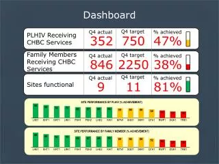
Layers of Information Dashboard For Example School
Layers of Information Dashboard For Example School GOLD marks the top 20%. GRAY marks the bottom 20%. Layer Ia: Note the colors. Layer Ib: Note the numbers. The numbers are percentile ranks. A percentile rank of 83 means that this school is performing better than approximately 83% of schools in the sample. Is 83 good? It’s all relative. The slowest shooting star is still fast! The fastest glacier is still slow.
Layers of Information Dashboard For Example School Digging Deeper What is the school’s actual SPS Score? This school is at the top of the pack in SPS, but what does the pack look like?
Layers of Information Dashboard For Example School This school has an SPS Score of 67. 56 and 67 mark the bottom 20% and the top 20%, respectively. The bulk of schools fall in this range.
Layers of Information Dashboard For Example School Digging Deeper This school has an SPS Score of 67. What does the 75 for Academic Environment mean? On the face, it means that this school scored higher than about 75% of the schools in the sample. But, there is more to uncover. 56 and 67 mark the bottom 20% and the top 20%, respectively. Layer IIa: Note the indicators for the domain. Relatively Low Layer IIb: Note the school’s actual values. Layer IIc: Note the placing in each pack. Layer IId (subtle): Note the weighting. (See Appendix)
Layers of Information Dashboard For Example School Digging Deeper What is statistical control? What is the difference between Per Pupil Expenditure Controlling for Number of Students and Per Pupil Expenditure (Uncontrolled)? What is the difference between Student-Faculty Ratio and Controlled Student-Faculty Ratio? It is one thing to have a Student-Faculty Ratio of 20 when you have 200 students. It is another thing to have a Student-Faculty Ratio of 20 when you have 800 students. When we statistically control for number of students, we ask of each school, what is your Student-Faculty Ratio over and above (or under and below) what we would predict based your number of students?
. . . . . . . . . . . . Layers of Information Dashboard For Example School This school has a Student-Faculty Ratio of 11, which puts it in the middle of the pack. But, the pack is comprised of schools of various sizes. Let’s simultaneously consider Student-Faculty Ratio and Number of Students. Based on a fitted trend line, we predict an S-F Ratio of about 15 for schools with 600 students. We see that one school has an S-F Ratio 10 units greater than we would predict based on Number of Students. Another school is 1 unit less than our prediction, and another school is 7 units less than our prediction. Notice the three schools with about 600 students each. One has an S-F Ratio of about 25, another of about 14, and another of about 8.
Layers of Information Dashboard For Example School Thus, the Student-Faculty Ratio of 11 is 5 units above what we would predict based on number of students. That 5 units is the Controlled Student-Faculty Ratio. Our school has a Student-Faculty Ratio of 11. It has a school size of about 180. Based on a school size of about 180 students, we would predict a Student-Faculty Ratio of about 6. Statistical control is the 3rd (and most complicated) layer of information. Now, we can put it all together…
A Comprehensive View of Performance Dashboard For Example School
Appendix: Weighting Digging Deeper Layer IId (subtle): Note the weighting. The percentile rank for the domain is based on a weighted average of the indicators. First, we give the indicators equal weight, as we standardize their various scales to a mean of zero and a standard deviation of one, roughly translating each indicator to a scale from -3 to 3. Then, we give each indicator a deliberate weight (decided by the consortium with a statistician’s guidance), and this deliberate weight is denoted by the dots under the value. Thus, we see that the SPS Score is weighted most and that the PPE (Uncontrolled) is weighted least. 4 Dots 3 Dots 3 Dots 2 Dots