Download
1 / 16
160 likes | 258 Views
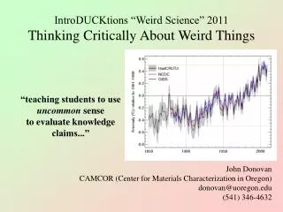
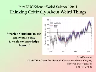
WeiRd things i see in Student power point presuntations. A Few Hyperbolic Notes. C. Andrews April 28, 2011. Too Much Text.

E N D
WeiRd things i see in Student power point presuntations A Few HyperbolicNotes C. Andrews April 28, 2011
Too Much Text There are a couple of problems here. First of all, the text-heavy slide makes you want to read it. This goes for the writer (who either worked really hard on that long paragraph, or thinks the long paragraph they found from that source is really awesome) as much as it does for the reader (whose eyes will ALWAYS gravitate toward the bright, flickering screen rather than the boring/unattractive/slightly balding/slovenly dressed/ unshowered/completely normal/ well-prepared/exciting/whatever person standing in front of them). There is nothing more boring than listening to someone read a long slide of text that you KNOW you could just as well read yourself. Another problem is that the text-heavy slide is difficult to read. This is intended to be a visual medium, with text being part of the visual. Let visuals tell your ‘story’ and try to use text only to highlight important data (quotations, statistics, examples, key words or phrases) or to emphasize main points (hypothesis, conclusions). You do the talking. FOCUS your text. Otherwise it becomes meaningless. You already wrote the paper. Now re-mediate it into a presentation. Don’t just lump out big paragraphs from your paper. The worst presentation I ever went to was by a high-ranking education expert; tons and tons of unreadable text made his presentation incredibly boring. A big wall of uninterrupted text sends a clear visual message: Read Me! It sends a much more insidious subliminal message: Go To Sleep…
On Visuals Beware of randomly chosen clipart.
On Visuals Tables and charts are great. As long as we can read them. Source: http://www.campaignforliberty.com/blog.php?view=22308
On Visuals If you DO use text, it should be in a typeface and font size that people can actually read easily in the room you’re presenting in.
On Visuals No contrast = No Visual
On Visuals Background Images are Tricky
On Visuals Got Motion Sickness?
On Visuals What’s the effect of my continuously changing color scheme? Consistency makes a visual argument.
visual elements image, shape, order, balance, alignment, color, typeface, emphasis, contrast, white space, position, size, similarity, etcetera make visual arguments
Details Cite your sources. If you borrow an image from the internet, put a simple citation on the page. MLA Logo. Source: http://www.mla.org/
Details Cite your sources. If you use a quotation from a secondary source, include a bibliography page at the end of your presentation.
Details • Things to help your audience remember: • Consistent headings • Minimal text • Short sentences or phrases • Parallel sentences or phrases
Details PlEaseprofread care fly.